- Release notes
- Getting started
- Installation
- Configuration
- Integrations
- Authentication
- Working with Apps and Discovery Accelerators
- AppOne menus and dashboards
- AppOne setup
- TemplateOne 1.0.0 menus and dashboards
- TemplateOne 1.0.0 setup
- TemplateOne menus and dashboards
- TemplateOne 2021.4.0 setup
- Purchase to Pay Discovery Accelerator menus and dashboards
- Purchase to Pay Discovery Accelerator Setup
- Order to Cash Discovery Accelerator menus and dashboards
- Order to Cash Discovery Accelerator Setup
- Basic Connector for AppOne
- SAP Connectors
- Introduction to SAP Connector
- SAP input
- Checking the data in the SAP Connector
- Adding process specific tags to the SAP Connector for AppOne
- Adding process specific Due dates to the SAP Connector for AppOne
- Adding automation estimates to the SAP Connector for AppOne
- Adding attributes to the SAP Connector for AppOne
- Adding activities to the SAP Connector for AppOne
- Adding entities to the SAP Connector for AppOne
- SAP Order to Cash Connector for AppOne
- SAP Purchase to Pay Connector for AppOne
- SAP Connector for Purchase to Pay Discovery Accelerator
- SAP Connector for Order-to-Cash Discovery Accelerator
- Superadmin
- Dashboards and charts
- Tables and table items
- Application integrity
- How to ....
- Working with SQL connectors
- Introduction to SQL connectors
- Setting up a SQL connector
- CData Sync extractions
- Running a SQL connector
- Editing transformations
- Releasing a SQL Connector
- Scheduling data extraction
- Structure of transformations
- Using SQL connectors for released apps
- Generating a cache with scripts
- Setting up a local test environment
- Separate development and production environments
- Useful resources
Process Mining user guide
Introduction
Filter controls are fixed filters created by a developer and placed on the dashboard. End users cannot add or remove these filters, they can only change the filter value.
Filter positions
There are multiple places in the dashboard where a filter can be positioned:
- Top
- Right
- Header
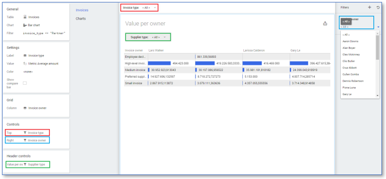
Based on the position of the filters in a dashboard, filters can affect multiple dashboard items. The Chart tab contains the Controls panel and the Header controls panel. Dragging a filter control on the Controls panel on either the Right or Top category will activate that filter for all dashboard items on this dashboard.
The Header controls panel contains a category for each dashboard item. Dragging a filter on one of these categories will only activate this filter for that specific dashboard item. Header controls are shared for all items on a dashboard. Removing a control from the Header controls does not automatically remove it from the chart.
See illustration below.

It is possible to move the filters between the panels by dragging and dropping them on the desired type. Depending on where the filter is positioned, it might look different.
Filter control types
Below is an overview of the available filter control types.
| Filter control type | Description |
|---|---|
| List box | Used to filter one or more values at once. |
| Combo box | Used to filter one value at a time. |
| Period filter | Used to filter on date values. |
| Range filter | Used to filter numerical values. |
| Search box | Filters only one value and is used to easily browse through the values. |
The most commonly used filters are the list box and the combo box filters.
Creating a filter
Follow these steps to create a filter.
| Step | Action |
|---|---|
| 1 | Go to the Dashboards tab and select the dashboard for which you want to create a filter. |
| 2 | Click on the chart for which you want to create filter and go to the Chart tab. |
| 3 | In the table item list right-click on the attribute on which want to create a filter to open the context menu. |
| 4 | Select New control and then the desired filter control. |
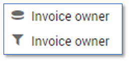
The new filter control is created in the table item list. See illustration below for an example.

The filter control has the same display name as the datasource attribute on which it is created, however, the ID differs. This is displayed when you edit the attribute or filter control. The filter control also has a different icon, to indicate that it is a filter control.
Deactivating a filter
It is possible to deactivate a filter. It is then still visible but does not filter data. Follow these steps to deactivate a filter.
| Step | Action |
|---|---|
| 1 | Go to the Chart tab. |
| 2 | Click on the Filters icon of the filter you want to deactivate in the Controls panel or Header controls panel. |
The filter is now deactivated, shown by a greyed-out version of the filter icon. You can activate the filter by clicking on the filter icon again.
Header filters are initially only active on the selected dashboard item. You can activate them on another dashboard item by selecting that dashboard item and clicking on the Filters icon.
Removing a filter
There are two ways to remove the filter from the dashboard.
- Right-click on the filter control in the Controls panel or the Header controls panel on the Chart tab and select Remove from the context menu.
- Drag the filter control from the Controls panel or the Header controls panel back to the table item list.
Filter control properties
Once a filter control is created, it is possible to edit the properties of the filter control.
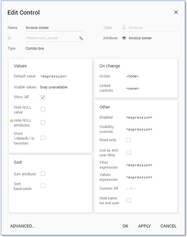
Filter properties can be changed in the Edit Control dialog.
Follow this step to display the Edit Control dialog.
| Step | Action |
|---|---|
| 1 | Right-click on the filter control in the Controls panel or the Header controls panel on the Chart tab and select Edit from the context menu. The Edit Control dialog is displayed. See illustration below. |

Name
The Name field is the display name of the filter. End users will see this name when the filter is placed on a dashboard. It is possible to change the name of the filter.
Filter type
It is possible to change the type of filter after it is created by selecting an different type from the Type drop down-list. Depending on which type of filter you select, the available settings in Edit Control dialog can differ.
Default value
It is possible to set the Default value of the filter. This means that whenever the filters are reset, or when the end-user logs in, the filter is set back to that specific default value.
Visible values
You can use the Visible values setting to determine which values of the attribute are shown in the filter. Below is a description of the possible options for Visible values.
| Option | Description |
|---|---|
| Show all | All values of the attribute are shown in the filter. |
| Gray unavailable | Values that are available in a dashboard are shown in black; the others are shown in gray. When a user selects a gray value, the dashboard will show no results. |
| Hide unavailable | Only values that are available in a dashboard will be shown. |
Remove NULL
You can select the Hide NULL value check box to remove NULL from the list of available filter values, so you cannot filter on attribute values which do not have a value filled in.
Customize All option
There are two available options to customize the All option.
Show ‘All’: The option to select All will be available in the combo box to clear the filter selection. Only available for combo box filter controls.
Custom ‘All’: Give another name for the filter option representing all values of the attribute, which is All by default. Available for combo box, list box, checked list box.