process-mining
2021.10
true
- Release notes
- Getting started
- Installation
- Configuration
- Integrations
- Authentication
- Working with Apps and Discovery Accelerators
- AppOne menus and dashboards
- AppOne setup
- TemplateOne 1.0.0 menus and dashboards
- TemplateOne 1.0.0 setup
- TemplateOne menus and dashboards
- TemplateOne 2021.4.0 setup
- Purchase to Pay Discovery Accelerator menus and dashboards
- Purchase to Pay Discovery Accelerator Setup
- Order to Cash Discovery Accelerator menus and dashboards
- Order to Cash Discovery Accelerator Setup
- Basic Connector for AppOne
- SAP Connectors
- Introduction to SAP Connector
- SAP input
- Checking the data in the SAP Connector
- Adding process specific tags to the SAP Connector for AppOne
- Adding process specific Due dates to the SAP Connector for AppOne
- Adding automation estimates to the SAP Connector for AppOne
- Adding attributes to the SAP Connector for AppOne
- Adding activities to the SAP Connector for AppOne
- Adding entities to the SAP Connector for AppOne
- SAP Order to Cash Connector for AppOne
- SAP Purchase to Pay Connector for AppOne
- SAP Connector for Purchase to Pay Discovery Accelerator
- SAP Connector for Order-to-Cash Discovery Accelerator
- Superadmin
- Dashboards and charts
- HTML panels
- Adding a compare period filter to a dashboard
- Migrating legacy charts to new charts
- Tables and table items
- Application integrity
- How to ....
- Working with SQL connectors
- Introduction to SQL connectors
- Setting up a SQL connector
- CData Sync extractions
- Running a SQL connector
- Editing transformations
- Releasing a SQL Connector
- Scheduling data extraction
- Structure of transformations
- Using SQL connectors for released apps
- Generating a cache with scripts
- Setting up a local test environment
- Separate development and production environments
- Useful resources
Process Mining user guide
Last updated May 5, 2026
Introduction
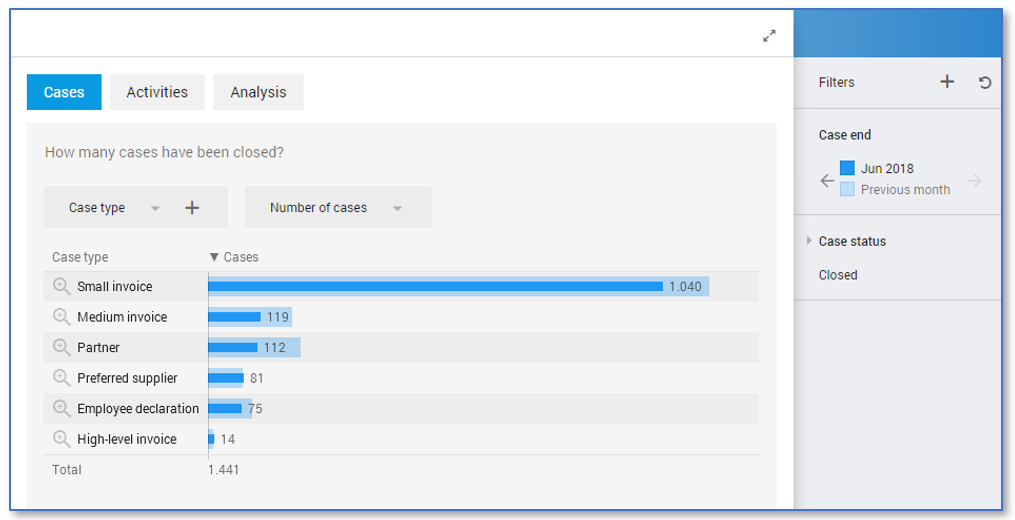
Comparing data of periods in bar charts helps the end user analyzing data. In this way you can easily see if the data increased or decreased in the current period compared to the last period.
Follow these steps to add a period filter and the comparing period filter with a metric. The metric can be exchanged by any expression that calculates a number.
| Step | Action |
|---|---|
| 1 | Open your app in your development environment and click on the dashboard for which you want to add the period filter. |
| 2 | Go to the Chart tab and create a new period filter. |
| 3 | Drag the new period filter to the Right level of the Controls pane. |
| 4 | In the General pane, change Size to X2 Expression. |
| 5 | Click on expression and enter: metric([metric], filter(records, activeperiodfilter)) where [metric] is the metric you are using for the filter. |
| 6 | Go to the Advanced tab. |
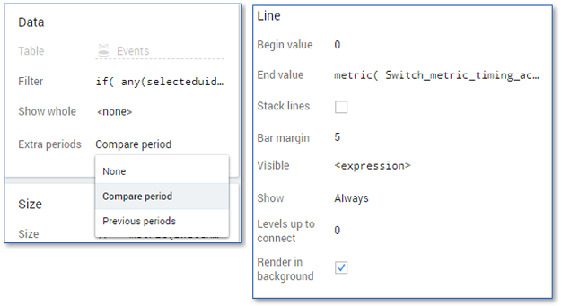
| 7 | Select Compare period from the list in the Extra periods field in the Data pane. |
| 8 | Right click in the Chart panel and select New overlay - Line to create new line overlay. |
| 9 | Enter the following values in the Line pane: • Begin value: 0 • End value: metric([metric], filter(records, not activeperiodfilter)) • Bar margin: 5 • Levels up to connect: 0. |

The dashboard now contains a filter that can be used to compare between periods on a dashboard. See illustration below for a dashboard containing the Case end filter.
