- Release notes
- Getting started
- Installation
- Configuration
- Integrations
- Authentication
- Working with Apps and Discovery Accelerators
- AppOne menus and dashboards
- AppOne setup
- TemplateOne 1.0.0 menus and dashboards
- TemplateOne 1.0.0 setup
- TemplateOne menus and dashboards
- TemplateOne 2021.4.0 setup
- Purchase to Pay Discovery Accelerator menus and dashboards
- Purchase to Pay Discovery Accelerator Setup
- Order to Cash Discovery Accelerator menus and dashboards
- Order to Cash Discovery Accelerator Setup
- Basic Connector for AppOne
- SAP Connectors
- Introduction to SAP Connector
- SAP input
- Checking the data in the SAP Connector
- Adding process specific tags to the SAP Connector for AppOne
- Adding process specific Due dates to the SAP Connector for AppOne
- Adding automation estimates to the SAP Connector for AppOne
- Adding attributes to the SAP Connector for AppOne
- Adding activities to the SAP Connector for AppOne
- Adding entities to the SAP Connector for AppOne
- SAP Order to Cash Connector for AppOne
- SAP Purchase to Pay Connector for AppOne
- SAP Connector for Purchase to Pay Discovery Accelerator
- SAP Connector for Order-to-Cash Discovery Accelerator
- Superadmin
- Dashboards and charts
- Tables and table items
- Application integrity
- How to ....
- Working with SQL connectors
- Introduction to SQL connectors
- Setting up a SQL connector
- CData Sync extractions
- Running a SQL connector
- Editing transformations
- Releasing a SQL Connector
- Scheduling data extraction
- Structure of transformations
- Using SQL connectors for released apps
- Generating a cache with scripts
- Setting up a local test environment
- Separate development and production environments
- Useful resources
Process Mining user guide
Introduction
Dashboards contain data that can be grouped in different levels by using charts.
Charts versus legacy charts
In UiPath Process Mining 2020.10 some chart types have a completely new User Interface that makes it easier to create them. Charts created in previous UiPath Process Mining versions are now available as Legacy charts. The new charts load up much faster than their Legacy chart counterparts. Moreover, the new charts can be cached in the disk cache, which makes sure that the initial loading times of these charts are significantly reduced as well.
Legacy charts will be deprecated in future versions of UiPath Process Mining. For Bar charts,History charts and Distribution charts, you are strongly advised to use the new chart types to get the associated benefits. Moreover, you should consider converting current legacy charts to new charts.
For the chart types that do not have a new-style variant yet, you can still use their legacy versions, for example Gantt charts, or detail lists or pie charts.
See Legacy Charts
Steps to design a chart
When you want to design a new chart you take some steps:
- Determine the attribute for which you want to display the values on the chart.
- Decide the type of the chart that is most suitable for the information you want to display.
- Define the main metric that you want to use on the chart.
- If desired, define any context metrics to display context information related to the main metric.
Creating a new chart
Follow these steps to create a new chart.
| Step | Action |
|---|---|
| 1 | Go to the Dashboards tab and create a new dashboard or go to the dashboard for which you want to create a chart. |
| 2 | Right click in the dashboard item list and select New chart and then the table that contains the attribute you want to display in the chart. |
Chart types
Below is an overview of the new chart types that are available and their purpose.
| Chart type | Description |
|---|---|
| Bar chart | Used to group data and to compare certain metrics. |
| History chart | Used to split data over different periods to show trends over time. |
| Distribution chart | Used to show the distribution of values of a numerical attribute. |
By default, when a new dashboard is created, a bar chart is drawn.
Chart tab
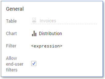
The Chart tab displays the properties of a selected chart. The General panel contains properties that are available for all charts. See illustration below.

Below is a description of the properties in the General panel.
| Property | Description |
|---|---|
| Table | The table on which the chart is based. This table contains the main attribute that is displayed in the chart. |
| Chart | Enables you to select the type of the chart. |
| Filter | Enables you to enter an expression that returns a Boolean value to filter data from the table before it is provided to the chart. Note: The syntax of the expression should be similar to a per record expression. See Record Expressions . |
| Allow end-user filters | Enables you to indicate whether end-user filters can be defined for the chart. |
Depending on the type of the chart the Settings panel contains different properties that can you use to add data to the chart.
Changing the chart colors
When a new chart is created, the default color is used. It is possible to use a different color scheme in the charts to differentiate between values.
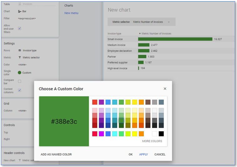
Follow these steps to change the color of the bars in a bar chart.
| Step | Action |
|---|---|
| 1 | Click on the chart and go to the Chart tab. |
| 2 | Click on Color icon next to Single color. |
| 3 | Select a color from the Predefined colors list, or click on Custom... to select a new color from the color picker. See illustration below. |

Single color is only available if Color is set to none.
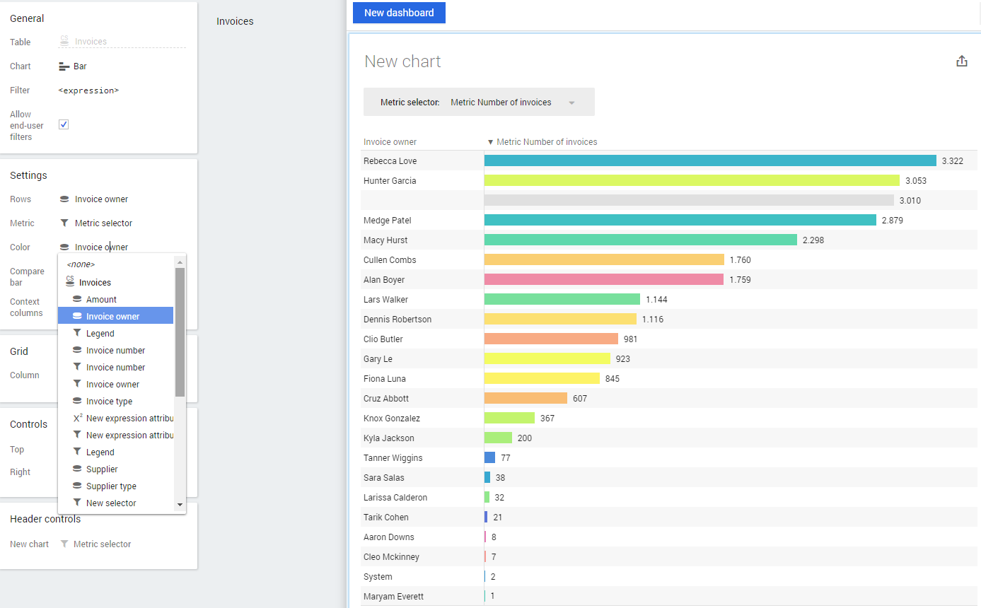
You can also use multiple colors in the chart by selecting a color scheme. Follow these steps to use a different color scheme for the bars in the chart.
| Step | Action |
|---|---|
| 1 | Click on the chart and go to the Chart tab. |
| 2 | Click on none next to Color and select an attribute from the table item list. |
The colors in the chart are changed according to the color scheme that is defined for the selected attribute. See illustration below.

See also Table Items
For History charts and Distribution charts, you can change colors in a similar way.
Related information
See Bar Charts.
See History Charts.
See Distribution Charts.