- 概要
- UI Automation
- UI Automation アクティビティ パッケージについて
- UI Automation を使用して自動化されるアプリケーションと技術
- プロジェクトの対応 OS
- UI-ANA-016 - [ブラウザーを開く] に使用されている URL を検出
- UI-ANA-017 - [エラー発生時に実行を継続] の値が True
- UI-ANA-018 - OCR/画像関連のアクティビティのリスト
- UI-DBP-006 - コンテナーの使用
- UI-DBP-013 - Excel の自動化方法の誤用
- UI-DBP-030 - セレクター内での変数の使用禁止
- UI-DBP-031 - アクティビティの検証
- UI-PRR-001 - クリックをシミュレート
- UI-PRR-002 - 入力をシミュレート
- UI-PRR-003 - [アプリケーションを開く] の誤用
- UI-PRR-004 - ハードコードされた待機時間
- UI-REL-001 - セレクター内の大きいインデックス値
- UI-SEC-004 - メール アドレスのデータを含むセレクター
- UI-SEC-010 - アプリ/URL の制限
- UI-USG-011 - 許可されていない属性
- UX-SEC-010 - アプリ/URL の制限
- UX-DBP-029 - セキュリティで保護されていないパスワードの使用
- UI-PST-001 - [プロジェクト設定] の監査ログ レベル
- UiPath ブラウザー移行ツール
- クリッピング領域
- Computer Vision レコーダー
- アクティビティの索引
- アクティベート
- アンカー ベース
- ブラウザーにアタッチ
- ウィンドウにアタッチ
- ユーザー入力をブロック
- 吹き出し
- チェック
- クリック
- 画像をクリック
- 画像クリック トリガー
- OCR で検出したテキストをクリック
- テキストをクリック
- クリック トリガー
- アプリケーションを閉じる
- タブを閉じる
- ウィンドウを閉じる
- コンテキスト対応のアンカー
- 選択されたテキストをコピー
- 要素属性変更トリガー
- 要素の存在を確認
- 要素スコープ
- 要素ステート変更トリガー
- UI ツリーをエクスポート
- 構造化データを抽出
- 子要素を探す
- 要素を探す
- 画像を探す
- 一致する画像を探す
- OCR でテキスト位置を探す
- 相対要素を探す
- テキスト位置を探す
- アクティブ ウィンドウを取得
- 親要素を取得
- 属性を取得
- イベント情報を取得
- クリップボードから取得
- フル テキストを取得
- OCR でテキストを取得
- パスワードを取得
- 位置を取得
- ソース要素を取得
- テキストを取得
- 表示中のテキストを取得
- 前に戻る
- 次に進む
- ホームに移動
- Google Cloud Vision OCR
- ウィンドウを隠す
- 強調表示
- ホットキー トリガー
- ホバー
- 画像上でホバー
- OCR で検出したテキスト上でホバー
- テキスト上でホバー
- 画像の存在を確認
- 画面上で指定
- .NET コードを挿入
- JS スクリプトを挿入
- ActiveX メソッドを呼び出し
- キー操作トリガー
- 画像を読み込み
- ウィンドウを最大化
- Microsoft Azure ComputerVision OCR
- Microsoft OCR
- Microsoft Project Oxford Online OCR
- ウィンドウを最小化
- イベントを監視
- マウス トリガー
- ウィンドウを移動
- URL に移動
- OCR でテキストの存在を確認
- 要素が出現したとき
- 要素が消滅したとき
- 画像が出現したとき
- 画像が消滅したとき
- アプリケーションを開く
- ブラウザーを開く
- ブラウザーを更新
- ユーザー イベントを再生
- ウィンドウを復元
- 画像を保存
- 項目を選択
- 複数の項目を選択
- ホットキーを押下
- クリッピング領域を設定
- フォーカスを設定
- テキストを設定
- クリップボードに設定
- Web 属性を設定
- ウィンドウを表示
- プロセスを開始
- システム トリガー
- スクリーンショットを作成
- Tesseract OCR
- テキストの存在を確認
- ツールチップ
- 文字を入力
- SecureString で文字を入力
- フォアグラウンドを使用
- 属性を待つ
- 要素の消滅を待つ
- 画像の消滅を待つ
- アクセシビリティ チェック
- アプリケーション イベント トリガー
- ユーザー入力をブロック
- チェック/チェック解除
- アプリのステートを確認
- 要素を確認
- クリック
- クリック イベント トリガー
- ドラッグ アンド ドロップ
- 表データを抽出
- 要素を探す
- 繰り返し (各 UI 要素)
- ブラウザーのデータを取得
- クリップボードを取得
- テキストを取得
- URL を取得
- URL に移動
- 強調表示
- ホバー
- JS スクリプトを挿入
- キーボード ショートカット
- キー押下イベント トリガー
- マウス スクロール
- ブラウザー内を移動
- 項目を選択
- ブラウザーのデータを設定
- クリップボードに設定
- ランタイム ブラウザーを設定
- フォーカスを設定
- テキストを設定
- スクリーンショットを作成
- 文字を入力
- ユーザー入力のブロックを解除
- アプリケーション/ブラウザーを使用
- ウィンドウ操作
- UI Automation API を使用してブラウザー検索を実行し、結果を取得する
- Web の閲覧
- 画像を検索する
- 画像をクリックする
- イベントをトリガーおよび監視する
- ファイルを作成して上書きする
- HTML ページ: 情報を抽出して操作する
- ウィンドウの操作
- リスト項目の選択の自動化
- ウィンドウ要素を探して操作する
- テキスト操作の自動化を行う
- 画像を読み込んで処理する
- マウスでアクティブ化する操作を管理する
- アプリケーションランタイムの操作を自動化する
- ローカル アプリケーションの自動実行
- ブラウザーのナビゲーション
- Web オートメーション
- トリガー スコープの例
- DevExpress での UI Automation の有効化
- Computer Vision Local Server
- モバイル オートメーション
- ターミナル

UI Automation アクティビティ
UI Explorer
UI Explorer は、特定の UI 要素に対応した独自のセレクターを作成できる高度なツールです。これは、Automation Cloud インスタンスの [リソース センター] からダウンロードできるスタンドアロンのツールです。UiPath.UIAutomation.Activities パッケージがプロジェクトの依存関係としてインストールされている場合には Studio からも利用できます。
UI Explorer をスタンドアロン ツールとして使用する場合、Studio をインストールする必要はありません。これは、セレクターを使用してアプリケーションを自動化できることを確認する場合に便利です。これにより、プロセスを構築することなく、簡単に要素を検査できます。スタンドアロン パッケージには SetupExtensions ユーティリティも含まれているため、ブラウザー拡張機能と JavaBridge をインストールして、自動化に関するあらゆるニーズにわたって要素を検査できます。
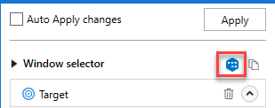
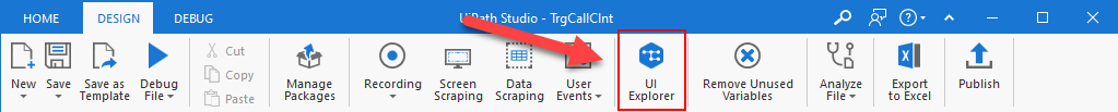
[UI Explorer] ウィンドウを開くには、[デザイン] タブの [セレクター] セクションにあるボタンをクリックします。あるいは、ターゲット UI 要素を指定した後に、ターゲットおよびアンカー属性のすべてのセレクターの選択画面にある高度なエディターからも開くことができます。
使用中のプロジェクトの依存関係として UiPath.UIAutomation.Activities パッケージがインストールされていない場合は、[UI Explorer] ボタンがリボンに表示されません。
別の方法として、Studio の Backstage ビューの [ツール] ページから UI Explorer を開くこともできます。コンテキスト メニューからの UI Explorer は、Studio の現行バージョンに同梱されている UI Automation ライブラリを使用します。
UI Explorer を開くと、右下隅に、現在使用中の UI Automation パッケージのバージョンが表示されます。このバージョンは場合によって異なります。UI Explorer を [ツール] ページから起動した場合は、使用中の Studio のバージョンに同梱されている既定の UI Automation バージョンを使用します。UI Explorer をリボンから起動した場合には、現在のプロジェクトの依存関係としてインストールされているバージョンを使用します。
最適なセレクターを選択するうえでのヒントを次に示します。
- 属性を追加または削除する
- 親タグまたは子タグを追加する
- ワイルドカードを使用して変更する値を置き換える
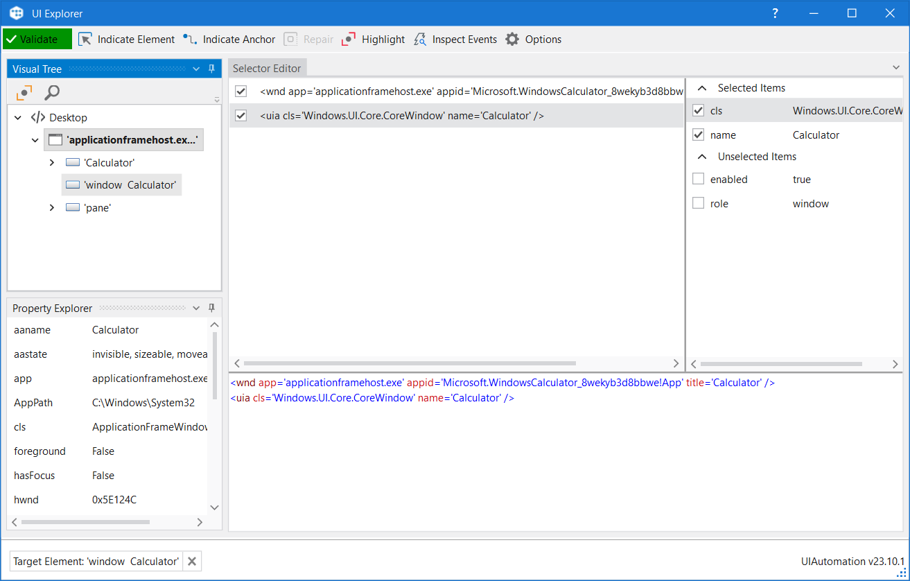
UI Explorer ウィンドウのフィールドの説明
| フィールド | 説明 |
|---|---|
| 検証 |
|
| 要素を選択 | 古い UI 要素に置き換わる新しい UI 要素を指定します。 |
| アンカーを指定 | ターゲットの UI 要素に相対するアンカーを選択できます。 |
| 修復 | 同じターゲット UI 要素を再度指定して、セレクターを修復できます。この操作は、古いセレクターを完全に置き換えることはしません。このボタンは、セレクターが無効な場合にのみ使用可能です。 |
| 強調表示 | ターゲット要素を最前に配置します。オフに切り替えられるまで、強調表示が継続します。このボタンは、セレクターが有効な場合にのみ使用有効です。 |
| イベントを検査 | イベント検査ツールを開きます。 |
| オプション | いくつかのオプションがあります。
詳しくは、「UI Automation and Microsoft Active Accessibility」をご覧ください。 |
 セレクターを検証中
  有効なセレクター
  無効なセレクター
  変更されたセレクター、再検証
 ビジュアル ツリー パネル
UI 階層のツリーを表示します。各ノードの前にある矢印をクリックしてナビゲートすることができます。
既定では、最初に UI Explorer を開くと、このパネルにはすべての開かれたアプリケーションがアルファベット順で表示されます。
ツリーから UI 要素をダブルクリックする (または右クリックして [ターゲット要素として設定] を選択する) と、[セレクター エディター]、[セレクター属性]、[プロパティ エクスプローラー] の各パネルが設定されます。
| フィールド | 説明 |
|---|---|
| 強調表示 | ビジュアル ツリーから選択した要素は、リアルタイムで強調表示されます。オフに切り替えられるまで、強調表示が継続します。 |
| 検索オプションを表示 | 検索ボックスと検索フィルター オプションを表示します。 |
| 検索ボックス | 特定の文字列を検索できます。完全一致が見つからない場合は、最も一致に近い文字列が含まれているノードが表示されます。 ワイルドカードがサポートされます。 [検索条件] ドロップダウン リストで選択した属性に応じて、検索で大文字と小文字が区別されます。 注: 検索では、選択した UI オブジェクトの下にあるツリー構造内の一致のみが検索されます。 |
| 検索条件 | 検索対象を、選択した属性またはセレクターに絞り込みます。選択した UI 要素に応じて、ドロップダウン リストの内容が変化します。 注: [検索条件] を [セレクター] に設定した場合は、 |
| 子のみ | 検索対象を、選択したノードの第 1 レベルの子に限定します。既定では、このチェック ボックスはオフになっています。 |
セレクター エディター パネル
指定した UI オブジェクトに対応するセレクターを表示し、セレクターをカスタマイズすることができます。
パネルの下部には、プロジェクトで使用する必要がある実際の XML フラグメントが表示されます。必要なセレクターが見つかったら、ここからコピーしてアクティビティの [プロパティ] パネルの [セレクター] フィールドに貼り付けることができます。
パネルの上部では、セレクター内のすべてのノードを表示でき、ノードの前にあるチェック ボックスをオフにすることで不要なノードを削除することができます。属性を有効化/無効化した場合、または下部のパネルでセレクターを編集した場合、セレクター ノードのリストにある要素がアクティブになります。一度に 1 つのノードしかアクティブになりません。
ここでノードを選択すると、その属性が [セレクター属性] パネルと [プロパティ エクスプローラー] パネルに表示されます。
また、変数を通じてセレクターも編集できます。その場合、CTRL+K ホットキーを使用してセレクター自体の内部に変数を作成するか、CTRL+Space の組み合わせにより既に作成済みの変数を指定します。CTRL+K ホットキーを使用すれば、変数の値と名前を指定できます。string 変数のみ使用できます。
セレクター属性パネル
([セレクター エディター] パネルから) 選択したノードの使用可能なすべての属性を表示します。
各属性の前にあるチェック ボックスをオンまたはオフにすることで、ノード属性の一部を追加または削除できます。
また、各属性の値を変更することもできますが、この変更が保持されるのは、新しいセレクターが最初に選択した UI オブジェクトを指し示している場合のみです。
プロパティ エクスプローラー パネル
指定した UI オブジェクトが持つことのできる属性のすべて (セレクターに出現しない属性を含む) を表示します。これらは変更できません。
イベント検査ツール
トリガーベースの有人オートメーションのコンテキストでは、イベント検査ツールを使用して、アプリケーション内の特定の UI 要素を操作したときにトリガーされるネイティブ イベントの種類を識別し、[アプリケーション イベント トリガー] アクティビティを設定することができます。このツールは、クリック、キーの押下、フォーカスの取得、フォーカスの喪失、その他の関連する操作など、選択したすべての種類のイベントをキャプチャして監視します。それにより、実行されたアクションを分析し、発生した問題を診断することができます。
有効な UI 要素が選択されている状態で [イベントを検査] ツールバー ボタンをクリックすると、UI Explorer からイベント検査ツールを開くことができます。
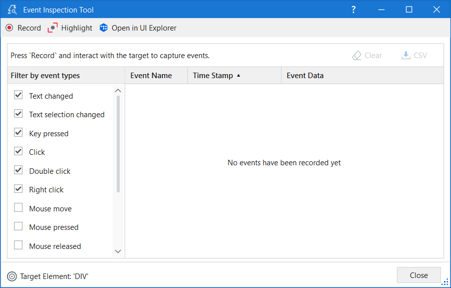
ツールバーは、次のオプションで構成されています。
- 記録 - UI 要素を操作することによって生成されたイベントが記録され、イベント リストに追加されます。
- 一時停止 - UI 要素を操作したときにその UI 要素によって生成されるイベントが記録されなくなります。
- 強調表示 - ターゲット要素の輪郭を表示し、数秒間前面に移動します。強調表示は無効化されるまでオンのままになります。
- UI Explorer で開く - 監視対象の要素が UI Explorer で開き、その要素のセレクターを確認できます。
イベントの記録を開始すると、さらに 2 つのオプションが利用可能になります。
- クリア - 記録されたすべてのイベントを削除します。
- CSV - キャプチャしたイベントを
.csvファイルにエクスポートして、さらに詳しく分析することができます。
[イベント検査ツール] ウィンドウには、以下の 2 つのメイン セクションがあります。
- イベント フィルター - ターゲット要素に対して監視するイベントの種類を選択できます。
- イベント リスト - キャプチャしたイベントに関する情報を表示します。
特定の種類のイベントをフィルタリングしてキャプチャするには、イベントの種類のリストでチェックボックスをオンまたはオフにします。リストは、選択した要素のテクノロジによって異なる場合があります。
Web または Java UI 要素に固有のあらゆる種類のマウス イベント (マウスの移動、マウスの押下、マウスの解放、マウスの到達、マウスの離れ) は、イベント リストが増大する可能性があるため、既定では無効になっています。そうした種類のマウス イベントを有効化するのは、特に監視が必要な場合だけにすることをお勧めします。
また、イベントの記録の開始後にも、そうした種類のイベントを有効化または無効化できます。
イベント リストには、以下の 3 つの列があります。
- イベント名 - イベントの種類です。
- タイム スタンプ - イベントが実行された日付と時間です。
- イベント データ - 特定のイベントに関するデータとパラメーターです。
各列は、昇順または降順に並べ替えることができます。既定では、イベントは実行された順に表示されます。

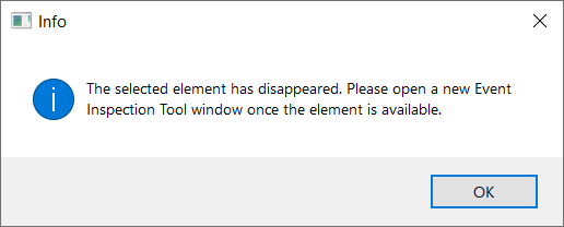
[消滅] というイベントの種類が検出されると、監視を続行できなくなり、画面にエラー メッセージが表示されます。ツールバーのオプションをクリックすると、同じエラー メッセージが画面に表示されます。利用可能なオプションは、データのクリアか、 .csv ファイルへのエクスポートのみです。監視を再開するには、ウィンドウを閉じて、 イベント検査ツールの別のインスタンスを開きます。