- Overview
- App Events
- Flowchart Builder
- Callout
- Complex Scenarios
- Credentials
- Data Service
- About the Data Service activity package
- Project compatibility
- Create Entity Record
- Update Entity Record
- Delete Entity Record
- Get Entity Record by Id
- Query Entity Records
- Query Multiple Entity Records
- Upload File to Record Field
- Download File from Record Field
- Delete File from Record Field
- Create Multiple Entity Records
- Update Multiple Entity Records
- Delete Multiple Entity Records
- Form
- Release notes
- Project compatibility
- Real Time Forms
- Updating form data
- Running forms using JavaScript
- Customizing Forms Using CSS
- Conditional components
- Adding multiple components on the same row in Columns
- Using the Data Table component
- Get File/Folder path
- Reading cell values from a Data Grid component
- Displaying PDF files
- Displaying images in forms
- Scrolling through Data Grids
- Using Dev Tools with forms
- Calculate form component values
- Managing dates in forms
- Opening hyperlinks inside forms
- Displaying a default tab in forms
- Displaying the full label of a component
- Searching long strings in drop-down lists
- Dynamically set form values
- About the pre 23.4 Form experience
- Project Compatibility
- Real Time Forms
- Dynamic Checkboxes
- Conditional Dropdowns
- Displaying a Default Tab
- Displaying Images
- Displaying PDF Files
- Displaying the Full Label
- Dynamic HTML Elements
- Managing Dates
- Searching Long Strings in Drop-downs
- Customizing Forms Using Local CSS Files
- Executing Do Block On Checkbox Change
- Customizing Columns Width
- Updating Form Data
- Resetting Collection Data
- Advanced Logic
- Executing Do Block on Dropdown Option Change
- Reading Cell Values From a Data Grid Component
- Conditional Components
- Scrolling Through Data Grid Components
- Using the Grid Component
- Dev Tools
- Calculated Value
- Dynamic Dropdowns
- Switching Tabs With Button Click
- Opening Hyperlinks Inside Form
- FTP
- IPC
- Automation Ops Pipelines
- Release notes
- About the Pipelines activity package
- Project compatibility
- Activate Solution Deployment
- Analyze
- Build
- Clone
- Delete Solution Package
- Deploy Solution
- Download Package
- Download Solution Package
- Download Solution Package Configuration
- Publish Package
- Publish Solution Package
- Re-sync Solution Project
- Run Existing Test Set
- Run Tests
- Stage
- Uninstall Solution
- Update Process
- Upload Solution Package
- Persistence
- Release notes
- Project compatibility
- Bulk Form Designer
- Start Job And Get Reference
- Wait For Job And Resume
- Add Queue Item And Get Reference
- Wait For Queue Item And Resume
- Wait For Form Task And Resume
- Resume After Delay
- Assign Tasks
- Create External Task
- Wait For External Task And Resume
- Complete Task
- Forward Task
- Get Form Tasks
- Get Task Data
- Get App Tasks
- Add Task Comment
- Update Task Labels
- Create App Task
- Wait For App Task And Resume
- Configure task timer
- Working with App tasks
- Building Your First Form Action
- Advanced Controls for Drop-downs
- Embedding Objects in Form Actions
- Allowing Users to Upload Files to the Storage Bucket
- Adding Advanced Logic Using Java Script
- Setting a Default Tab
- Removing the Delete button from Edit Grid using custom CSS
- Customizing Edit Grid templates
- Using buttons to trigger custom logic
- Using an External Form Layout
- Dynamically expanding form components at runtime
- Aligning the content of a form component from left to right using JSON attributes
- Sample Workflows
- System
- Release notes
- Project compatibility
- Supported character encoding
- RegEx Builder Wizard
- Add Data Column
- Add Data Row
- Add Log Fields
- Add or Subtract from Date
- Add Transaction Item
- Add Queue Item
- Append Item to Collection
- Append Item to List
- Append Line
- Beep
- Break / Exit Loop
- Browse for File
- Browse for Folder
- Build Collection
- Build Data Table
- Bulk Add Queue Items
- Change Case for Text
- Change Type
- Check False
- Check True
- Clear Data Table
- Collection to Data Table
- Comment
- Compress/Zip Files
- Copy File
- Copy Folder
- Combine text
- Comment Out / Disabled Activities
- Continue / Skip Current
- Create File
- Create Folder
- Create List
- Custom Input
- Delete
- Delete File
- Delete Folder
- Delete Storage File
- Delete Queue Items
- Disable Local Trigger
- Do While
- Download file from URL
- Download Storage File
- Enable Local Trigger
- Evaluate Business Rule
- Exists in Collection
- Extract/Unzip Files
- Extract Date and Time from Text
- Extract Text
- File Change Trigger
- File Exists
- Filter Collection
- Filter Data Table
- Folder Exists
- For Each
- For Each File in Folder
- File Change Trigger V3
- Find and Replace
- Find Matching Patterns
- For Each Folder in Folder
- For Each Row in Data Table
- Format Date as Text
- Format Value
- Generate Data Table From Text
- Get Asset
- Get Credential / Get Orchestrator Credential
- Get Current Job Info
- Get Environment Folder
- Get Environment Variable
- Get File Info
- Get Folder Info
- Get Jobs
- Get Processes
- Get Row Item
- Get Secret
- Get Transaction Item
- Get Username/Password
- Get Queue Items
- Global Variable Changed Trigger
- Input Dialog
- Invoke Code
- Invoke Com Method
- Invoke Power Shell
- Invoke Process
- Invoke VBScript
- Invoke Workflow File
- Is Text Matching
- Join Data Tables
- Kill Process
- Launch Workflow Interactive
- List Storage Files
- Log Message
- Lookup Data Table
- Manual Trigger
- Merge Collections
- Merge Data Table
- Message Box
- Modify Date
- Modify Text
- Move File
- Move Folder
- Multiple Assign
- New Item Added to Queue
- Notify Global Variable Changed
- Orchestrator HTTP Request
- Output Data Table
- Parallel
- Parallel for each
- Path Exists
- Postpone Transaction Item
- Process End Trigger
- Process Start Trigger
- Process Tracking Scope
- Raise Alert
- Read List Item
- Read Text File
- Read Storage Text
- Remove Data Column
- Remove Data Row
- Remove Duplicate Rows
- Remove From Collection
- Remove Log Fields
- Replace Matching Patterns
- Repeat Number of Times
- Repeat Trigger
- Rename File
- Rename Folder
- Report Status
- Reset Timer
- Resume Timer
- Retry Scope
- Return
- Run Local Triggers
- Run Agent
- Run Job
- Run Parallel Process
- Set Asset
- Send Email Notification
- Set Credential
- Set Environment Variable
- Set Secret
- Set Task Status
- Set Trace Status
- Set Transaction Progress
- Set Transaction Status
- Should Stop
- Split Text
- Sort Data Table
- Start Timer
- Start Job
- Stop Job
- Stop Local Triggers
- Stop Timer
- Text to Left/Right
- Text to Upper/Lowercase
- Time Trigger
- Trigger Scope
- Track Object
- Timeout Scope
- Update Row Item
- Update List Item
- Upload Storage File
- Wait for Download
- Wait Queue Item
- While
- Workflow Placeholder
- Write Storage Text
- Write Text File
- AddDataRow
- AddQueueItem
- AddTransactionItem
- AppendLine
- BulkAddQueueItems
- ClearDataTable
- CompressZipFiles
- CopyFile
- CreateFile
- CreateFolder
- DeleteFileOrFolder
- DeleteQueueItems
- DeleteStorageFile
- DownloadStorageFile
- ExtractUnzipFiles
- FilterDataTable
- GetAsset
- GetCredential
- GetJobs
- GetQueueItem
- GetQueueItems
- GetResourceForLocalPath
- GetRowItem
- GetTransactionItem
- InvokeProcess
- JoinDataTables
- ListStorageFiles
- LookUpDataTable
- MergeDataTable
- MoveFile
- OrchestratorHTTPRequest
- OutputDataTable
- PathExists
- PostponeTransactionItem
- ReadStorageText
- ReadTextFile
- RemoveDataColumn
- RemoveDuplicateRows
- Replace
- SetAsset
- SetCredential
- SetTransactionProgress
- SetTransactionStatus
- SortDataTable
- StartJob
- StopJob
- UpdateRowItem
- UploadStorageFile
- WaitQueueItem
- WriteStorageText
- WriteTextFile
- Testing
- Release notes
- About the Testing activity package
- Project compatibility
- Project Settings
- Add Test Data Queue Item
- Attach Document
- Bulk Add Test Data Queue Items
- Create Comparison Rule
- Compare PDF Documents
- Compare Text
- Delete Test Data Queue Items
- Generate Address
- Generate Given Name
- Generate Last Name
- Generate Random Date
- Generate Random Number
- Generate Random String
- Generate Random Value
- Get Test Data Queue Item
- Get Test Data Queue Items
- Verify Control Attribute
- Verify Expression
- Verify Expression With Operator
- Verify Range
- Address
- AddTestDataQueueItem
- AttachDocument
- BulkAddTestDataQueueItems
- DeleteTestDataQueueItems
- GetTestDataQueueItem
- GetTestDataQueueItems
- GivenName
- LastName
- RandomDate
- RandomNumber
- RandomString
- RandomValue
- VerifyAreEqual
- VerifyAreNotEqual
- VerifyContains
- VerifyExpression
- VerifyExpressionWithOperator
- VerifyIsGreater
- VerifyIsGreaterOrEqual
- VerifyIsLess
- VerifyIsLessOrEqual
- VerifyIsRegexMatch
- VerifyRange
- Workflow Foundation

Workflow activities
Form controls
Once you select a form component, a wizard opens displaying several configuration tabs, to allow further customization for different functionalities. Check the progress inside the preview pane of the wizard.
When you are satisfied with the design of a component, select Save.
The table below describes the settings and controls available for the common wizard tabs.
| Wizard Tab | Description | Special Mentions |
|---|---|---|
| Display | Configure the way the form component is displayed. | The name you set in the mandatory Label field becomes the PropertyName in the Field Key tab. |
| Data | Configure a default value that end users see in the text field. | Components that may hold multiple items (e.g., Selectboxes, Tab) can be defined here. |
| Validation | Configure validation requirements to enable other UI components. | NA |
| Field Key | Configure the property name of the component that you want to use in the workflow. | By default, this value is passed from the Label field of the Display tab. |
| Conditional | Configure conditions for the component. | You can set advanced conditions, such as Javascript or JSON. |
| Logic | Configure the logic that triggers the conditions. | NA |
Some form components have specific tabs, for example:
| Component | Wizard Tab | Description |
|---|---|---|
| Date / Time | Date | Configure the minimum and maximum dates available for selection. |
| Time | Configure the incremental step for hours and minutes. | |
| Day | Day | Configure the way the business user selects the day (incremental or from a drop-down list). |
| Month | Configure the way the business user selects the month (incremental or from a drop-down list). | |
| Year | Configure the way the business user selects the year (incremental or from a drop-down list), and also the minimum and maximum year available for selection. | |
| Edit Grid | Templates | Customize the headers and rows of your edit grid data. |
| Data Map | Layout | Apply marginal layout changes to your data map. |
Display
Label - The title of the component.
Label Position - The position of the label for a field.
Description - The text that appears below the input field.
Tooltip - Adds a tooltip icon on one side of the icon. Input the text of the tooltip.
Custom CSS Class - Add a custom CSS class to the component. You can add multiple classes, separated by a space.
Hidden - Hide a component when you show the form.
The component still appears in the JSON file.
Hide Label - Hide the label of a component.
Disabled - Disable a field in the form.
Placeholder - The text that appears when the field is empty.
Prefix - The text that is displayed before a field.
Suffix - The text that is displayed after a field.
Unique - When checked, the field is considered unique to the form.
Protected - When checked, makes the field available for input-only.
Persistent - When checked, it stores a field in the database. If you don't want to save a field to the database, uncheck Persistent.
Table View - When checked, shows the value within the table view of the submissions. You can use it for child components that you add inside Edit Grid components, to show the child components inside rows. If left unchecked, the data doesn't display in the collapsed row of the Edit Grid. Even if the data doesn't display, you can configure a component while editing a row.
Input Mask
An input mask provides a predefined format. For example, for a phone-number field, the default input mask would be (999) 999-9999.
Input mask elements are:
9- numerica- alphabetical*- alphanumeric
Data
Default Value - The value of the field before users interact with it. The default value overrides the placeholder text.
Multiple Values - When checked, multiple values can be added to the field. The values appear as an array in the API and an Add Another Button is visible on the field.
Content - The section where you type the content of a component.
Data Format - The moment.js format you use for saving this field. For example, HH:mm:ss.
Redraw On - Redraw this component if another component in the form changes. Choose the event when the component should redraw from the dropdown list. The default events to choose are Any Change and Submit.
Validation
Required - When checked, this field is required to have a value.
Validate On - Determines when this component triggers front-end validation. Choose an event from the dropdown list: Change or Blur.
Minimum Length - The minimum length requirement this field must meet.
Maximum Length - The maximum length requirement this field must meet.
Minimum Word Length - The minimum amount of words that can be added to this component.
Maximum Word Length - The maximum amount of words that can be added to this field.
Regular Expression Pattern - The regular expression pattern that the component must pass before the form can be submitted.
Error Label - The label that displays when a validation error message shows.
Custom Error Message - A customized error message to be displayed if an error occurs.
Allow only available values - When checked, performs a validation check to make sure the value selected is an available option.
Field Key
Property Name - The corresponding argument name for a component in the Arguments Collection.
You can use the Property Name to pass in arguments (using the Set Form Values activity) inside the form, or to get values outside of a form (using the Get Form Values activity).
Conditional
The Conditional tab in the Form Builder allows you to place conditions on components in your form, to hide or display them.
The Conditional tab has two sections:
- Simple
- Advanced Conditions
Simple conditions
The Simple section of the Conditional tab allows you to hide or display a component, based on the value of another component.
The Simple section consists of three fields:
-
This component should Display - from this dropdown list, choose:
- True if you want to condition when the component displays.
- False if you want to condition when the component hides.
-
When the form component - from this dropdown list, choose a component in the form to act as a condition.
-
Has the value - type in the value that conditions the component when to display or hide.

Advanced conditions
The Advanced Conditions section allows you to use JavaScript code or JSONLogic to make combinations of conditions.
Advanced Logic overrides the results of Simple conditional logic.
In the JavaScript code section, enter a custom JavaScript code.
The show variable must be given a true or false value. The data variable is used to access other components in the form, through the API key.

To learn how to use conditional components, check the Conditional components tutorial page.
Logic
The Logic tab of the Form Builder allows you to create conditions and advanced logic scripts that can change the state or the behavior of the selected form component.
Using advanced logic, you can dynamically change the controls, look, and feel of a form component.
A form logic consists of two parts: the trigger and the action.
Trigger
The logic trigger is the condition upon which the action takes place. For example, you may want to display a specific form field only when a checkbox option is selected. In this case, the checkbox option is the trigger, and displaying the form field is the action.
There are four types of logic triggers:
| Trigger type | Description | Example |
|---|---|---|
| Simple | Select the type of trigger and the value you want to use in your logic. | 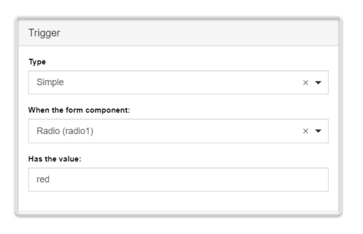 |
| Javascript | You provide a JavaScript logic for a form component or form data. Use the JavaScript syntax to create complex logic, such as loop or dynamic behavior. | 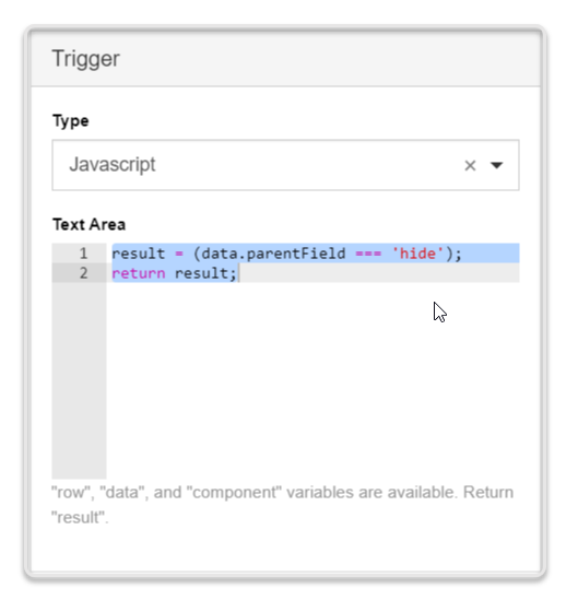 |
| JSON Logic | You provide a JSON logic for a form component or form data. Recommended in cases where JavaScript is not permitted. Cannot support loops or dynamic behaviors. | 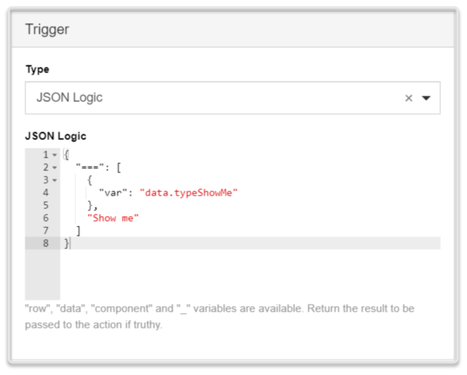 |
| Event | You define a component event, which once emitted by the corresponding component, triggers the desired action. | 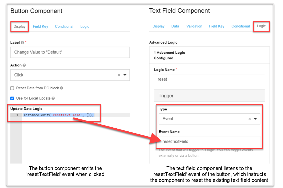 |
Action
The logic action is the form component behavior that should happen based on the logic conditions you set (i.e., the trigger). For example, you may want to activate a button for users of a specific age. In this case, the age range is the trigger, and activating the button is the action.
There are four types of logic actions:
| Action type | Description | Example |
|---|---|---|
| Property | The trigger changes one of the available component properties, such as Tooltip, Description, CSS class, etc. The available properties depend on the type of the triggering component. | 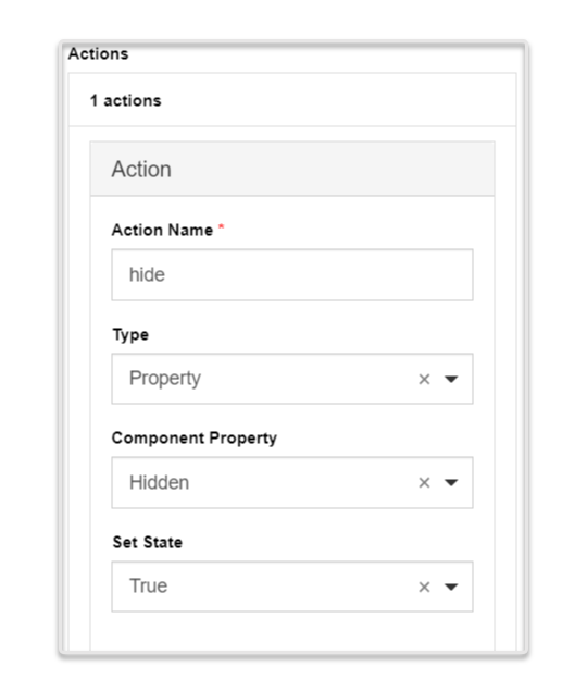 |
| Value | The trigger changes the value of the corresponding component. The action must be defined using JavaScript syntax. | 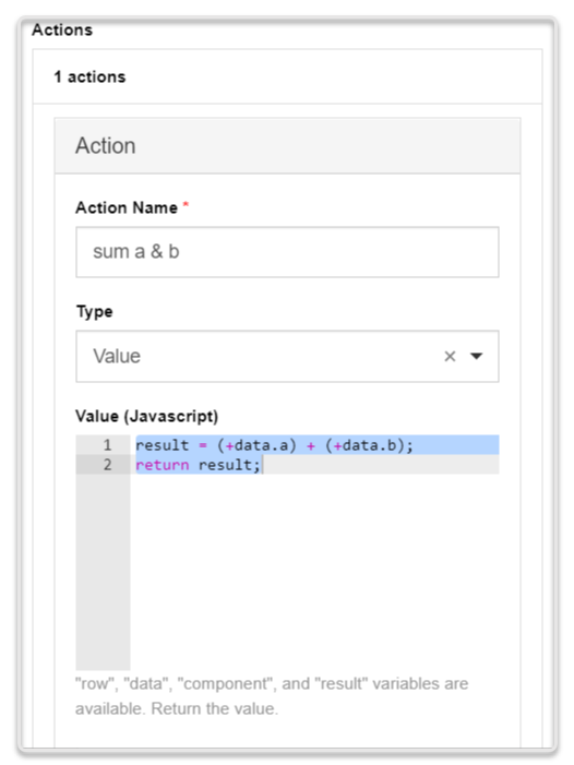 |
| Merge Component Schema | The trigger changes the component schema parameters found in the component JSON. To see the schema parameters you can change, hover over the corresponding component and click Edit JSON. You can change multiple parameters within one action. | 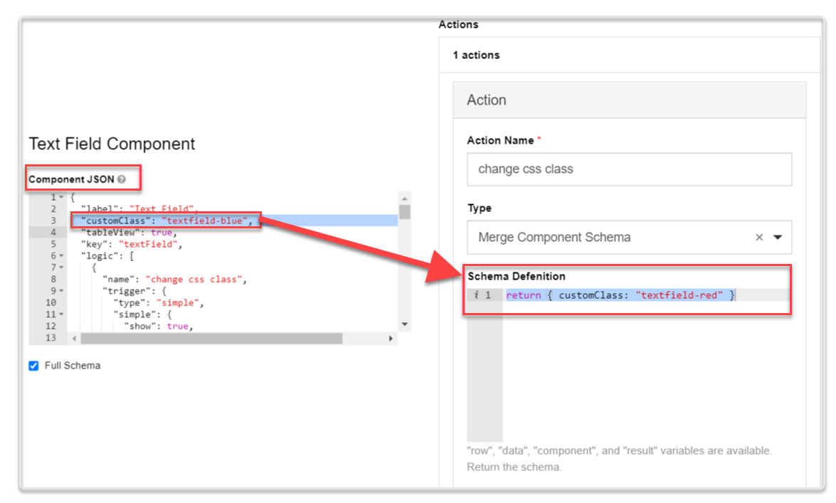 |
| Custom Action | You define a custom action using JavaScript syntax, in the same way you would define the JavaScript trigger type. | NA |