- Overview
- App Events
- Flowchart Builder
- Callout
- Complex Scenarios
- Credentials
- Data Service
- About the Data Service activity package
- Project compatibility
- Create Entity Record
- Update Entity Record
- Delete Entity Record
- Get Entity Record by Id
- Query Entity Records
- Query Multiple Entity Records
- Upload File to Record Field
- Download File from Record Field
- Delete File from Record Field
- Create Multiple Entity Records
- Update Multiple Entity Records
- Delete Multiple Entity Records
- Form
- Release notes
- Project compatibility
- Real Time Forms
- Updating form data
- Running forms using JavaScript
- Customizing Forms Using CSS
- Conditional components
- Adding multiple components on the same row in Columns
- Using the Data Table component
- Get File/Folder path
- Reading cell values from a Data Grid component
- Displaying PDF files
- Displaying images in forms
- Scrolling through Data Grids
- Using Dev Tools with forms
- Calculate form component values
- Managing dates in forms
- Opening hyperlinks inside forms
- Displaying a default tab in forms
- Displaying the full label of a component
- Searching long strings in drop-down lists
- Dynamically set form values
- About the pre 23.4 Form experience
- Project Compatibility
- Real Time Forms
- Dynamic Checkboxes
- Conditional Dropdowns
- Displaying a Default Tab
- Displaying Images
- Displaying PDF Files
- Displaying the Full Label
- Dynamic HTML Elements
- Managing Dates
- Searching Long Strings in Drop-downs
- Customizing Forms Using Local CSS Files
- Executing Do Block On Checkbox Change
- Customizing Columns Width
- Updating Form Data
- Resetting Collection Data
- Advanced Logic
- Executing Do Block on Dropdown Option Change
- Reading Cell Values From a Data Grid Component
- Conditional Components
- Scrolling Through Data Grid Components
- Using the Grid Component
- Dev Tools
- Calculated Value
- Dynamic Dropdowns
- Switching Tabs With Button Click
- Opening Hyperlinks Inside Form
- FTP
- IPC
- Automation Ops Pipelines
- Release notes
- About the Pipelines activity package
- Project compatibility
- Activate Solution Deployment
- Analyze
- Build
- Clone
- Delete Solution Package
- Deploy Solution
- Download Package
- Download Solution Package
- Download Solution Package Configuration
- Publish Package
- Publish Solution Package
- Re-sync Solution Project
- Run Existing Test Set
- Run Tests
- Stage
- Uninstall Solution
- Update Process
- Upload Solution Package
- Persistence
- Release notes
- Project compatibility
- Bulk Form Designer
- Start Job And Get Reference
- Wait For Job And Resume
- Add Queue Item And Get Reference
- Wait For Queue Item And Resume
- Wait For Form Task And Resume
- Resume After Delay
- Assign Tasks
- Create External Task
- Wait For External Task And Resume
- Complete Task
- Forward Task
- Get Form Tasks
- Get Task Data
- Get App Tasks
- Add Task Comment
- Update Task Labels
- Create App Task
- Wait For App Task And Resume
- Configure task timer
- Working with App tasks
- Building Your First Form Action
- Advanced Controls for Drop-downs
- Embedding Objects in Form Actions
- Allowing Users to Upload Files to the Storage Bucket
- Adding Advanced Logic Using Java Script
- Setting a Default Tab
- Removing the Delete button from Edit Grid using custom CSS
- Customizing Edit Grid templates
- Using buttons to trigger custom logic
- Using an External Form Layout
- Dynamically expanding form components at runtime
- Aligning the content of a form component from left to right using JSON attributes
- Sample Workflows
- System
- Release notes
- Project compatibility
- Supported character encoding
- RegEx Builder Wizard
- Add Data Column
- Add Data Row
- Add Log Fields
- Add or Subtract from Date
- Add Transaction Item
- Add Queue Item
- Append Item to Collection
- Append Item to List
- Append Line
- Beep
- Break / Exit Loop
- Browse for File
- Browse for Folder
- Build Collection
- Build Data Table
- Bulk Add Queue Items
- Change Case for Text
- Change Type
- Check False
- Check True
- Clear Data Table
- Collection to Data Table
- Comment
- Compress/Zip Files
- Copy File
- Copy Folder
- Combine text
- Comment Out / Disabled Activities
- Continue / Skip Current
- Create File
- Create Folder
- Create List
- Custom Input
- Delete
- Delete File
- Delete Folder
- Delete Storage File
- Delete Queue Items
- Disable Local Trigger
- Do While
- Download file from URL
- Download Storage File
- Enable Local Trigger
- Evaluate Business Rule
- Exists in Collection
- Extract/Unzip Files
- Extract Date and Time from Text
- Extract Text
- File Change Trigger
- File Exists
- Filter Collection
- Filter Data Table
- Folder Exists
- For Each
- For Each File in Folder
- File Change Trigger V3
- Find and Replace
- Find Matching Patterns
- For Each Folder in Folder
- For Each Row in Data Table
- Format Date as Text
- Format Value
- Generate Data Table From Text
- Get Asset
- Get Credential / Get Orchestrator Credential
- Get Current Job Info
- Get Environment Folder
- Get Environment Variable
- Get File Info
- Get Folder Info
- Get Jobs
- Get Processes
- Get Row Item
- Get Secret
- Get Transaction Item
- Get Username/Password
- Get Queue Items
- Global Variable Changed Trigger
- Input Dialog
- Invoke Code
- Invoke Com Method
- Invoke Power Shell
- Invoke Process
- Invoke VBScript
- Invoke Workflow File
- Is Text Matching
- Join Data Tables
- Kill Process
- Launch Workflow Interactive
- List Storage Files
- Log Message
- Lookup Data Table
- Manual Trigger
- Merge Collections
- Merge Data Table
- Message Box
- Modify Date
- Modify Text
- Move File
- Move Folder
- Multiple Assign
- New Item Added to Queue
- Notify Global Variable Changed
- Orchestrator HTTP Request
- Output Data Table
- Parallel
- Parallel for each
- Path Exists
- Postpone Transaction Item
- Process End Trigger
- Process Start Trigger
- Process Tracking Scope
- Raise Alert
- Read List Item
- Read Text File
- Read Storage Text
- Remove Data Column
- Remove Data Row
- Remove Duplicate Rows
- Remove From Collection
- Remove Log Fields
- Replace Matching Patterns
- Repeat Number of Times
- Repeat Trigger
- Rename File
- Rename Folder
- Report Status
- Reset Timer
- Resume Timer
- Retry Scope
- Return
- Run Local Triggers
- Run Agent
- Run Job
- Run Parallel Process
- Set Asset
- Send Email Notification
- Set Credential
- Set Environment Variable
- Set Secret
- Set Task Status
- Set Trace Status
- Set Transaction Progress
- Set Transaction Status
- Should Stop
- Split Text
- Sort Data Table
- Start Timer
- Start Job
- Stop Job
- Stop Local Triggers
- Stop Timer
- Text to Left/Right
- Text to Upper/Lowercase
- Time Trigger
- Trigger Scope
- Track Object
- Timeout Scope
- Update Row Item
- Update List Item
- Upload Storage File
- Wait for Download
- Wait Queue Item
- While
- Workflow Placeholder
- Write Storage Text
- Write Text File
- AddDataRow
- AddQueueItem
- AddTransactionItem
- AppendLine
- BulkAddQueueItems
- ClearDataTable
- CompressZipFiles
- CopyFile
- CreateFile
- CreateFolder
- DeleteFileOrFolder
- DeleteQueueItems
- DeleteStorageFile
- DownloadStorageFile
- ExtractUnzipFiles
- FilterDataTable
- GetAsset
- GetCredential
- GetJobs
- GetQueueItem
- GetQueueItems
- GetResourceForLocalPath
- GetRowItem
- GetTransactionItem
- InvokeProcess
- JoinDataTables
- ListStorageFiles
- LookUpDataTable
- MergeDataTable
- MoveFile
- OrchestratorHTTPRequest
- OutputDataTable
- PathExists
- PostponeTransactionItem
- ReadStorageText
- ReadTextFile
- RemoveDataColumn
- RemoveDuplicateRows
- Replace
- SetAsset
- SetCredential
- SetTransactionProgress
- SetTransactionStatus
- SortDataTable
- StartJob
- StopJob
- UpdateRowItem
- UploadStorageFile
- WaitQueueItem
- WriteStorageText
- WriteTextFile
- Testing
- Release notes
- About the Testing activity package
- Project compatibility
- Project Settings
- Add Test Data Queue Item
- Attach Document
- Bulk Add Test Data Queue Items
- Create Comparison Rule
- Compare PDF Documents
- Compare Text
- Delete Test Data Queue Items
- Generate Address
- Generate Given Name
- Generate Last Name
- Generate Random Date
- Generate Random Number
- Generate Random String
- Generate Random Value
- Get Test Data Queue Item
- Get Test Data Queue Items
- Verify Control Attribute
- Verify Expression
- Verify Expression With Operator
- Verify Range
- Address
- AddTestDataQueueItem
- AttachDocument
- BulkAddTestDataQueueItems
- DeleteTestDataQueueItems
- GetTestDataQueueItem
- GetTestDataQueueItems
- GivenName
- LastName
- RandomDate
- RandomNumber
- RandomString
- RandomValue
- VerifyAreEqual
- VerifyAreNotEqual
- VerifyContains
- VerifyExpression
- VerifyExpressionWithOperator
- VerifyIsGreater
- VerifyIsGreaterOrEqual
- VerifyIsLess
- VerifyIsLessOrEqual
- VerifyIsRegexMatch
- VerifyRange
- Workflow Foundation
Workflow activities
HTML Element
You can use the HTML Element to display a single HTML element in your form and configure it based on your use-case.
Enable the Disable Sanitize property inside the Create Form activity to show all unsafe content inside an HTML Element.

- HTML Tag - The tag of the HTML Element.
- CSS Class - The CSS Class that can be added for this HTML Element. You can input multiple classes, by separating them with single spaces.
- Attributes - The attributes for the HTML Element. Only safe attributes are allowed, such as:
src,href, andtitle. - Content - the content of the HTML Element.
- Refresh On Change - re-renders the HTML Element whenever a value changes in the form.
To display images in forms, you need to use the HTML Element component. Check out the following tutorial Displaying Images.
For PDF files, you can only display them when you create a custom HTML form.
Content
You can use the Content component to add information in your form, that is display-only. The value of the component is not submitted back to the workflow.

- Refresh On Change - renders the Content component each time a value in the form changes.
Email
Data type: String
You can use the Email component to add a field for inputting email addresses.

Url
Data type: System.Uri
You can use the Url component to add a field for inputting url addresses, ensuring they're in the correct format.
Phone Number
Data type: String
You can use the Phone Number component to add a field for inputting phone numbers.

- Input Mask - Provides a predefined format for the phone number. For the phone number field, the default format is
(999) 999-9999. 9- numerica- alphabetical*- alphanumeric- Input Mask Placeholder Char - You can use a character as a placeholder in the field. For example, you can use a hyphen (-).
Note:
The placeholder character gets replaced by a space if it is used inside the mask.
Date/Time
Data type: String
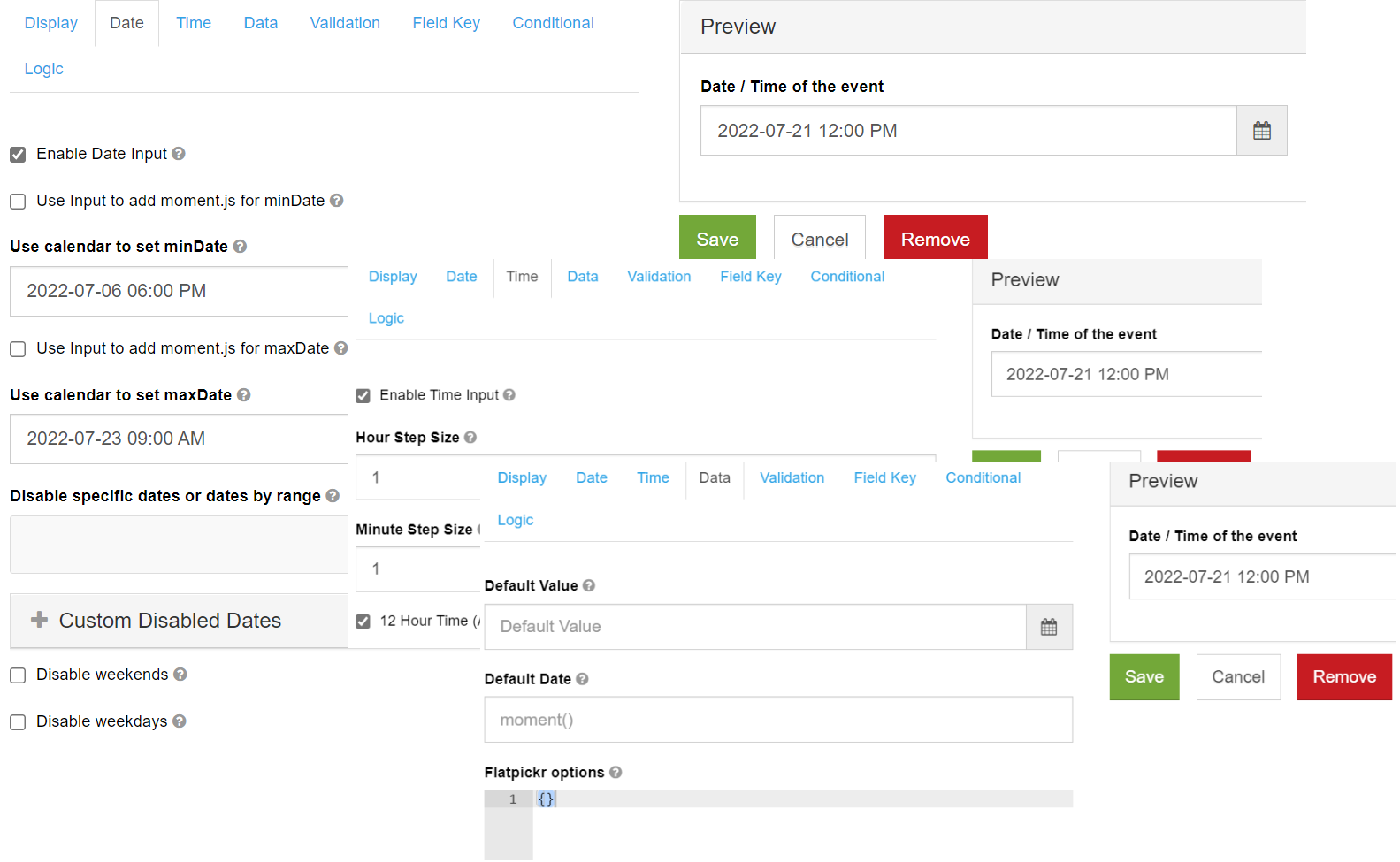
You can use the Date/Time component to input dates, times, or input both.

-
Format - the format used for displaying the datetime value.
-
Enable Date Input - allows users to input dates for this field.
-
Use Input to add moment.js for minDate - enables the user to use an input for the
minDatemoment function, instead of a calendar. -
Use calendar to set minDate - enables the user to use a calendar to set the
minDate. -
Use Input to add moment.js for maxDate - enables the user to use an input for
maxDatemoment function, instead of a calendar. -
Use calendar to set maxDate - enables the user to use a calendar to set the
maxDate. -
Disable specific dates or dates by range - add dates that you want to ban. For example,
2027-08-11. -
Custom Disabled Dates - allows you to ban certain dates using a customized function.
-
Disable weekends - allows you to ban weekends.
-
Disable weekdays - allows you to ban weekdays.
-
Enable Time Input - allows users to input time for this field.
-
Hour Step Size - the number of hours that have to be incremented or decremented in the time picker.
-
Minute Step Size - the number of minutes that have to be incremented or decremented in the time picker.
-
12 Hour Time (AM/PM) - displays time in 12 hour periods, using AM or PM.
-
Default Date - sets the default value to a specific date using Moment.js functions. For example, you can use the following function:
moment().substract(10, 'days').
Day
Data type: System.DateOnly
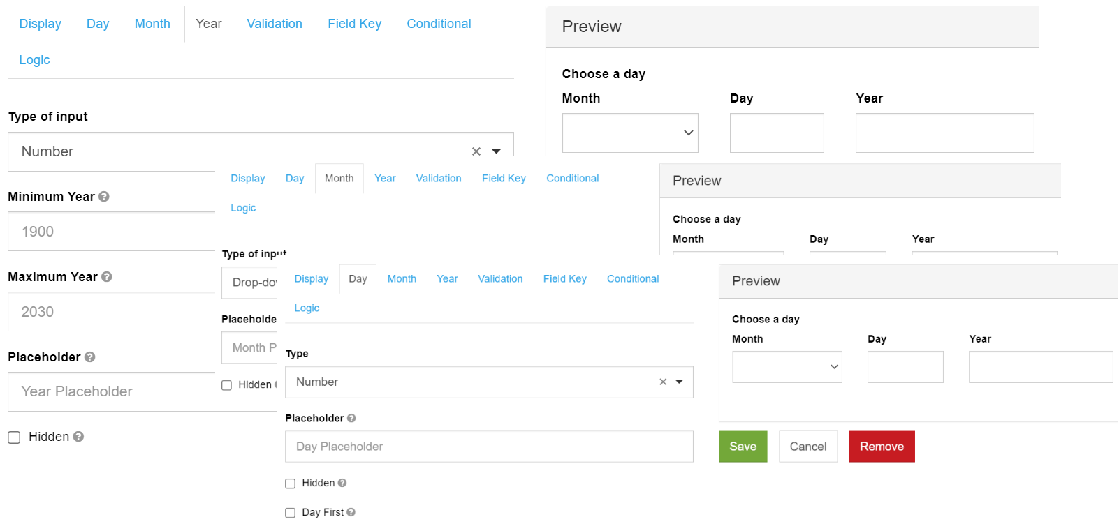
You can use the Day component to ask for input for Day,Month, and Year, either through a number-type field or a select-type field.

- Type / Type of input - choose to give input for Day, Month, or Year either by typing in a number or by selecting options from a dropdown list.
Minimum / Maximum Year - choose the minimum / maximum year that can be entered.
-
Require Day - the Day field must be filled in before the form renders.
-
Require Month - the Month field must be filled in before the form renders.
-
Require Year - the Year field must be filled in before the form renders.
-
Maximum / Minimum Day - choose a minimum / maximum day that can be entered. You can also use Moment.js functions. For example, you can use
moment().add(10, 'days').
Time
Data type: System.TimeOnly
You can use the Time component to input time in different formats.

- Input Type - select the type of widget you would like to use for inputting time: HTML5 Time Input (users can choose the time from a given panel) or Text Input with Mask (users can manually input the time).
Currency
Data type: System.Double
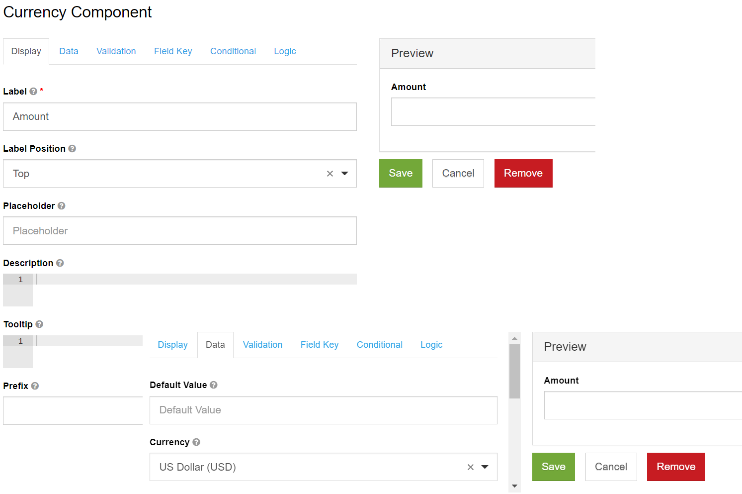
You can use the Currency component to display financial amounts using a certain currency. The component has an input mask that displays the currency icon and automatically adds commas based on the number that the user inputs. The component allows two decimal values.

- Currency - choose a certain currency from the drop-down list.
Survey
Data type: System.Collections.Generic.Dictionary<System.String,System.String>
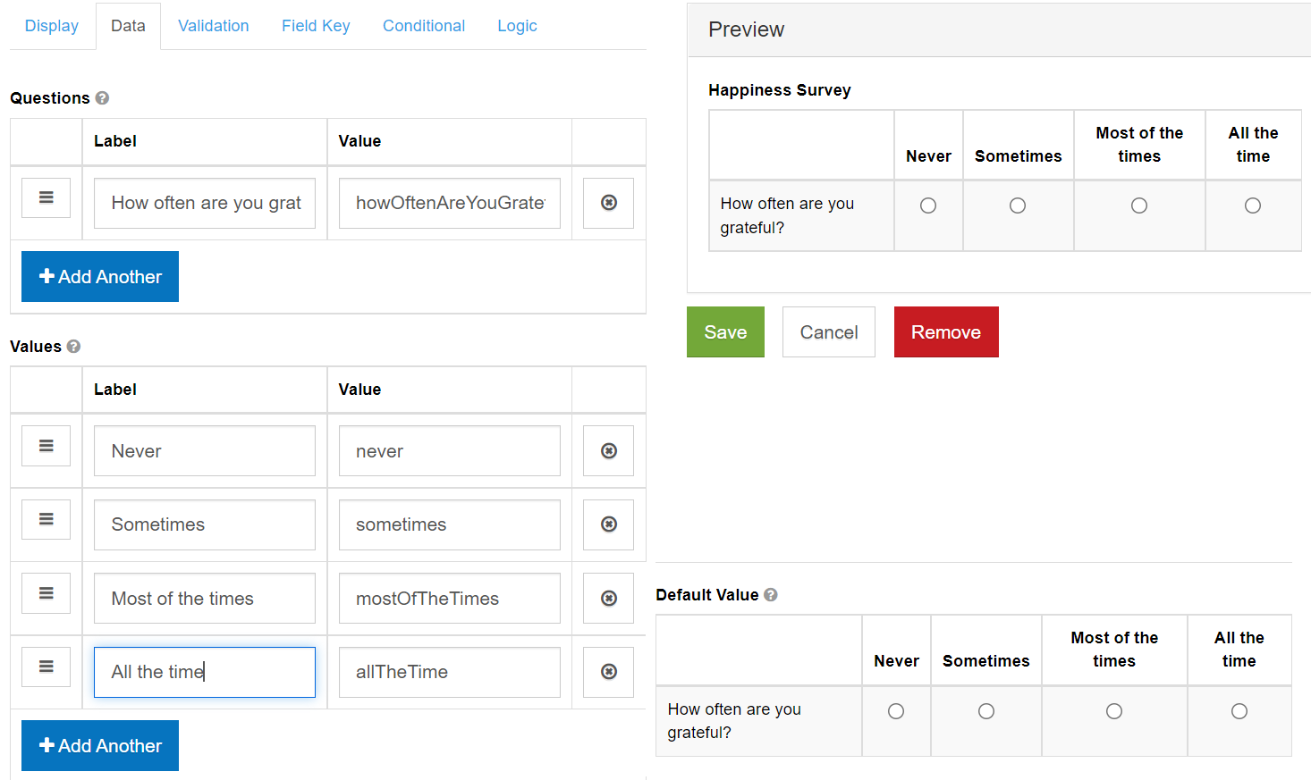
You can use the Survey component to allow users to answer multiple questions, by choosing only one value from a list.

- Questions - add the questions that the users should answer.
- Values - add the options that the user can select per question.