- Overview
- App Events
- Flowchart Builder
- Callout
- Complex Scenarios
- Credentials
- Data Service
- About the Data Service activity package
- Project compatibility
- Create Entity Record
- Update Entity Record
- Delete Entity Record
- Get Entity Record by Id
- Query Entity Records
- Query Multiple Entity Records
- Upload File to Record Field
- Download File from Record Field
- Delete File from Record Field
- Create Multiple Entity Records
- Update Multiple Entity Records
- Delete Multiple Entity Records
- Form
- Release notes
- Project compatibility
- Real Time Forms
- Updating form data
- Running forms using JavaScript
- Customizing Forms Using CSS
- Conditional components
- Adding multiple components on the same row in Columns
- Using the Data Table component
- Get File/Folder path
- Reading cell values from a Data Grid component
- Displaying PDF files
- Displaying images in forms
- Scrolling through Data Grids
- Using Dev Tools with forms
- Calculate form component values
- Managing dates in forms
- Opening hyperlinks inside forms
- Displaying a default tab in forms
- Displaying the full label of a component
- Searching long strings in drop-down lists
- Dynamically set form values
- About the pre 23.4 Form experience
- Project Compatibility
- Real Time Forms
- Dynamic Checkboxes
- Conditional Dropdowns
- Displaying a Default Tab
- Displaying Images
- Displaying PDF Files
- Displaying the Full Label
- Dynamic HTML Elements
- Managing Dates
- Searching Long Strings in Drop-downs
- Customizing Forms Using Local CSS Files
- Executing Do Block On Checkbox Change
- Customizing Columns Width
- Updating Form Data
- Resetting Collection Data
- Advanced Logic
- Executing Do Block on Dropdown Option Change
- Reading Cell Values From a Data Grid Component
- Conditional Components
- Scrolling Through Data Grid Components
- Using the Grid Component
- Dev Tools
- Calculated Value
- Dynamic Dropdowns
- Switching Tabs With Button Click
- Opening Hyperlinks Inside Form
- FTP
- IPC
- Automation Ops Pipelines
- Release notes
- About the Pipelines activity package
- Project compatibility
- Activate Solution Deployment
- Analyze
- Build
- Clone
- Delete Solution Package
- Deploy Solution
- Download Package
- Download Solution Package
- Download Solution Package Configuration
- Publish Package
- Publish Solution Package
- Re-sync Solution Project
- Run Existing Test Set
- Run Tests
- Stage
- Uninstall Solution
- Update Process
- Upload Solution Package
- Persistence
- Release notes
- Project compatibility
- Bulk Form Designer
- Start Job And Get Reference
- Wait For Job And Resume
- Add Queue Item And Get Reference
- Wait For Queue Item And Resume
- Wait For Form Task And Resume
- Resume After Delay
- Assign Tasks
- Create External Task
- Wait For External Task And Resume
- Complete Task
- Forward Task
- Get Form Tasks
- Get Task Data
- Get App Tasks
- Add Task Comment
- Update Task Labels
- Create App Task
- Wait For App Task And Resume
- Configure task timer
- Working with App tasks
- Building Your First Form Action
- Advanced Controls for Drop-downs
- Embedding Objects in Form Actions
- Allowing Users to Upload Files to the Storage Bucket
- Adding Advanced Logic Using Java Script
- Setting a Default Tab
- Removing the Delete button from Edit Grid using custom CSS
- Customizing Edit Grid templates
- Using buttons to trigger custom logic
- Using an External Form Layout
- Dynamically expanding form components at runtime
- Aligning the content of a form component from left to right using JSON attributes
- Sample Workflows
- System
- Release notes
- Project compatibility
- Supported character encoding
- RegEx Builder Wizard
- Add Data Column
- Add Data Row
- Add Log Fields
- Add or Subtract from Date
- Add Transaction Item
- Add Queue Item
- Append Item to Collection
- Append Item to List
- Append Line
- Beep
- Break / Exit Loop
- Browse for File
- Browse for Folder
- Build Collection
- Build Data Table
- Bulk Add Queue Items
- Change Case for Text
- Change Type
- Check False
- Check True
- Clear Data Table
- Collection to Data Table
- Comment
- Compress/Zip Files
- Copy File
- Copy Folder
- Combine text
- Comment Out / Disabled Activities
- Continue / Skip Current
- Create File
- Create Folder
- Create List
- Custom Input
- Delete
- Delete File
- Delete Folder
- Delete Storage File
- Delete Queue Items
- Disable Local Trigger
- Do While
- Download file from URL
- Download Storage File
- Enable Local Trigger
- Evaluate Business Rule
- Exists in Collection
- Extract/Unzip Files
- Extract Date and Time from Text
- Extract Text
- File Change Trigger
- File Exists
- Filter Collection
- Filter Data Table
- Folder Exists
- For Each
- For Each File in Folder
- File Change Trigger V3
- Find and Replace
- Find Matching Patterns
- For Each Folder in Folder
- For Each Row in Data Table
- Format Date as Text
- Format Value
- Generate Data Table From Text
- Get Asset
- Get Credential / Get Orchestrator Credential
- Get Current Job Info
- Get Environment Folder
- Get Environment Variable
- Get File Info
- Get Folder Info
- Get Jobs
- Get Processes
- Get Row Item
- Get Secret
- Get Transaction Item
- Get Username/Password
- Get Queue Items
- Global Variable Changed Trigger
- Input Dialog
- Invoke Code
- Invoke Com Method
- Invoke Power Shell
- Invoke Process
- Invoke VBScript
- Invoke Workflow File
- Is Text Matching
- Join Data Tables
- Kill Process
- Launch Workflow Interactive
- List Storage Files
- Log Message
- Lookup Data Table
- Manual Trigger
- Merge Collections
- Merge Data Table
- Message Box
- Modify Date
- Modify Text
- Move File
- Move Folder
- Multiple Assign
- New Item Added to Queue
- Notify Global Variable Changed
- Orchestrator HTTP Request
- Output Data Table
- Parallel
- Parallel for each
- Path Exists
- Postpone Transaction Item
- Process End Trigger
- Process Start Trigger
- Process Tracking Scope
- Raise Alert
- Read List Item
- Read Text File
- Read Storage Text
- Remove Data Column
- Remove Data Row
- Remove Duplicate Rows
- Remove From Collection
- Remove Log Fields
- Replace Matching Patterns
- Repeat Number of Times
- Repeat Trigger
- Rename File
- Rename Folder
- Report Status
- Reset Timer
- Resume Timer
- Retry Scope
- Return
- Run Local Triggers
- Run Agent
- Run Job
- Run Parallel Process
- Set Asset
- Send Email Notification
- Set Credential
- Set Environment Variable
- Set Secret
- Set Task Status
- Set Trace Status
- Set Transaction Progress
- Set Transaction Status
- Should Stop
- Split Text
- Sort Data Table
- Start Timer
- Start Job
- Stop Job
- Stop Local Triggers
- Stop Timer
- Text to Left/Right
- Text to Upper/Lowercase
- Time Trigger
- Trigger Scope
- Track Object
- Timeout Scope
- Update Row Item
- Update List Item
- Upload Storage File
- Wait for Download
- Wait Queue Item
- While
- Workflow Placeholder
- Write Storage Text
- Write Text File
- AddDataRow
- AddQueueItem
- AddTransactionItem
- AppendLine
- BulkAddQueueItems
- ClearDataTable
- CompressZipFiles
- CopyFile
- CreateFile
- CreateFolder
- DeleteFileOrFolder
- DeleteQueueItems
- DeleteStorageFile
- DownloadStorageFile
- ExtractUnzipFiles
- FilterDataTable
- GetAsset
- GetCredential
- GetJobs
- GetQueueItem
- GetQueueItems
- GetResourceForLocalPath
- GetRowItem
- GetTransactionItem
- InvokeProcess
- JoinDataTables
- ListStorageFiles
- LookUpDataTable
- MergeDataTable
- MoveFile
- OrchestratorHTTPRequest
- OutputDataTable
- PathExists
- PostponeTransactionItem
- ReadStorageText
- ReadTextFile
- RemoveDataColumn
- RemoveDuplicateRows
- Replace
- SetAsset
- SetCredential
- SetTransactionProgress
- SetTransactionStatus
- SortDataTable
- StartJob
- StopJob
- UpdateRowItem
- UploadStorageFile
- WaitQueueItem
- WriteStorageText
- WriteTextFile
- Testing
- Release notes
- About the Testing activity package
- Project compatibility
- Project Settings
- Add Test Data Queue Item
- Attach Document
- Bulk Add Test Data Queue Items
- Create Comparison Rule
- Compare PDF Documents
- Compare Text
- Delete Test Data Queue Items
- Generate Address
- Generate Given Name
- Generate Last Name
- Generate Random Date
- Generate Random Number
- Generate Random String
- Generate Random Value
- Get Test Data Queue Item
- Get Test Data Queue Items
- Verify Control Attribute
- Verify Expression
- Verify Expression With Operator
- Verify Range
- Address
- AddTestDataQueueItem
- AttachDocument
- BulkAddTestDataQueueItems
- DeleteTestDataQueueItems
- GetTestDataQueueItem
- GetTestDataQueueItems
- GivenName
- LastName
- RandomDate
- RandomNumber
- RandomString
- RandomValue
- VerifyAreEqual
- VerifyAreNotEqual
- VerifyContains
- VerifyExpression
- VerifyExpressionWithOperator
- VerifyIsGreater
- VerifyIsGreaterOrEqual
- VerifyIsLess
- VerifyIsLessOrEqual
- VerifyIsRegexMatch
- VerifyRange
- Workflow Foundation

Workflow activities
Customizing Columns Width
Tables in your form sometimes need wider or narrower columns, rather than columns with the same width. You can set a custom width for tables in Edit Grid and Data Grid components.
Tutorial
The next tutorial provides steps on how to modify the width for Column3 in a table saved as myTable.
Building the Data Table
To create a table to use inside your form:
-
Inside your workflow, add the Build Data Table activity.
-
Click DataTable... . The Build Data Table wizard opens.
-
Add the desired columns for your table and edit their properties. Make sure the columns name have no spaces or special characters, as you use these names to link the columns in the form through the Field Key component tab.

-
Click OK to save the table.
-
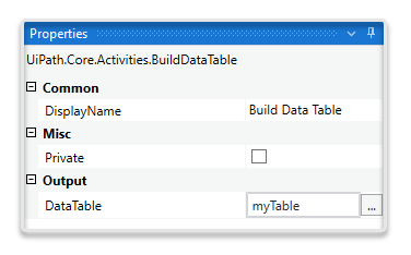
In the Properties panel > Output field of the Build Data Table activity, set a variable name for your table (for example,
myTable).You use this variable to bind the table to the form through the FormFieldsCollection property of the Create Form activity.
Binding the Data Table to your Form and Grid Components
To bind the data table to your form:
-
Add the Create Form activity in your workflow.
-
In the Properties panel > FormFieldsCollection field, click on the three dots menu (fa-ellipsis-v:) . The FormFieldsCollection wizard opens.
-
Create an argument and link it to the previously created table using the variable (i.e.,
myTable). Set the argument Direction toIn/Outand the Type toDataTable. Give a Name to your argument, for exampletable.
-
Click OK. Make sure that GenerateInputFields box is unchecked.
To bind the data table to the Edit Grid or Data Grid component:
-
Open the Form Designer from the Create Form activity.
-
From the Data category, drag and drop a grid component (i.e., Edit Grid and/or Data Grid).
-
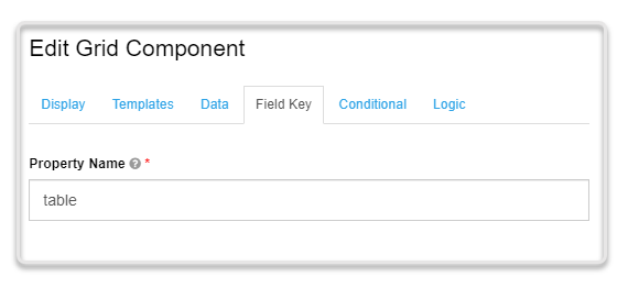
In the Field Key tab of your grid, reference the table argument (i.e.,
table).The Field Key value is case sensitive.
-
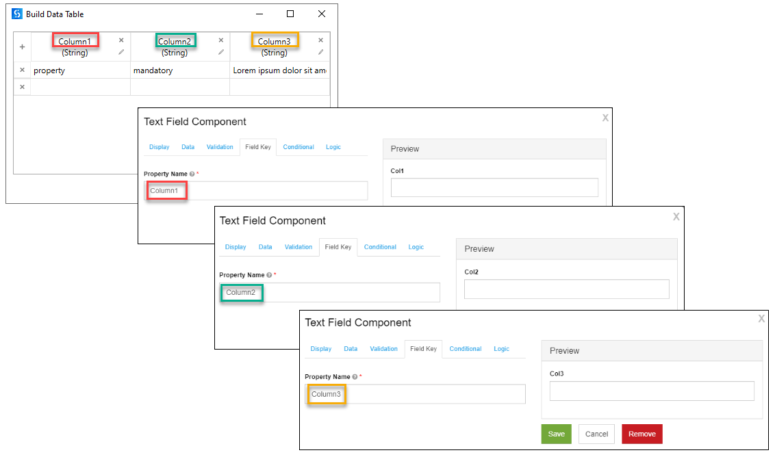
Add text components into your grid to replicate the columns in your table. Save each text component.
For example, if your table has three columns called
Column1,Column2, andColumn3, drag and drop three text components into your grid, and make sure to use the column names from the table into the components Field Key tab.The Field Key value is case sensitive.
-
Save the form.
Customizing Columns Width in Edit Grid Components
Using Bootstrap 3
- Go to the Edit Grid Component settings .
- In the Templates tab > Header Template section, change the default generated code with the following template:
<div class="row"> {% util.eachComponent(components, function(component) { %} {% if (displayValue(component)) { %} {% if (component.key=== 'Column3') { %} <div class="col-sm-8"> {% } %} {% if (component.key !== 'Column3') { %} <div class="col-sm-2"> {% } %} {{ component.label }}</div> {% } %} {% }) %} </div><div class="row"> {% util.eachComponent(components, function(component) { %} {% if (displayValue(component)) { %} {% if (component.key=== 'Column3') { %} <div class="col-sm-8"> {% } %} {% if (component.key !== 'Column3') { %} <div class="col-sm-2"> {% } %} {{ component.label }}</div> {% } %} {% }) %} </div> - In the Templates tab > Row Template section, change the default generated code with the following template:
<div class="row"> {% util.eachComponent(components, function(component) { %} {% if (!component.hasOwnProperty('tableView') || component.tableView) { %} {% if (component.key=== 'Column3') { %} <div class="col-sm-8"> {% } %} {% if (component.key !== 'Column3') { %} <div class="col-sm-2"> {% } %} {{ getView(component, row[component.key]) }} </div> {% } %} {% }) %} {% if (!instance.options.readOnly && !instance.disabled) { %} <div class="col-sm-2"> <div class="btn-group pull-right"> <button class="btn btn-default btn-light btn-sm editRow"><i class="{{ iconClass('edit') }}"></i></button> {% if (!instance.hasRemoveButtons || instance.hasRemoveButtons()) { %} <button class="btn btn-danger btn-sm removeRow"><i class="{{ iconClass('trash') }}"></i></button> {% } %} </div> </div> {% } %} </div><div class="row"> {% util.eachComponent(components, function(component) { %} {% if (!component.hasOwnProperty('tableView') || component.tableView) { %} {% if (component.key=== 'Column3') { %} <div class="col-sm-8"> {% } %} {% if (component.key !== 'Column3') { %} <div class="col-sm-2"> {% } %} {{ getView(component, row[component.key]) }} </div> {% } %} {% }) %} {% if (!instance.options.readOnly && !instance.disabled) { %} <div class="col-sm-2"> <div class="btn-group pull-right"> <button class="btn btn-default btn-light btn-sm editRow"><i class="{{ iconClass('edit') }}"></i></button> {% if (!instance.hasRemoveButtons || instance.hasRemoveButtons()) { %} <button class="btn btn-danger btn-sm removeRow"><i class="{{ iconClass('trash') }}"></i></button> {% } %} </div> </div> {% } %} </div>Note:- Notice that you compare the
component.keyvalue to the exact name of the column, which is the same one used in the Field Key tab of each text component (step 4 in binding the data table to Edit Grid or Data Grid components). - UiPath Forms are using the Bootstrap 3 framework. The total width of the table is divided into 12 sections. Therefore, make sure that any division you make, it adds up to 12. In this example, two columns with
col-sm-2class take up 4 sections, leaving the remaining 8 for the third column (col-sm-8).
- Notice that you compare the
Using Style property
- Hover over the Edit Grid component and click Edit. The configuration page opens.
- Navigate to the Templates tab.
-
In the Header Template script, identify all
<div class="col-sm-2">tags and add your custom width as follows:style="width:{your_custom_width}px !important". The width must be expressed in pixels. -
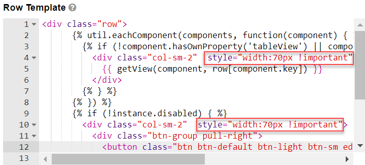
In the Row Template script, identify all
<div class="col-sm-2">tags and add your custom width as follows:style="width:{your_custom_width}px !important". The width must be expressed in pixels.The
"col-sm-2"element represents the default column width. You can modify the default column width by adding a customized style tag. For examplestyle="width:70px !important"applies a width of 70 pixels to all Edit Grid columns.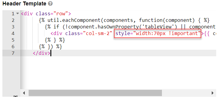
-
- Save your component and the form.
Customizing Columns Width in Data Grid Components
- Create a local CSS file with the desired column widths. In our example, the following template creates a wider
Column3(i.e.,nth-child(3)):.mygrid tbody>tr>:nth-child(1){ width: 70px; } .mygrid tbody>tr>:nth-child(2){ width: 15%; } .mygrid tbody>tr>:nth-child(3){ width: 60%; }.mygrid tbody>tr>:nth-child(1){ width: 70px; } .mygrid tbody>tr>:nth-child(2){ width: 15%; } .mygrid tbody>tr>:nth-child(3){ width: 60%; } - In the Properties panel > LocalCSSFilePath field of the Create Form activity, reference the previously created CSS file. For example,
"/file://C:\User\Desktop\EditColumnWidth.css". - In the Data Grid component > Display tab > Custom CSS Class field, enter the name of the CSS class (for example,
mygrid).
Sample Workflow
To check the complete workflows or to have a future reference, download the XAML examples