- Overview
- UI Automation
- About the UI Automation activity package
- Applications and technologies automated with UI Automation
- Project compatibility
- UI-ANA-016 - Pull Open Browser URL
- UI-ANA-017 - ContinueOnError True
- UI-ANA-018 - List OCR/Image Activities
- UI-DBP-006 - Container Usage
- UI-DBP-013 - Excel Automation Misuse
- UI-DBP-030 - Forbidden Variables Usage In Selectors
- UI-DBP-031 - Activity verification
- UI-PRR-001 - Simulate Click
- UI-PRR-002 - Simulate Type
- UI-PRR-003 - Open Application Misuse
- UI-PRR-004 - Hardcoded Delays
- UI-REL-001 - Large Idx in Selectors
- UI-SEC-004 - Selector Email Data
- UI-SEC-010 - App/Url Restrictions
- UI-USG-011 - Non Allowed Attributes
- UX-SEC-010 - App/Url Restrictions
- UX-DBP-029 - Insecure Password Use
- UI-PST-001 - Audit Log Level in Project Settings
- UiPath Browser Migration Tool
- Clipping region
- Computer Vision Recorder
- Activities index
- Activate
- Anchor Base
- Attach Browser
- Attach Window
- Block User Input
- Callout
- Check
- Click
- Click Image
- Click Image Trigger
- Click OCR Text
- Click Text
- Click Trigger
- Close Application
- Close Tab
- Close Window
- Context Aware Anchor
- Copy Selected Text
- Element Attribute Change Trigger
- Element Exists
- Element Scope
- Element State Change Trigger
- Export UI Tree
- Extract Structured Data
- Find Children
- Find Element
- Find Image
- Find Image Matches
- Find OCR Text Position
- Find Relative Element
- Find Text Position
- Get Active Window
- Get Ancestor
- Get Attribute
- Get Event Info
- Get From Clipboard
- Get Full Text
- Get OCR Text
- Get Password
- Get Position
- Get Source Element
- Get Text
- Get Visible Text
- Go Back
- Go Forward
- Go Home
- Google Cloud Vision OCR
- Hide Window
- Highlight
- Hotkey Trigger
- Hover
- Hover Image
- Hover OCR Text
- Hover Text
- Image Exists
- Indicate On Screen
- Inject .NET Code
- Inject Js Script
- Invoke ActiveX Method
- Key Press Trigger
- Load Image
- Maximize Window
- Microsoft Azure Computer Vision OCR
- Microsoft OCR
- Microsoft Project Oxford Online OCR
- Minimize Window
- Monitor Events
- Mouse Trigger
- Move Window
- Navigate To
- OCR Text Exists
- On Element Appear
- On Element Vanish
- On Image Appear
- On Image Vanish
- Open Application
- Open Browser
- Refresh Browser
- Replay User Event
- Restore Window
- Save Image
- Select Item
- Select Multiple Items
- Send Hotkey
- Set Clipping Region
- Set Focus
- Set Text
- Set To Clipboard
- Set Web Attribute
- Show Window
- Start Process
- System Trigger
- Take Screenshot
- Tesseract OCR
- Text Exists
- Tooltip
- Type Into
- Type Secure Text
- Use Foreground
- Wait Attribute
- Wait Element Vanish
- Wait Image Vanish
- Accessibility Check
- Application Event Trigger
- Block User Input
- Check/Uncheck
- Check App State
- Check Element
- Click
- Click Event Trigger
- Drag and Drop
- Extract Table Data
- Find Elements
- For Each UI Element
- Get Browser Data
- Get Clipboard
- Get Text
- Get URL
- Go to URL
- Highlight
- Hover
- Inject Js Script
- Keyboard Shortcuts
- Keypress Event Trigger
- Mouse Scroll
- Navigate Browser
- Save Image
- Select Item
- Set Browser Data
- Set Clipboard
- Set Runtime Browser
- Set Focus
- Set Text
- Take Screenshot
- Type Into
- Unblock User Input
- Use Application/Browser
- Window Operation
- Perform browser search and retrieve results using UI Automation APIs
- Web Browsing
- Find Images
- Click Images
- Trigger and Monitor Events
- Create and Override Files
- HTML Pages: Extract and Manipulate Information
- Window Manipulation
- Automated List Selection
- Find and Manipulate Window Elements
- Manage Text Automation
- Load and Process Images
- Manage Mouse Activated Actions
- Automate Application Runtime
- Automated Run of a Local Application
- Browser Navigation
- Web Automation
- Trigger Scope Example
- Enable UI Automation support in DevExpress
- Computer Vision Local Server
- Mobile Automation
- Release notes
- About the mobile device automation architecture
- Project compatibility
- Get Log Types
- Get Logs
- Get Page Source
- Get Device Orientation
- Get Session Identifier
- Install App
- Manage Current App
- Manage Other App
- Open DeepLink
- Open URL
- Mobile Device Connection
- Directional Swipe
- Draw Pattern
- Positional Swipe
- Press Hardware Button
- Set Device Orientation
- Take Screenshot
- Take Screenshot Part
- Element Exists
- Execute Command
- Get Attribute
- Get Selected Item
- Get Text
- Set Selected Item
- Set Text
- Swipe
- Tap
- Type Text
- Terminal
- Release notes
- About the Terminal activity package
- Project compatibility
- Best practices
- Find Text
- Get Color at Position
- Get Cursor Position
- Get Field
- Get Field at Position
- Get Screen Area
- Get Text
- Get Text at Position
- Move Cursor
- Move Cursor to Text
- Send Control Key
- Send Keys
- Send Keys Secure
- Set Field
- Set Field at Position
- Terminal Session
- Wait Field Text
- Wait Screen Ready
- Wait Screen Text
- Wait Text at Position
- Terminal coded automation APIs
UI Automation activities
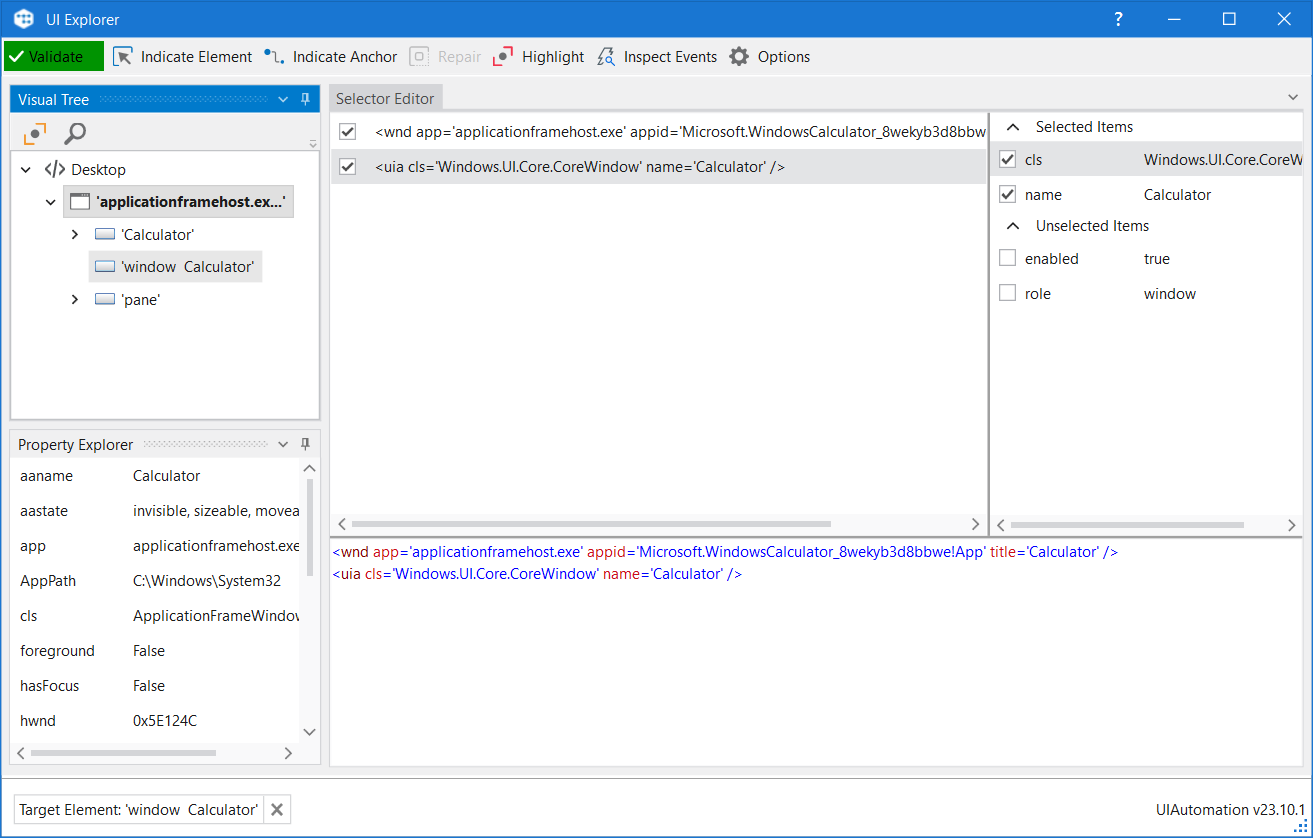
UI Explorer is an advanced tool that enables you to create a custom selector for a specific UI element. It is available as a standalone tool you can download from the Resource Center in your Automation Cloud instance, or from Studio only if the UiPath.UIAutomation.Activities package is installed as a dependency to the project.
Using UI Explorer as a standalone tool does not require you to install Studio. This comes in handy when you want to make sure that an application can be automated with selectors. It enables you to simply inspect elements without building a process. The standalone package also contains the SetupExtensions utility, thus making it possible to install browser extensions and the JavaBridge to inspect elements across all your automation needs.
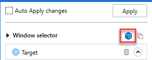
To open the UI Explorer window, click the button in the Selectors section, in the Design tab, or from the advanced editor in the selection screen of all the selectors of the target and anchors attributes, after indicating the target UI element.

If you do not have the UiPath.UIAutomation.Activities pack installed as a dependency for the current project, the UI Explorer button does not appear in the Ribbon.
Alternatively, the UI Explorer can be launched from the Tools page in the Studio backstage view. UI Explorer from the context menu uses the UI automation libraries shipped with the current version of Studio.
The version of the UI Automation package that is currently used is displayed in the lower right corner in the UI Explorer you have opened. This version varies, as launching the UI Explorer from the Tools page uses the default UI Automation version shipped with the Studio version you are using, while opening UI Explorer from the Ribbon uses the version you have installed as a dependency for the current project.

To be sure that you choose the best selector, remember to:
- Add or remove attributes
- Add parent or children tags
- Use wild cards to replace changing values

Field Descriptions for the UI Explorer Window
| Field | Description |
|---|---|
| Validate |
|
| Indicate Element | Indicates a new UI element to replace the previous one. |
| Indicate Anchor | Enables you to choose an anchor relative to the target UI element. |
| Repair | Enables you to re-indicate the same target UI element and repair the selector. This operation does not completely replace the previous selector. The button is available only when the selector is invalid. |
| Highlight | Brings the target element in the foreground. The highlight stays on until it's switched off. The button is enabled only if the selector is valid. |
| Inspect Events | Opens the Event Inspection Tool . |
| Options | Contains several options:
For more information, refer to Active Accessibility and UI Automation. |
The Visual Tree Panel
Displays a tree of the UI hierarchy and enables you to navigate through it, by clicking the arrows in front of each node.
By default, the first time when you open UI Explorer, this panel displays all opened applications, in alphabetical order.
Double-clicking a UI element (or right-clicking and selecting Set as Target Element) from the tree, populates the Selector Editor, Selector Attributes and Property Explorer panels.
| Field | Description |
|---|---|
| Highlight | Highlights the selected element from the Visual Tree in real time. The highlight stays on until it's switched off. |
| Show Search Options | Displays the search box and search filter options. |
| Search Box | Enables you to look for a specific string. If an exact match is not found, nodes containing the nearest match are displayed. Wildcards are supported. Depending on the attribute selected from the Search by drop-down list, the search can be case sensitive. Note: The search only looks for matches in the tree structure under the selected UI object. |
| Search by | Filters your search to a selected attribute or a selector. The contents of this drop-down list change according to the selected UI element. Note: If Search by is set to Selector, you can only input one node in the |
| Children Only | Limit your search to the first level children of the selected node. By default, this check box is not selected. |
The Selector Editor Panel
Displays the selector for the specified UI object and enables you to customize it.
The bottom part of the panel displays the actual XML fragment that you have to use in a project. Once you find the selector you want, you can copy it from here and paste it in the Properties panel of an activity, in the Selector field.
The top part of this panel enables you to view all the nodes in a selector and eliminate the ones that are not necessary by clearing the check box in front of them. An element in the list of selector nodes becomes active when you enable or disable an attribute, or when editing a selector in the bottom panel. Only one node is active at a time.
Selecting a node here displays its attributes in the Selector Attributes and Property Explorer panels.
Selectors can also be edited with the aid of variables, either by using the CTRL+K hotkey to create a variable in the selector itself, or by specifying an already created variable with the CTRL+Space combination. Using the CTRL+K hotkey enables you to specify a value and a name for the variable. Please note that only string variables can be used.
The Selector Attributes Panel
Displays all the available attributes of a selected node (from the Selector Editor panel).
You can add or eliminate some of the node attributes by selecting or clearing the check box in front of each attribute.
Additionally, you can change the value of each attribute yet this modification is retained only if the new selector points at the originally selected UI object.
The Property Explorer Panel
Displays all the attributes that a specified UI object can have, including the ones that do not appear in the selector. They cannot be changed.
Event Inspection Tool
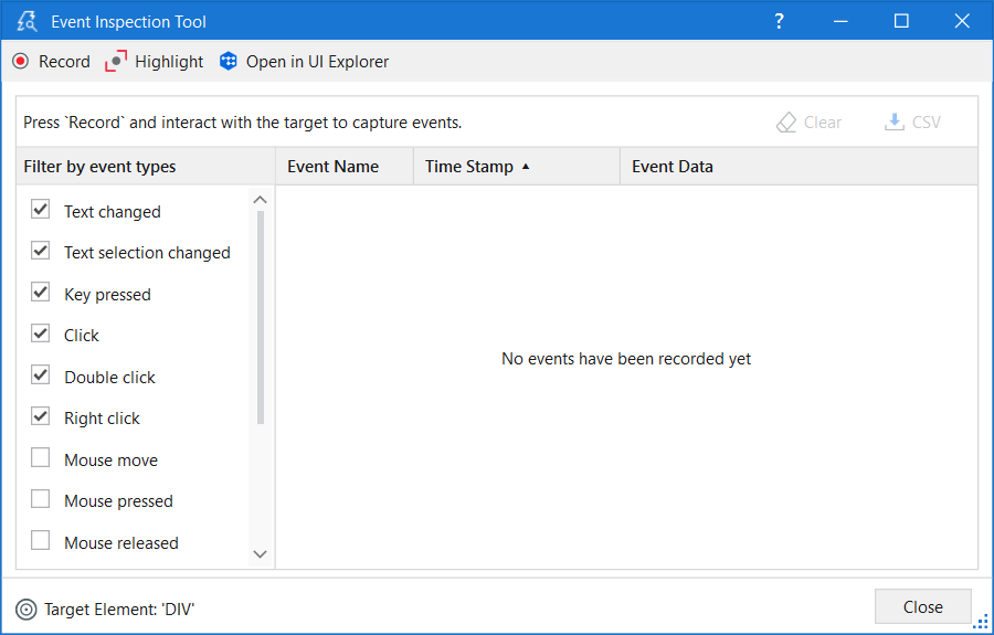
In the context of trigger-based attended automation, the Event Inspection Tool can be used to identify the type of native events triggered when you interact with certain UI elements in an application, and then it can be used for configuring the Application Event Trigger activity. The tool captures and monitors all the selected event types, such as Click, Key pressed, Focus gained, Focus lost, and other relevant interactions, enabling you to analyze the actions performed and, if applicable, diagnose issues.
The Event Inspection Tool can be opened from the UI Explorer, once a valid UI element is selected, by clicking the Inspect Events toolbar button.

The toolbar consists of the following options:
- Record - The events generated by interacting with the UI element are recorded and added to the events list.
- Pause - The events generated by the UI element when you interact with it are no longer recorded.
- Highlight - Shows the contour of the target element and brings it to the foreground for a few seconds. The highlight stays on until it is disabled.
- Open in UI Explorer - The monitored element is opened in UI Explorer where you can observe the selector of that element.
Once you start event recording, two more options become available:
- Clear - Deletes all the recorded events.
- CSV - The captured events can be exported to a
.csvfile for further analysis.
The Event Inspection Tool window has two main sections:
- Event filter - Allows selecting the types of events you want to monitor for the target element.
- Event list - Displays information about captured events.
You can filter event types to be captured by enabling or disabling the checkboxes from the list of event types. The list may vary based on the selected element technology.
All mouse event types (Mouse move, Mouse pressed, Mouse released, Mouse entered, Mouse exited), specific for Web or Java UI elements, are disabled by default because the event list, in such cases, can become quite large. Our recommendation is to enable the mouse event types only if you have a specific need to monitor them.
It is worth also mentioning that event types can be enabled or disabled even after you started the event recording.
The event list has three columns:
- Event Name - The event type.
- Time Stamp - The date and hour when the event was performed.
- Event Data - The associated data and parameters for a certain event.
Each column can be sorted in ascending or descending order. The events are displayed by default in the order they were performed.

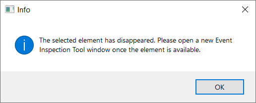
When the Disappeared event type is found, you can no longer continue monitoring and an error message is displayed on the screen. When clicking any option from the toolbar, the same error message is displayed on the screen. The only available options are to either clear the data or export it to a .csv file. To start monitoring again, close the window and open another instance of the Event Inspection Tool.

 Selector is being validated
  Valid selector
  Invalid selector
  Modified selector, revalidate