- Démarrage
- Meilleures pratiques
- Modélisation de l'organisation dans Orchestrator
- Meilleures pratiques d'automatisation
- Optimisation de l'infrastructure Unattended à l'aide de modèles de machine
- Organisation des ressources avec des balises
- Exportation des grilles dans l'arrière-plan
- Appliquer la gouvernance de la connexion Integration Service au niveau de l'utilisateur
- Locataire
- À propos du contexte du locataire
- Recherche de ressources dans un locataire
- Gestion des Robots
- Connexion des Robots à Orchestrator
- Enregistrement des identifiants du Robot dans CyberArk
- Stockage des mots de passe de l’Unattended Robot dans Azure Key Vault (lecture seule)
- Stockage des informations d’identification de l’Unattended Robot dans HashiCorp Vault (lecture seule)
- Stockage des informations d'identification du robot Unattended dans AWS Secrets Manager (lecture seule)
- Suppression des sessions Unattended déconnectées et qui ne répondent pas
- Authentification du Robot
- Authentification du Robot avec les informations d'identification du client
- Configurer les capacités d’automatisation
- Solutions
- Audit
- Enforced encryption
- Intégration des magasins d'identifiants
- Gestion des magasins d'identifiants
- Accès au dossier du magasin d’informations d’identification
- Affectation de magasins d'informations d'identification à des dossiers
- L'Orchestrator Credentials Proxy
- Débogage d'Orchestrator Credentials Proxy
- Managing credential proxies
- Paramètres
- Registre
- Notifications
- Contexte des dossiers
- Processus (Processes)
- Tâches (Jobs)
- Apps
- Déclencheurs (Triggers)
- Journaux (Logs)
- Surveillance
- Index
- Files d'attente (Queues)
- Actifs
- À propos des actifs
- Gestion des actifs dans Orchestrator
- Gestion des actifs dans Studio
- Stockage des ressources dans Azure Key Vault (lecture seule)
- Stockage des ressources dans HashiCorp Vault (lecture seule)
- Stockage des ressources dans AWS Secrets Manager (lecture seule)
- Stocker des ressources dans Google Secret Manager (lecture seule)
- Connexions
- Règles métier
- Compartiments de stockage
- Passerelle d’agent
- Tests d'Orchestrator
- Service de catalogue de ressources
- Intégrations
- Résolution des problèmes
About the new Orchestrator layout
Describes the new Orchestrator layout, including the folder context, task-based navigation, the Create new menu, the page header actions, and the collapsible sidebar.
The new Orchestrator layout is a redesigned interface that groups pages by the task you are performing, keeps the current folder always in view, and brings folder resources and creation actions together in one place.
The new layout is not enforced. The classic layout remains available, and you can switch between the two layouts at any time. All users can try the new layout by selecting Try new layout in the Orchestrator header.
The sidebar is organized from top to bottom as follows:
- The search field, which opens the command palette.
- The folder context: the Folders tree.
- The task-based navigation groups for the selected folder.
- The Tenant section, with tenant-level pages.
Contexte du dossier
The Folders tree is displayed at the top of the sidebar, below the search field, so switching folders is always at hand.
The tree lists All folders, your personal workspace, and the folders you have access to. The selected folder sets the scope of the pages you open:
- All folders displays content aggregated across the tenant and its folders.
- A specific folder displays only the content of that folder.
You can search the tree, and you can collapse the Folders section if you prefer to navigate through the command palette. When the section is collapsed, a compact folder card shows the selected folder, and you can select the card to switch to another folder.
Folder menu
When you hover over a folder in the tree, a three-dot menu button is displayed next to it. The menu displays different options depending on the folder.
For All folders, the menu is called Create new and lets you create tenant-level and folder-level entities without leaving your current page. When the Folders section is collapsed, select the All folders card to open the same menu. For the full list of options, see New layout navigation map.
For a specific folder, the menu contains two groups of options:
- Actions:
- Copier le chemin du dossier
- Ajouter (Add)
- Lier les ressources
- Start job
- Folder management:
- Créer un sous-dossier
- Modifier (Edit)
- Déplacer
- Paramètres
- Supprimer (Delete)
Page header actions
The Overview page header contains quick actions for the selected folder.
With All folders selected, the header contains the following buttons:
- Access and folders: opens Access → Folder management.
- Add: creates tenant-level entities, such as packages, libraries, roles, machines, and webhooks. This menu contains a subset of the Create new menu options.
- Deploy: deploys a solution.
With a specific folder selected, the header contains the following buttons:
- Folder management
- Add: adds entities to the folder, such as processes, apps, triggers, queues, assets, storage buckets, and MCP servers.
- Start job
- Déployer
For the full list of Add options, see New layout navigation map.
Task-based navigation
Pages are grouped by what you are doing, instead of one long row of tabs. Each navigation group contains the related pages as tabs, and the available groups depend on the selected folder.
| Groupe | Pages | Disponible dans |
|---|---|---|
| Vue d'ensemble (Overview) | Health, inventory, and recent activity for the selected scope, including the following cards:
| All folders and specific folders |
| Surveillance |
With All folders selected, also:
| All folders and specific folders |
| Exécutions |
| All folders and specific folders |
| Deployments registry |
| All folders and specific folders |
| Test |
| Specific folders only |
Deployments registry replaces the Registry context from the classic layout. For details about its content, see About the Registry context.
Ressources
The Resources tab of Deployments registry brings all folder resources together on a single page, such as queues, assets, triggers, connections, storage buckets, indexes, and MCP servers. Type filters at the top of the page narrow the list to a specific resource type.
Webhooks are also available on this page, under Deployments registry → Resources → Webhooks, when All folders is selected.
Tenant section
Tenant-level pages are grouped in the Tenant section at the bottom of the sidebar. The section can be collapsed.
| Groupe | Pages |
|---|---|
| Accès |
|
| Infrastructure |
|
| Flux |
|
| Paramètres généraux |
|
To find where a page from the classic layout is located in the new layout, see New layout navigation map.
Search command palette
The search field at the top of the sidebar opens the command palette. You can also open it by pressing Ctrl+K (Cmd+K on Mac). By default, the search is scoped to the selected folder.
The command palette supports the following prefixes:
- >: search for actions and pages.
- /: search for folders.
- #: search for resources.
When the search field is empty, the command palette displays folders, suggested searches, and suggested actions. Selecting Search inside next to a folder, or pressing Tab, scopes the search to that folder.
Collapsible sidebar
The sidebar can be collapsed to a compact icon rail, which gives you more space for your work. In the collapsed state, the navigation groups and the Tenant section pages are displayed as icons, so everything stays one click away. The arrow button next to the sidebar collapses and expands it.

Layout menu
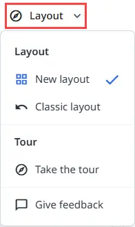
The Layout menu in the header replaces the Try new layout button after you switch to the new layout. The menu contains the following options:
- New layout and Classic layout: switch between the two layouts at any time.
- Take the tour: starts a guided tour of the new layout.
- Give feedback: lets you share your experience with the new layout.