- Introduction
- Setting up your account
- Balance
- Clusters
- Concept drift
- Coverage
- Datasets
- General fields
- Labels (predictions, confidence levels, label hierarchy, and label sentiment)
- Models
- Streams
- Model Rating
- Projects
- Precision
- Recall
- Annotated and unannotated messages
- Extraction Fields
- Sources
- Taxonomies
- Training
- True and false positive and negative predictions
- Validation
- Messages
- Access control and administration
- Manage sources and datasets
- Understanding the data structure and permissions
- Creating or deleting a data source in the GUI
- Preparing data for .CSV upload
- Uploading a CSV file into a source
- Creating a dataset
- Multilingual sources and datasets
- Enabling sentiment on a dataset
- Amending dataset settings
- Deleting a message
- Deleting a dataset
- Exporting a dataset
- Using Exchange integrations
- Model training and maintenance
- Understanding labels, general fields, and metadata
- Label hierarchy and best practices
- Comparing analytics and automation use cases
- Turning your objectives into labels
- Overview of the model training process
- Generative Annotation
- Dastaset status
- Model training and annotating best practice
- Training with label sentiment analysis enabled
- Understanding data requirements
- Train
- Introduction to Refine
- Precision and recall explained
- Precision and Recall
- How validation works
- Understanding and improving model performance
- Reasons for label low average precision
- Training using Check label and Missed label
- Training using Teach label (Refine)
- Training using Search (Refine)
- Understanding and increasing coverage
- Improving Balance and using Rebalance
- When to stop training your model
- Using general fields
- Generative extraction
- Using analytics and monitoring
- Automations and Communications Mining™
- Developer
- Uploading data
- Downloading data
- Exchange Integration with Azure service user
- Exchange Integration with Azure Application Authentication
- Exchange Integration with Azure Application Authentication and Graph
- Migration Guide: Exchange Web Services (EWS) to Microsoft Graph API
- Fetching data for Tableau with Python
- Elasticsearch integration
- General field extraction
- Self-hosted Exchange integration
- UiPath® Automation Framework
- UiPath® official activities
- How machines learn to understand words: a guide to embeddings in NLP
- Prompt-based learning with Transformers
- Efficient Transformers II: knowledge distillation & fine-tuning
- Efficient Transformers I: attention mechanisms
- Deep hierarchical unsupervised intent modelling: getting value without training data
- Fixing annotating bias with Communications Mining™
- Active learning: better ML models in less time
- It's all in the numbers - assessing model performance with metrics
- Why model validation is important
- Comparing Communications Mining™ and Google AutoML for conversational data intelligence
- Licensing
- FAQs and more

Communications Mining user guide
Understanding and improving model performance
Understanding overall model performance
How well a machine learning model performs overall is determined by a number of contributing factors, which need to be considered in combination with each other. It's not sufficient to only consider whether a model's labels have high average precision, or to just look at how much of a dataset is covered by predictions on its own.
To be confident that a model is a true representation of a dataset, with accurate, reliable label predictions and high coverage, we assess the following main factors. For more detalils, check How validation works.
- All labels - Assesses the average performance of all labels in the taxonomy
- Underperforming labels - Assesses the performance of the 10% of labels that have the most significant performance issues or lowest overall health
- Coverage - Assesses the proportion of messages that are predicted to have at least one informative label
- Balance - Assesses whether the reviewed data is an effective, balanced representative of the whole dataset
The platform combines its' assessment of these 4 factors into a single, easy to understand proprietary Model Rating. This rating is the best measure of the performanceof the model, as it accounts for all of the most important factors that a label model should be assessed on, weighted by their relative importance.
The Model Rating is a score from 0 to 100, which equates to a rating of Poor (0-49), Average (50-69), Good (70-89) or Excellent (90-100).
Validation also provides a breakdown of each of these factors - each factor is assigned its own qualitative rating, as well as displaying the metrics that contribute towards that rating. These are discussed in more detail below.
Each factor can have either a positive or negative contribution towards the Model Rating, depending on its performance. It's very possible for models with Poor ratings across each factor to have an overall rating of zero, particularly when it's very early on in the model training process.
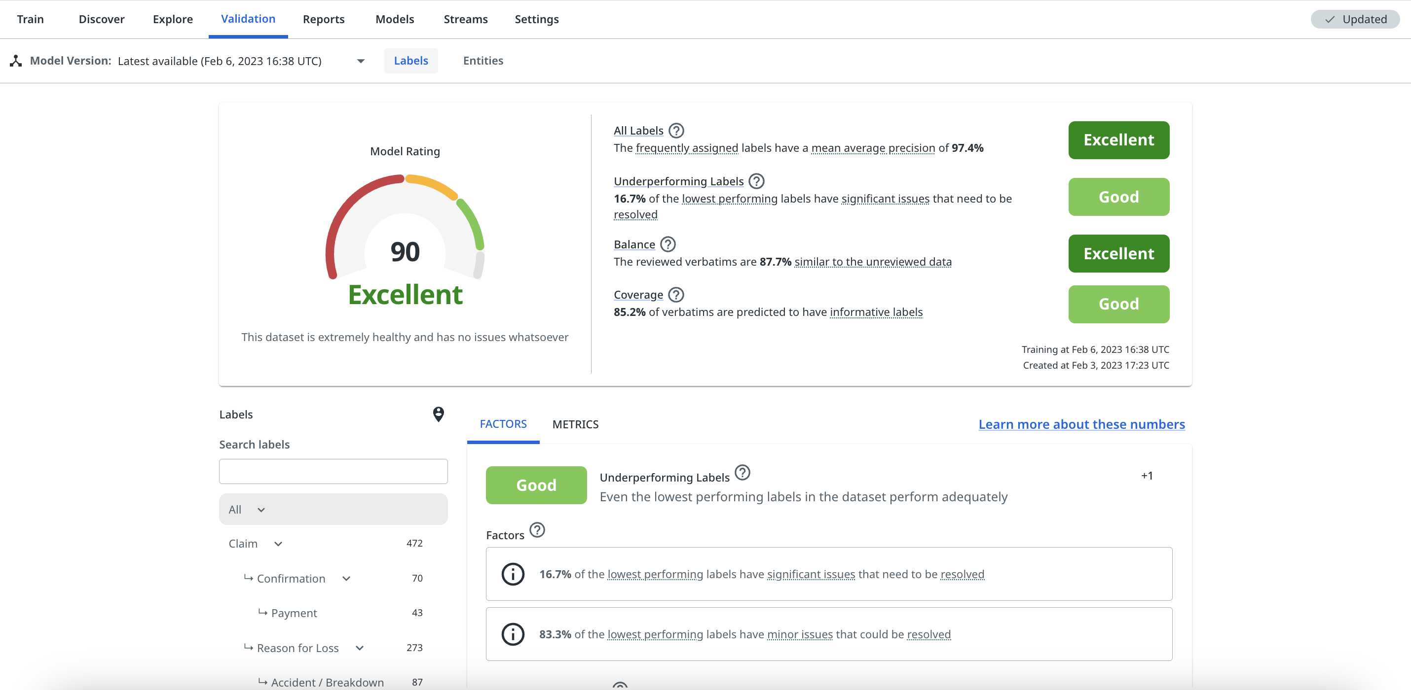
The model rating is specific to labels and does not take into account the performance of general fields. Validation does, however, also provide detailed metrics on the performance of general field predictions. For more details, check Using general fields.
The Model Version dropdown allows you to view all validation scores across past model versions on a given dataset. You can also prioritise or 'star' individual ones so that they appear at the top of the list in the future. This tool can be useful for tracking and comparing progress as you build out your model.
The dropdown ensures that you don't need to pin a model version to see validation scores for it. Pinning a model version only needs to be used for model versions that you want to be able to call downstream via the API (e.g., for automated routing).
The model version dropdown

Factors
The Factors tab in Validation, as shown previously, provides a breakdown of each of the key factors that are considered when calculating the Model Rating.
Each factor card shows:
- The rating for the factor and a qualitative description of it
- The contributors, which are the different components that contribute to the rating for that factor
- Recommended actions, listed in order of priority, that can help to improve the rating of the factor
All labels
- This factor assesses the average performance of all labels in the taxonomy,
- It primarily relies on the Mean Average Precision (MAP) across all labels, weighted by how frequently they're assigned
- It also takes into account when there are labels in the taxonomy that have red or amber performance warnings
- The recommended actions for this factor will typically be designed to increase the average precision of specific labels, or to remove their performance warnings
Underperforming labels
- This factor assesses the performance of the 10% of the labels in the taxonomy that have the most significant performance issues or lowest overall label 'health' (if no warnings are returned)
- If even the bottom 10% of your labels still perform very well, this is a great sign that your model is healthy
- This relies on the MAP of the lowest performing labels, as well as whether these labels have any significant performance warnings (i.e. red or amber warnings)
- The recommended actions for this factor will typically be designed to increase the average precision of specific underperforming labels and remove any other individual performance warnings
Coverage
- This factor assesses the proportion of messages that are predicted to have at least one informative label. For more details, check How validation works.
- It's very important that a well performing model 'covers' as much of the dataset as possible with informative label predictions
- The recommended actions for this factor are designed to help increase the coverage of the dataset. This will most often be training in Low Confidence mode.
- For more details on coverage, check Understanding and increasing coverage.
Balance
- This factor assesses whether the reviewed data is an effective, balanced representation of the whole dataset, and is designed to detect potential annotating bias. For more details, check How validation works.
- It relies on a similarity score, which results from comparing the reviewed data against the unreviewed data in the dataset, as well as whether enough Shuffle mode has been used when annotating the data.
- It's important that the reviewed data in a dataset is as similar as possible to the unreviewed data, so that the platform can reliably identify as much of it as possible.
- The recommended actions for this factor are designed to reduce any potential annotating bias and increase the similarity score of the reviewed data.
- For more details on understanding and improving the balance of the dataset, check Improving Balance and using Rebalance.
Note:
The platform will always try to surface the recommended next best actions that could improve a factor, even if the factor is rated Good or Excellent. This is in case you want to continue to optimise the performance of that factor.
Metrics
The Metrics tab of the Validation page shows some average label performance statistics, as well as a chart showing the average precision of each label versus their training set size. The chart also flags labels that have amber or red performance warnings.
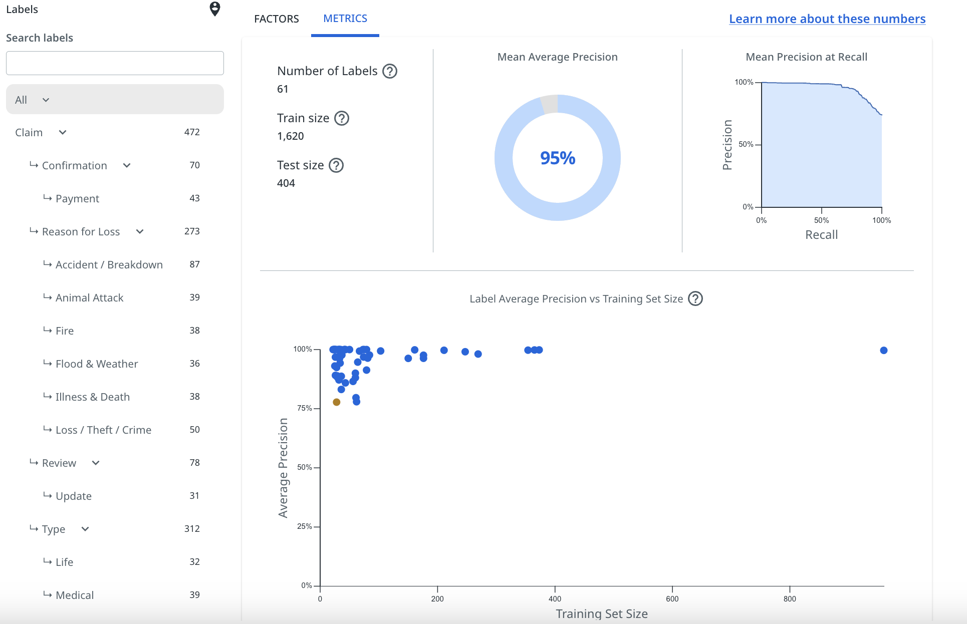
The label performance statistics shown are:
Essentially, the higher your MAP score, the better the model is performing overall when it comes to the accuracy of it's predictions, but this will vary between datasets depending on the type of data, and the objectives you have centred your taxonomy around.
MAP is not a good measure of coverage or balance, however, and should not be solely relied on to determine whether your model is fit for purpose. For more details, check Understanding and increasing coverage and Understanding and improving model performance.
Understanding label performance
The label performance chart shown in the Metrics tab of the Validation page gives an immediate visual indication of how each individual label is performing.
For a label to appear on this chart, it must have at least 20 pinned examples present in the training set used by the platform during validation. To ensure that this happens, users should make sure they provide a minimum of 25 (often more) pinned examples per label.
Each label will be plotted as one of three colours, based on the model's understanding of how the label is performing. Below, we explain what these mean:

Label performance indicators
- Those labels plotted as blue on the chart have a satisfactory performance level. This is based on numerous contributing factors, including number and variety of examples, annotating bias and average precision for that label.
- Labels plotted as amber have slightly less than satisfactory performance. They may have relatively low average precision, not quite enough training examples, or could have been annotated in a biased manner. These labels require a bit of training / correction to improve their performance or to reduce bias in the way that they were trained.
- Labels plotted as red are poorly performing labels. They may have very low average precision, not enough training examples, or are highly biased in the way that they were annotated. These labels may require considerably more training / correction to bring their performance up to a satisfactory level or to significantly reduce the bias in the way they were trained.
Note:
You will see the amber and red performance indicators appear in the label filter bars in Explore, Reports and Validation. This helps to quickly notify you which labels need some help, and also which labels' predictions should not be relied upon (without some work to improve them) when using the analytics features.
Individual Label performance
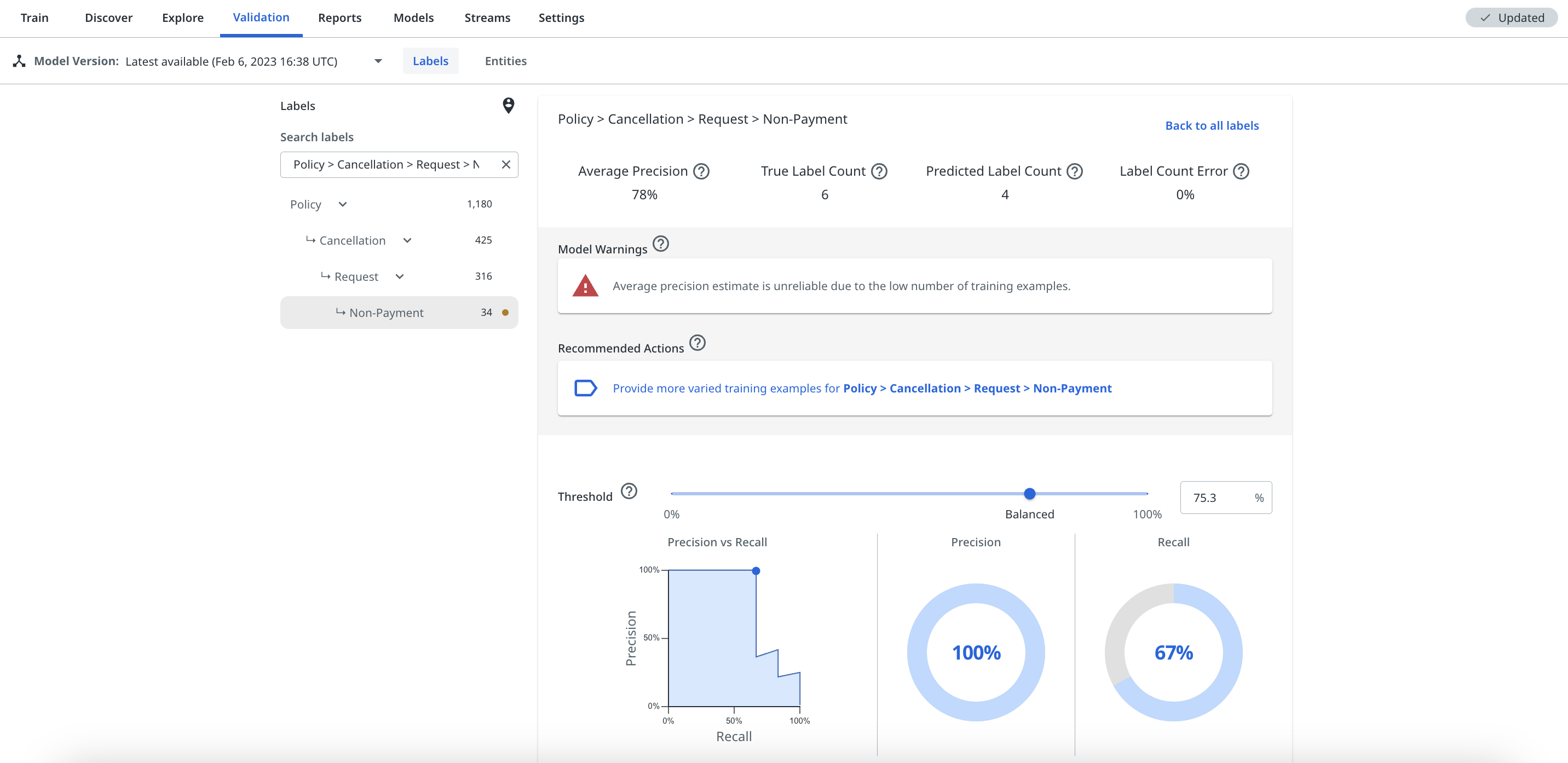
Users can select individual labels from the label filter bar, or by selecting the plot of the label on the All labels chart, in order to view the performance statistics of the label. The specific label view will also show any performance warnings and recommended next best action suggestions to help improve its performance.
The label view will show the average precision for the label, as well as its precision vs. recall based on a given confidence threshold that users can adjust themselves to view how it changes. For more details, check Understanding the label threshold slider.
Improving overall model and individual label performance
If your model or a specific label has a performance warning, the platform recommends the next best action that it thinks will help address that warning. This will either be via one of the factor cards (as shown below) or when you select a specific label from the taxonomy or the All Labels chart, as shown previously.
For some labels that have very low average precision, it might not always be clear why they are performing badly. Possible reasons why a label may have low average precision and how to improve it are discussed in the following article Reasons for label low average precision. The platform will always provide what it thinks are the best corrective actions to improve the label, listed in order of priority.
When you aren't in the Validation page, the red and amber performance warnings still appear in the taxonomy filter in Explore and Reports, so these can be a helpful indicator to check Validation to see the recommended corrective actions.
The next best actions suggestions act as links that you can select to take you direct to the training view that the platform suggests in order to improve the label's performance or reduce its bias. The suggestions are intelligently ordered with the highest priority action to improve the label listed first.
These are the most important tool to help you understand the performance of your model, and should regularly be used as guides when trying to improve the performance of a label.
The next article covers in detail the reasons why a label may have low average precision. The later articles in this section of the Knowledge Base also cover the other training modes that the platform may suggest using to improve your model's performance, which are Check label, Missed label, and Rebalance.
If you have an older model version selected, you will still see the warnings and suggested actions, but if you hover over the information icon with your mouse, a pop-up will warn you that these specific stats cannot be changed as there is a newer model version, which you can work on.
Understanding the label threshold slider
Adjusting the confidence threshold slider does not actually impact the model, it just gives you a visual representation of how predictions would be impacted for that label if a certain confidence threshold was selected. This can help you select a suitable threshold for streams or using predictions for downstream automation.
To adjust the confidence threshold for a label, you can type a percent sign % figure into the box, or just drag the slider along the scale.
Annotate specific Validation stats
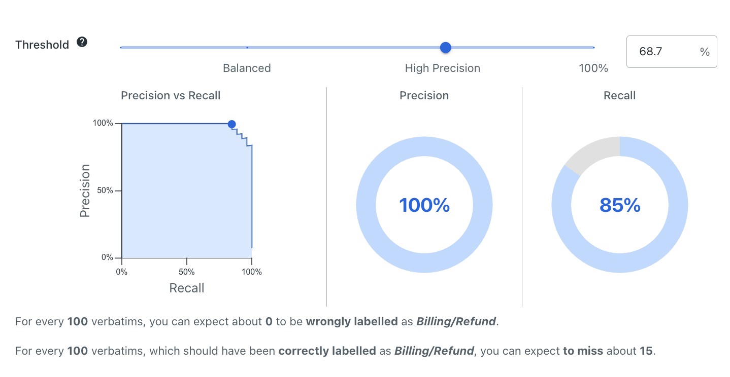
Notice how in the previous image, the confidence threshold for the Quote > Motor label is set at 68.7%, giving a precision of 100% and recall of 85%.
Then, in the following image, the confidence threshold has been adjusted using the slider to 17%, which brings the precision down to 84%, but increases the recall to 100%.
Label specific Validation charts
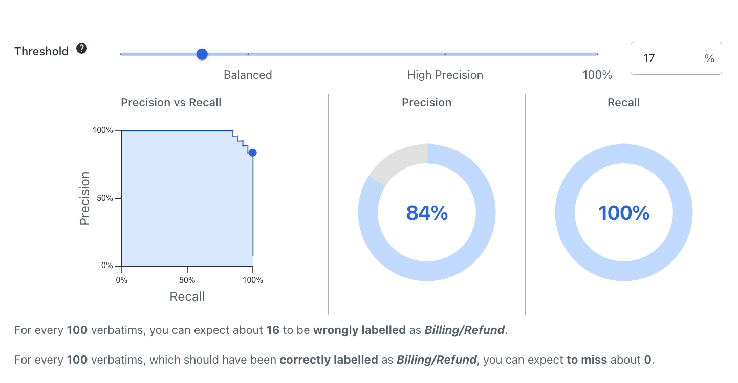
For more details on the relationship between precision and recall, check Precision and recall.
For more details on how to select thresholds to use in automations, check Selecting label confidence thresholds.