- Introduction
- Setting up your account
- Balance
- Clusters
- Concept drift
- Coverage
- Datasets
- General fields
- Labels (predictions, confidence levels, label hierarchy, and label sentiment)
- Models
- Streams
- Model Rating
- Projects
- Precision
- Recall
- Annotated and unannotated messages
- Extraction Fields
- Sources
- Taxonomies
- Training
- True and false positive and negative predictions
- Validation
- Messages
- Access control and administration
- Manage sources and datasets
- Understanding the data structure and permissions
- Creating or deleting a data source in the GUI
- Preparing data for .CSV upload
- Uploading a CSV file into a source
- Creating a dataset
- Multilingual sources and datasets
- Enabling sentiment on a dataset
- Amending dataset settings
- Deleting a message
- Deleting a dataset
- Exporting a dataset
- Using Exchange integrations
- Model training and maintenance
- Understanding labels, general fields, and metadata
- Label hierarchy and best practices
- Comparing analytics and automation use cases
- Turning your objectives into labels
- Overview of the model training process
- Generative Annotation
- Dastaset status
- Model training and annotating best practice
- Training with label sentiment analysis enabled
- Understanding data requirements
- Train
- Introduction to Refine
- Precision and recall explained
- Precision and Recall
- How validation works
- Understanding and improving model performance
- Reasons for label low average precision
- Training using Check label and Missed label
- Training using Teach label (Refine)
- Training using Search (Refine)
- Understanding and increasing coverage
- Improving Balance and using Rebalance
- When to stop training your model
- Using general fields
- Generative extraction
- Using analytics and monitoring
- Automations and Communications Mining™
- Developer
- Uploading data
- Downloading data
- Exchange Integration with Azure service user
- Exchange Integration with Azure Application Authentication
- Exchange Integration with Azure Application Authentication and Graph
- Migration Guide: Exchange Web Services (EWS) to Microsoft Graph API
- Fetching data for Tableau with Python
- Elasticsearch integration
- General field extraction
- Self-hosted Exchange integration
- UiPath® Automation Framework
- UiPath® official activities
- How machines learn to understand words: a guide to embeddings in NLP
- Prompt-based learning with Transformers
- Efficient Transformers II: knowledge distillation & fine-tuning
- Efficient Transformers I: attention mechanisms
- Deep hierarchical unsupervised intent modelling: getting value without training data
- Fixing annotating bias with Communications Mining™
- Active learning: better ML models in less time
- It's all in the numbers - assessing model performance with metrics
- Why model validation is important
- Comparing Communications Mining™ and Google AutoML for conversational data intelligence
- Licensing
- FAQs and more

Communications Mining user guide
Reports
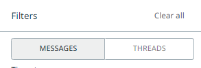
Messages and Threads filter
Depending on the type of data, the number of tabs on the Reports page can vary. Users can toggle between message and thread-level reports if the data is in thread form, for example, call transcripts and email chains. If not, the message filter will be the default.
The built-in reporting functionality of the platform includes the following tabs:
- Dashboard - allows you to create custom dashboard views using the data from the other tabs. For more details, check Using dashboards.
- Label Summary - presents high-level summary statistics for labels. For more details, check Using Label summary.
- Trends - presents charts for message volume, label volume, and sentiment over a given time period. For more details, check Using Trends.
- Segments - presents charts of label volumes versus message metadata fields, for example, sender domain. For more details, check Using Segments.
- Threads - presents charts of thread volumes and label volumes within a thread, only accessible when you apply the Thread filter. For more details, check Using Threads.
- Comparison - allows you to compare different cohorts of data against each other. For more details, check Using Comparison.
At the top of each tab in the Reports page, you will notice the number of messages contained in the dataset, net sentiment, if sentiment analysis is enabled, and the date period for the selected data.
Dashboard
You can think of the Dashboard page as a place to create fully customizable reports, or even a homepage for your datasets. On this page, you can add high-level information on the datasets, such as accuracy of the model, various charts, recent messages, the health of your taxonomy, and so on.
To access the dashboard, go to the Reports page, on the navigation bar, and select the Dashboard tab. You can view the default automatically created dashboard.
Dashboards are specific to the dataset itself. You can create new dashboards, delete, and edit existing ones. In addition, you can rename the titles of the dashboards to suit your use case.
Any Automation Cloud user with the IXP Analyst or IXP Viewer roles, and any legacy user with the View Labels permission, can view these dashboards. However, to create, edit, and delete any dashboard, you need the IXP Analyst role as an Automation Cloud user, or the Modify dashboards permission as a legacy user.
The dashboard does contain a few default example visuals, as shown in the following image. You can fully customize your dashboards. This means you can customize what is included, removed, and how it is arranged by adding charts to them from the Reports page. You can also resize cards by dragging the corner.
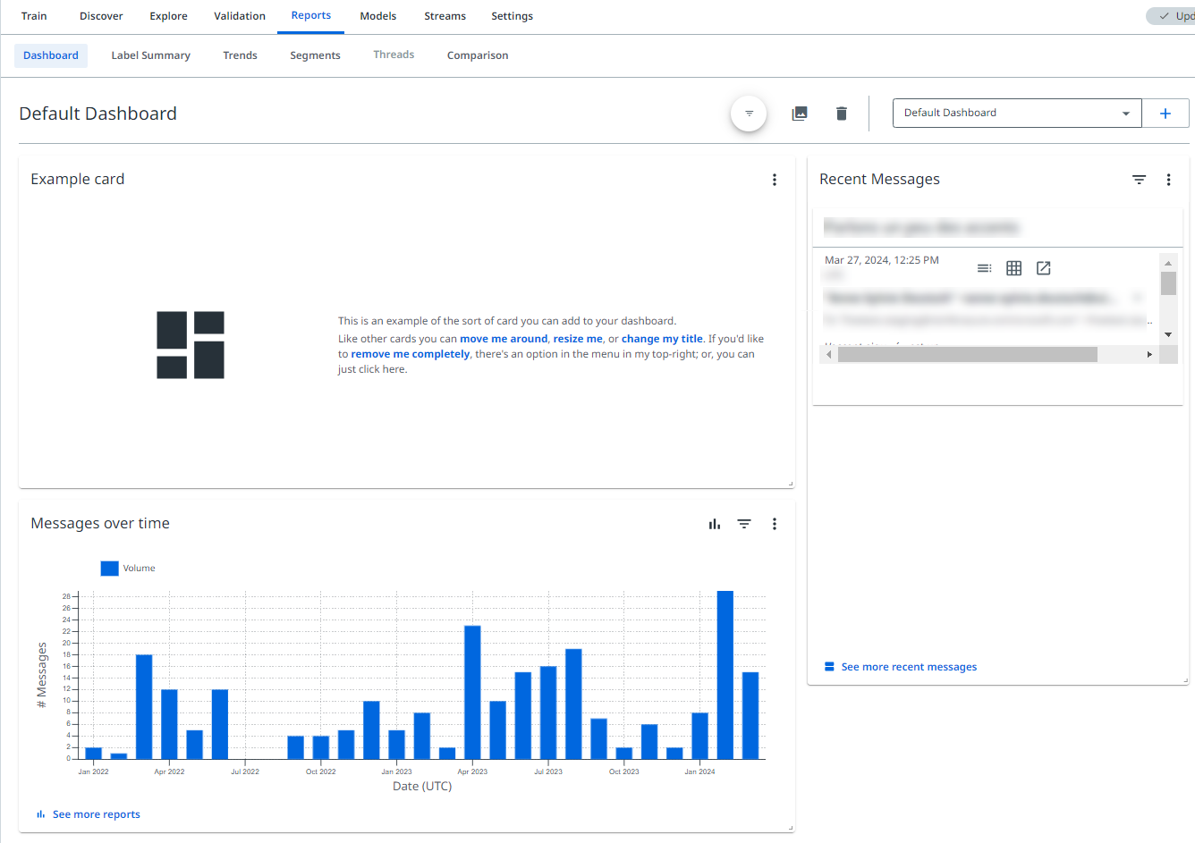
Example of a customized Dashboard page
Each dashboard card has its own filter, determining which information is presented on it. To create a card, create the filtered card on the Reports page, and select the Add button. You can change the filters of a specific card directly from the dashboard.
You also have access to a global filters feature, which allows you to augment any existing filters across the existing cards on the dashboard, for example, by narrowing down to a specific time range. For more details on updating dashboards, check Using Dashboards.
Trends
You can view the data in the time series charts by selecting from the time sequence dropdown menu, from the statistics summary in the Trends tab:
- Daily
- Weekly
- Monthly
- Yearly
Chart buttons
Several buttons are displayed when you hover over each chart.
The available buttons change depending on the exact chart type, and some are revealed when you select the existing view to change to a new one:
 | Add this chart to your dashboard. |
 | Option to download an image of the chart, download the raw data for the chart as CSV, or add chart to your dashboard. |
 | Show percentages. |
 | Show totals. |
 | Display as column or bar chart. |
 | Display as line chart. |
 | Display as scatter graph. |
 | Display as doughnut chart. |
 | Sort by prominence. |
 | Sort alphabetically. |
 | Sort reverse alphabetically. |
 | View labels with the biggest changes in rank. |
 | Change the number of labels displayed. |
For more details on how reports work, and how to use them, check Using analytics and monitoring - Overview.
Charted labels
To control which labels are shown or hidden in the charts from the Reports page, use the Charted labels dropdown menu. You can find this menu next to the time sequence dropdown menu.
You can use the plus icon to select any combination of labels you want to appear, and these will show on the charts that distinguish between different labels. Alternatively, use the minus icon to select which labels to exclude.
If you select a number of labels, they will appear in a bar, as a visual indicator of which labels have been selected to appear on the charts.
All of the labels that you select or exclude will appear highlighted at the top of the page, as a visual reminder, and you can easily remove them by selecting the X icon for each label name.
When the Reports page shows Charted labels selected, this action does not change the messages that are taken into account, only which labels are shown on the label-specific charts. An easy way to remind yourself of this is to note that the total number of messages shown at the top of the page does not change when you select any labels from the Charted labels dropdown.
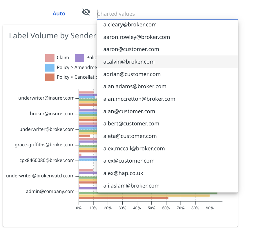
Charted property values
In Segments, you can also chart specific string property values, similar to charting labels.
You can select a number of property values you wish to display on the chart, and this will override the default displayed values, which are typically the property values that have the highest corresponding message volumes.
In the following image example, the email property of the Sender Domain is shown. You can use the dropdown menu to select a number of values to display, instead of the default ones that are shown.
Hidden property charts
The Segments tab loads a number of property-based charts by default, but some of those with a very high number of potential values can default to being hidden. Users can also choose to hide property charts that they do not find useful.
In the following example, the property charts for Inbound, Cc, and To, which are all email-related, are hidden.
To unhide a chart, select the eye icon next to its name, and the platform will load the chart for the property.
To hide a chart, select the corresponding icon, the eye with a strike through it. The chart will then appear in the Hidden property charts list.

Filter bar
The filter bar works in the same way as the one in the Explore page.
You cannot filter by reviewed status in the Reports page.
For more details on filtering, check Applying filters on Reports.
Label bar
The Label bar in Reports works in the same way as the one from the Explore page. For more details, check Advanced prediction filters.
Comparison
The Compare page allows you to compare the distribution of labels across two different user-defined cohorts of messages or threads.
You can apply filters to Group A and Group B to compare the count, proportion, and sentiment of the labels across the groups, and view the differences in these numbers. Depending on the analytics you would like to extract, you can toggle between Messages and Threads, depending on whether you want to compare individual messages or compare at a thread level, for example, email threads, phone calls, and live chats.