- Before you begin
- Managing access
- Getting started
- Integrations
- Working with process apps
- Working with dashboards and charts
- Working with process graphs
- Working with Discover process models and Import BPMN models
- Showing or hiding the menu
- Context information
- Export
- Filters
- Sending automation ideas to UiPath® Automation Hub
- Tags
- Due dates
- Compare
- Conformance checking
- Process simulation
- Root cause analysis (Preview)
- Simulating automation potential
- Starting a Task Mining project from Process Mining
- Triggering an automation from a process app
- Viewing Process data
- Process Insights (preview)
- Creating apps
- Loading data
- Transforming data
- Autopilot™ for SQL (preview)
- Structure of transformations
- Tips for writing SQL
- Exporting and importing transformations
- Viewing the data run logs
- Merging event logs
- Configuring Tags
- Configuring Due dates
- Configuring fields for Automation potential
- Activity Configuration: Defining activity order
- Making the transformations available in dashboards
- Data models
- Adding and editing processes
- Customizing dashboards
- Publishing process apps
- App templates
- Notifications
- Additional resources

Process Mining user guide
Working with dashboards and charts
Introduction
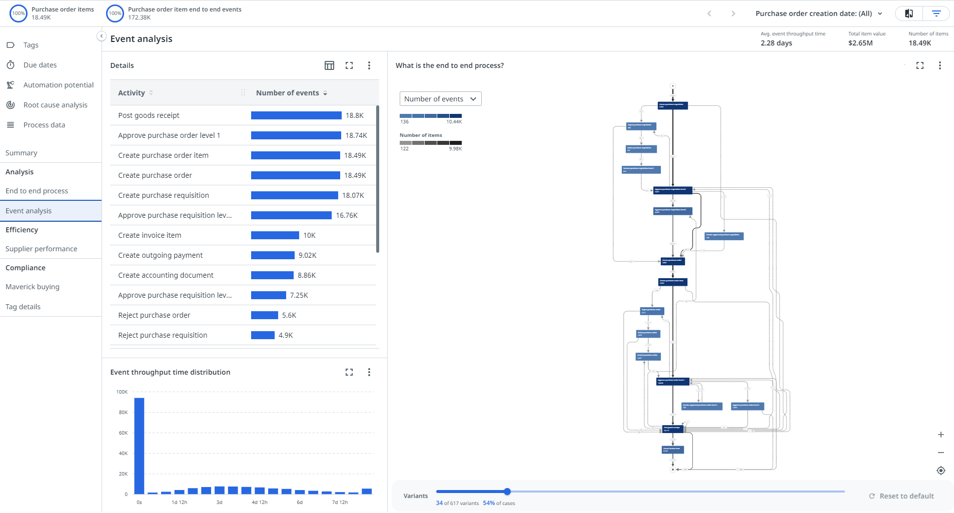
Process apps use data to visualize and analyze the actual end-to-end process, with all variants and relevant key performance indicators (KPIs). A process app consists of multiple dashboards, visualizing different parts of the input data.
Charts are dashboard items that are used to visualize data on a dashboard. For example a process graph, a bar chart, or a cross-analysis table.
A chart usually contains information about a specific part of the process, e.g. case information or event information. A dashboard can contain multiple charts.

Charts can have different layouts so that various aspects of the process can be shown.
On the left side, two tabs are available that each contain different charts. In the above example, the Details tab and the Trend tab. The right side contains one chart, the process graph.
KPIs
The KPI bar at the top of the dashboard displays the most important KPIs. KPIs are measurable values used to gauge performance of specific properties over time. KPI is an abbreviation for Key Performance Indicator.
KPIs enable you to check the progress and quality of the process on a regular basis. The goal is to determine if everything is going as expected. If deviations are found, you can do a more detailed analysis and take action to improve or change the process.

The following table describes the elements.
| Element | Description |
|---|---|
 | Black numbers represent the figures of the selected period. |
 | Up arrow numbers represent the positive difference compared to the previous period. |
 | Down arrow numbers represent the negative difference compared to the previous period. |
Metrics
Metrics can be used to measure the performance of your process. Metrics are used to compute the value for each category, e.g. the number of objects, or the percentage of objects. For example, in the Analysis - End to end dashboard in Purchase-to-Pay the initial value is Number of items. If you select a different metric in the metric selector, the value for each of the categories in the dashboard is modified.
Event throughput time and event cycle time
In most dashboards and charts, Event throughput time and Event cycle time metrics are available.
The Event throughput time is the time it takes to execute the event and is calculated as the duration between the Event end and the previous Event end. In this case, any waiting time between the execution of the preceding events is also included in the Event throughput time. The Event cycle time is the actual time it takes to execute the event and is calculated as the duration between the Event start and the Event end. In this case, waiting time is not taken into account.

Event cycle time is only available when both event_start and event_end are defined in your dataset, and is calculated as the time between event_start and event_end. In this case, event_start must be defined for all events. (event_start is only taken into account if every record in the dataset contains a not-null value.) The transition waiting time is calculated as the duration between the evend_end and the event_start of the next event.
Fields and metrics
The data in charts is displayed based on selected fields and metrics. Selecting a fields determines how the records in the dashboard are categorized. For example, in the Analysis - End to end dashboard in Purchase-to-Pay, the initial field selected is Variant and the selected metric is Number of items. This means all the objects are categorized by variant. For each variant, the number of objects is displayed.
If you select a different field or metric in the selector, the data in the dashboard changes.
Bar charts
By default, one field is selected. You can change the data in the horizontal bar chart by selecting the fields and metrics using the Columns icon ![]() in the top right corner of the chart.
in the top right corner of the chart.
Showing metric values as percentages
By default, metrics that represent a "count of value", for example Number of events or Total case value, are displayed as numeric values. You can use the Show metric values as percentages icon ![]() to toggle between numeric values and percentages for these metrics.
to toggle between numeric values and percentages for these metrics.
Restricted fields
For fields that contain sensitive information, for example, personal data, data restrictions or record access policies may have been defined for these fields. This means that the data for these fields will not visible in the chart or dashboard, depending on the rule or policy. A message is displayed in the chart for a restricted field.
Refer to Setting data restrictions for a process app for more information.
Thresholds
A threshold is a predefined value or limit that helps you interpret the KPI values. A threshold defines what counts as good, bad, or critical performance for the KPI. These boundaries are visualized in the KPI chart.
Thresholds support performance monitoring. For example, by flagging when a process takes longer than expected, distinguishing acceptable from unacceptable performance, and highlighting deviations or risks in dashboards.
The following example shows a threshold for tracking Average throughput time end-to-end:
- A green threshold at MIN < 3 days (good performance);
- A yellow threshold between 4–5 days (warning);
- A red threshold 5 days > MAX (needs attention).
The following illustration shows an example KPI chart with a threshold for Automation rate.

Hovering over a KPI chart also displays the defined thresholds and context metrics. The following illustration shows an example of context information for a KPI chart.

Resizing charts
Since dashboards can contain multiple charts, some charts are smaller than others. You can resize the charts by using the horizontal and/or vertical splitters. You can also resize the columns of a bar chart.
When you resize charts and/or columns, the new browser state is saved and automatically applied the next time when you open the dashboard.
Viewing a chart full-screen
If you want to have a closer look at a chart, you can select the Full-screen button to enlarge the chart and view it in full-screen mode. You can select the Exit full-screen button to reduce the chart to its normal size.

The full-screen state is included in the page URL. This implies that the current state is displayed when you refresh the page. This also enables you to share the link to a chart in full-screen mode.
Hiding the menu
To enlarge the view on the dashboard, you can select the  icon to hide the menu on the left. The
  button is a toggle button. If you select it again, the menu on the left is displayed.
Data selections
Selections in the dataset allow you to zoom in on a specific part of the dataset based on the information displayed in the dashboards. Selections can be triggered by dragging your mouse or clicking on the graphs and charts. When you apply a selection, a filter is created and the data in the dashboard is changed according to the selection.
Follow these steps to create a filter based on a selection in the chart.
- Select a chart and drag to make a selection. The selection is highlighted in the chart.
- Right-click to open the context menu.
- Select Filter -> Filter by selected values from the menu.
When you select a period in a trend chart a Custom period filter is created based on the selection. When you select a range in a distribution chart, a filter is added to the Advanced filter panel.
You can also use data selections for other actions available on the chart. For example, Export.
Using selections in multiple dashboards
Both the selection of fields and metrics apply to different dashboards. This makes it possible that in one dashboard a selection is created to analyze, and the same selection can be analyzed further on a different dashboard.
This does not apply for all selectors and fields.
Column sorting
You have several options to sort the data in bar charts using the column sort function.
![]()
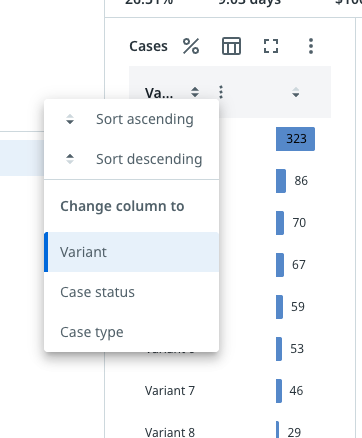
Column context menu
The column context menu allows you to easily change the column settings. The following illustration shows an example.

Details
The Details button ![]() enables you to analyze objects on the lowest level by going to the related Details dashboard.
enables you to analyze objects on the lowest level by going to the related Details dashboard.
Sharing a dashboard
You can share the URL of the dashboard with others using the Share option. You share your current dashboard view.
If the recipient does not have the same app permissions, they might have a different result.
Follow these steps to share your dashboard URL.
- Go to the dashboard that you want to share.
- Optionally add filters if you want to create context.
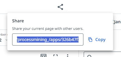
- Select the Share icon in the header bar of the process app.
A pop-up window is displayed, showing the URL of the current dashboard.
 4. Select Copy to copy the URL to the Clipboard.
5. Send the link to the person you would like to share it with.
The URL captures the full-screen state. This enables you to share a link to a chart in full-screen mode. The URL also captures compare filters. This enables you to share the link to a compare view.
- Introduction
- KPIs
- Metrics
- Event throughput time and event cycle time
- Fields and metrics
- Bar charts
- Showing metric values as percentages
- Restricted fields
- Thresholds
- Resizing charts
- Viewing a chart full-screen
- Hiding the menu
- Data selections
- Using selections in multiple dashboards
- Column sorting
- Column context menu
- Details
- Sharing a dashboard