process-mining
latest
false
- Before you begin
- Managing access
- Getting started
- Integrations
- Working with process apps
- Working with dashboards and charts
- Working with process graphs
- Working with Discover process models and Import BPMN models
- Showing or hiding the menu
- Context information
- Export
- Filters
- Sending automation ideas to UiPath® Automation Hub
- Tags
- Due dates
- Compare
- Conformance checking
- Process simulation
- Root cause analysis (Preview)
- Simulating automation potential
- Starting a Task Mining project from Process Mining
- Triggering an automation from a process app
- Viewing Process data
- Process Insights (preview)
- Creating apps
- Loading data
- Transforming data
- Autopilot™ for SQL (preview)
- Structure of transformations
- Tips for writing SQL
- Exporting and importing transformations
- Viewing the data run logs
- Merging event logs
- Configuring Tags
- Configuring Due dates
- Configuring fields for Automation potential
- Activity Configuration: Defining activity order
- Making the transformations available in dashboards
- Data models
- Adding and editing processes
- Customizing dashboards
- Publishing process apps
- App templates
- Notifications
- Additional resources

Process Mining user guide
Last updated Apr 28, 2026
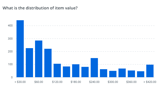
Distribution charts
Introduction
Distribution charts can be used to show the distribution of values of a numerical field. The bars are displayed vertically. The following illustration shows an example of a distribution chart.
In a distribution chart, you select the field for which you want to display values on the X-axis. The Y-axis is used to display the variable values defined by a metric. By default, the metric displayed on the Y-axis is the record count. If you want to display a different value, you can choose a different metric.
Properties
You can edit the properties of a distribution chart in the Edit distribution chart panel.
The following table describes the properties of the Distribution chart.
| Property | Description |
|---|---|
| Title | Text box that enables you to edit the title of the distribution chart. |
| Tooltip | Text box that enables you add a text that will be displayed as tooltip when the user hovers the mouse over the chart title in the published process app. |
| Field | Combo box that enables you to select the field that defines the values displayed on X-axis. |
| Metric | Combo box that enables you to select the metric that defines the values displayed on Y-axis. |