- Getting Started
- Demo apps
- How To
- Notifications
- Using VB Expressions
- Designing your App
- Designing your app with Autopilot
- Events and Rules
- Rule: If-Then-Else
- Rule: Open a Page
- Rule: Open URL
- Rule: Close Pop-Over/Bottom Sheet
- Rule: Log Message
- Rule: Show Message
- Rule: Show/Hide Spinner
- Rule: Set Value
- Rule: Start Process
- Rule: Reset Values
- Rule: Upload File to Storage Bucket
- Rule: Download File From Storage Bucket
- Rule: Create Entity Record
- Rule: Update Entity Record
- Rule: Delete Entity Record
- Rule: Add to Queue
- Rule: Trigger workflow
- Rule: Submit Action
- Leveraging RPA in your App
- Leveraging Entities in Your App
- Leveraging Queues in Your App
- Leveraging Media in your app
- Leveraging Actions in your app
- Leveraging Connections in your apps
- Apps in Studio Web
- Application Lifecycle Management (ALM)
- UiPath First-Party Apps
- Basic Troubleshooting Guide
Apps user guide
A page container is a primary container. Use it to add multiple controls and containers within a page.
To add multiple pages to your app, right-click on an existing page in the tree view and select Add new page.
When adding a new page, you can use a prebuilt template for different use cases, such as dashboards, forms, or lists. To start from scratch, select Blank Page.
General
- Page title - The title of the page.
- Description- The description of the page. This information is not visible at runtime.
- Tooltip - Tooltip to be displayed on the page. Use this to provide additional information on the page.
- Show Loading Progress Indicator - Enabled by default, allows users to interact with the app after the page is completely loaded. If you deselect this checkbox, users can interact with the app while the page is loading, which may be useful for apps with complex pages.
Events
- Loaded - Configure what happens when the page is loaded.
Style
-
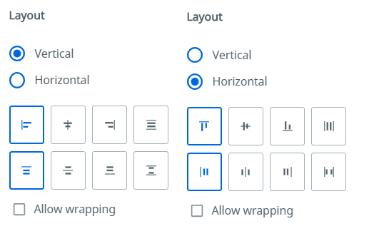
Layout - Determine how the controls within the container are positioned:
- Horizontal/Vertical - The orientation of controls.
- Alignment- The alignment of controls within the container.
- Allow wrapping - If selected, wraps the controls in the container.

-
Background Color - The background color of the container.
-
Border - The border for the control. Border Thickness, Color, and Radius can be configured.
-
Font - The font family for the container layout. All the controls within the container share the same font family. By default, the control inherits the font family of the immediate parent container which is indicated by the keyword "Inherited".
-
Margin- The margin of the layout. By default, a margin of 0px is set. Top/Bottom and Left/Right margin properties are combined. These properties can be detached using the Link button at the right side of the Margin section.
-
Padding - The padding of the layout. By default, a padding of 4px is set. Top/Bottom and Left/Right margin properties are combined. These properties can be detached using the Link button at the right side of the Padding section.
-
Size - The width and height of the layout. By default, the Width is set to 100% and the Full width checkbox is selected, while the Height is set to
auto, to allow the layout to expand based on the containers and controls inside. To set a custom width value, deselect the Full width box.
VB properties
| VB property | Data type | Description |
|---|---|---|
Tooltip | String | Information text which appears when the user hovers over the control. |