- Getting Started
- Demo apps
- How To
- Notifications
- Using VB Expressions
- Designing your App
- Designing your app with Autopilot
- Events and Rules
- Rule: If-Then-Else
- Rule: Open a Page
- Rule: Open URL
- Rule: Close Pop-Over/Bottom Sheet
- Rule: Log Message
- Rule: Show Message
- Rule: Show/Hide Spinner
- Rule: Set Value
- Rule: Start Process
- Rule: Reset Values
- Rule: Upload File to Storage Bucket
- Rule: Download File From Storage Bucket
- Rule: Create Entity Record
- Rule: Update Entity Record
- Rule: Delete Entity Record
- Rule: Add to Queue
- Rule: Trigger workflow
- Rule: Submit Action
- Leveraging RPA in your App
- Leveraging Entities in Your App
- Leveraging Queues in Your App
- Leveraging Media in your app
- Leveraging Actions in your app
- Leveraging Connections in your apps
- Apps in Studio Web
- Application Lifecycle Management (ALM)
- UiPath First-Party Apps
- Basic Troubleshooting Guide

Apps user guide
Layout and styling
App Studio offers extensive customization options in terms of app layout using its different container controls and styling options for each of the controls.
Positioning your controls
You can easily create a customized page layout using the Container Layout control. This way, you can group several controls to have a specific positioning, while configuring the layout and alignment of a single control (that is, the container).
To customize the controls position within a page or a container:
-
Select the page or the container where the desired control resides.
-
In the Style panel, select the Layout (Vertical, Horizontal) and the control alignment (Left, Center, Right, Stretch, Top, Middle, Bottom, Distribute).
Note:By default, controls fit themselves in one line and inherit the alignment of the parent-container.
-
(Optional) For the desired control, override the inherited alignment by selecting one of the available options. To default back to the container alignment, deselect any overridden alignment.
-
(Optional) For the desired container or page, select the Allow wrapping option to wrap the controls to multiple lines.

Resizing your controls
Controls are automatically sized by default. Auto allows the control to take the size of the content within it. For example, if the width and height of a button control are set to auto, the size of the button grows or shrinks based on the text in the button.
Specific height and width can also be set. Min Width/Height and Max Width/Height are available under the three dots icon (...) in the Size section of the Style panel.
The units of measurement are %, px (pixels), and em (relative to the font-size of the element). For example, 3em means 3 times the size of the current font.

To select the units of measurement, use the dropdowns of the size fields, or type in the unit. For example, to set a width of 100 pixels, type 100px in the Width field.
If no units of measurement are provided, the system defaults to pixels (px).
Customizing the font
To change the way text appears in your app, adjust the attributes in the Font section, such as the font family, size, color, or style.
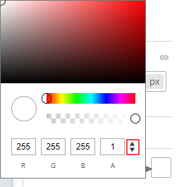
You can switch between RGB, HEX, and HSL color formats by clicking on the arrows next to the color value.

Working with borders
Use the Border property to create a border around your control. You can define the thickness and radius of the border.
The Border section can be found in the properties of all Container controls, as well as certain Input and Display controls. The Border section has three properties:
- Border thickness
- Border color
- Corner radius.
Pixels are the unit of measurement for these attributes.

Spacing out controls
Controls and containers can be spaced out using the attributes in the Margin and Padding sections.
Margins provide spacing around the controls.

Paddings provide spacing between the control and the content within it.

To detach the Top/Bottom and Left/Right values and set them independently, click the Link button at the right of the Margin/Padding section.
You can set the margin and padding of Container controls, while for the majority of the controls you can only set margin.
Changing the background color
You can change the background color of your controls using one of the three color formats: RGB, Hex or HSL.
To change the background color of a control, use the arrows next to the color values.
