- Getting Started
- Before You Begin
- How To
- Notifications
- Using VB Expressions
- Designing your App
- Events and Rules
- Rule: If-Then-Else
- Rule: Open a Page
- Rule: Open URL
- Rule: Close Pop-Over/Bottom Sheet
- Rule: Log Message
- Rule: Show Message
- Rule: Show/Hide Spinner
- Rule: Set Value
- Rule: Start Process
- Rule: Reset Values
- Rule: Upload File to Storage Bucket
- Rule: Download File From Storage Bucket
- Rule: Create Entity Record
- Rule: Update Entity Record
- Rule: Delete Entity Record
- Rule: Add to Queue
- Rule: Trigger workflow
- Leveraging RPA in your App
- Leveraging Entities in Your App
- Leveraging Queues in Your App
- Apps in Studio Web
- Application Lifecycle Management (ALM)
- Basic Troubleshooting Guide

Apps user guide
Tabs
General
When you add the Tab control, it displays three tabs by default (Tab 1, Tab 2, Tab 3). Expanding each tab within the control exposes the following properties:
- Tab name - The display name of the tab.
- Page source - The Apps page to import within this tab.
- Hidden- If true, hides the control at runtime.
- Disabled - If true, disables the control at runtime.
The following properties apply to the entire Tab control.
- Add new tab - Add new tab to your data by clicking the plus "+" icon.
- Active tab index - Navigate to a specific tab using this property. The index starts at 0. For example, if you have four consecutive tabs named "Tab1", "Tab2", "Tab3", and "Tab4", then "Tab1" has the index
0, "Tab2" has the index1, "Tab3" has the index2, and "Tab4" has the index3. - Hidden- If true, hides the control at runtime.
- Disabled - If true, disables the control at runtime.
Events
- Value changed—Configure what happens when the value is changed.
Style
- Control Alignment - By default, it is set to Stretch. A different alignment can be set.
Note:
The alignment is dependent on the layout selected for the parent (Vertical vs Horizontal).
- Style - The size of tabs and the color for an active tab.
- Border - The border for the control. Border Thickness, Color, and Radius can be configured.
- Font - The font attributes for the tab text, such as font family, size, or color. By default, the control inherits the font family of the immediate parent container which is indicated by the keyword "Inherited".
- Margin - The margin of the control. By default, a margin of 4px is set. Top/Bottom and Left/Right margin properties are combined. These properties can be detached using the Link button at the right side of the Margin section.
- Size - The width and height of the control. By default, the size is set to
auto. To set minimum or maximum values, click the three dot icon (...). If the size of the control is smaller than the options, a scroll bar is displayed.
Keyboard Shortcuts
For improved accessibility, you can use the following keyboard shortcuts in the tabs list from the General tab in the configuration panel:
- Up and Down arrow keys to change the selected tab.
- Alt+Up arrow key to move the selected tab up.
- Alt+Down arrow key to move the selected tab down.
Example: Navigating to the next tab
This example shows how to navigate to the next tab of a Tabs control.
-
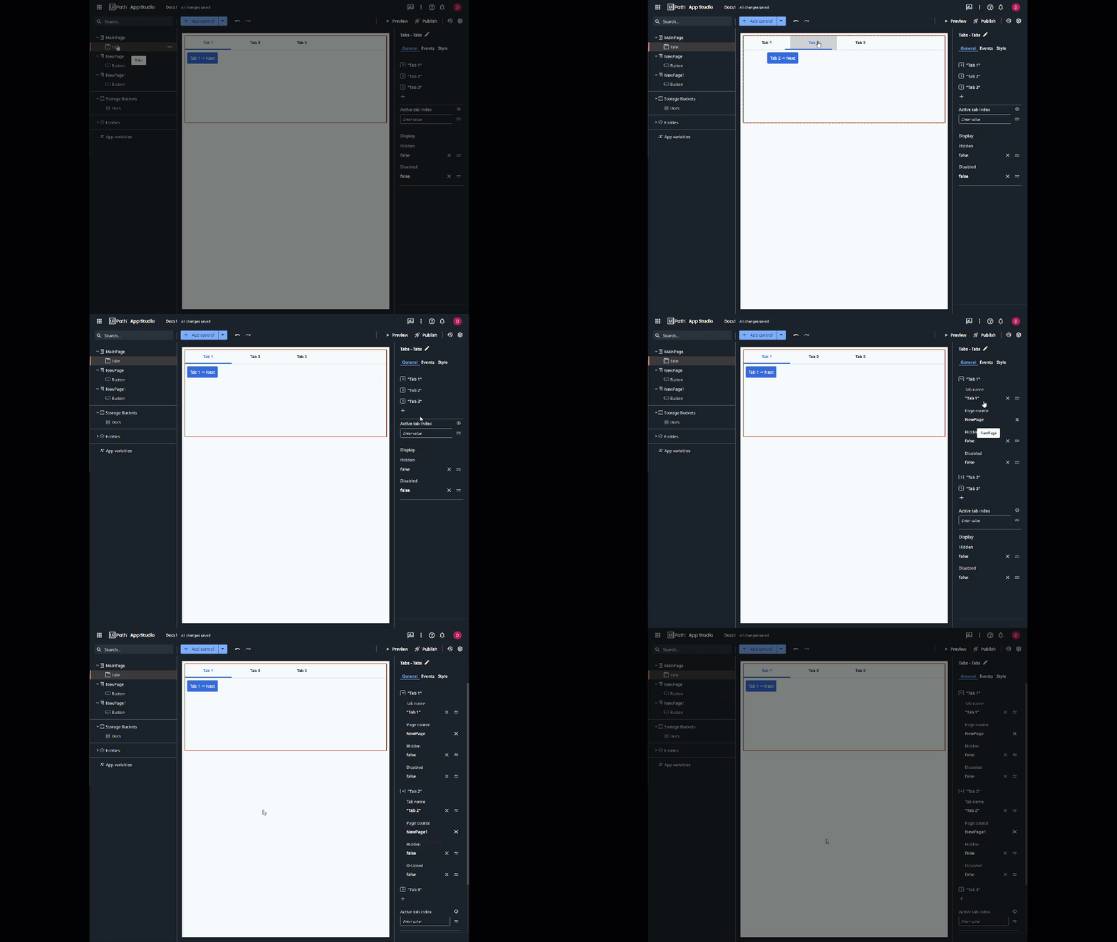
In your app, add a Tabs control and make it Static. It automatically created 3 tabs: "Tab 1", Tab 2", and "Tab 3".
-
Add two new pages and a Button control on each. Name the buttons "Tab 1 -> Next", and "Tab 2 -> Next" respectively.
-
For "Tab 1", in the Page source field, reference the previously added page which has the "Tab 1 -> Next" button.
-
For "Tab 2", in the Page source field, reference the previously added page which has the "Tab 2-> Next" button. Your app should look like in the following image:

-
Create a rule for each Button control. The rule instructs the app to navigate to the next tab when you click the button.
-
Create an app variable of type Int32 and name it "var_tab_index".
-
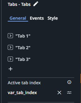
Select the Tabs control, and assign the variable
var_tab_indexto the Active tab index field.
-
Select the main page that contains the Tabs control, navigate to the Events tab, and create a rule for the Loaded event.
- Add the Set Value rule, and configure it as follows:
- Item To Set -
var_tab_index - Value -
0, which is the index of Tab 1.
- Item To Set -
- Add the Set Value rule, and configure it as follows:
-
Select the page that contains the Button control named "Tab 1-> Next", navigate to the Events tab, and create a rule for the Clicked on event.
- Add the Set Value rule, and configure it as follows:
- Item To Set -
var_tab_index - Value -
1, which is the index Tab 2.
- Item To Set -
- Add the Set Value rule, and configure it as follows:
-
Select the page that contains the Button control named "Tab 2-> Next", navigate to the Events tab, and create a rule for the Clicked on event.
- Add the Set Value rule, and configure it as follows:
- Item To Set -
var_tab_index - Value -
2, which is the index Tab 3.
- Item To Set -
- Add the Set Value rule, and configure it as follows:
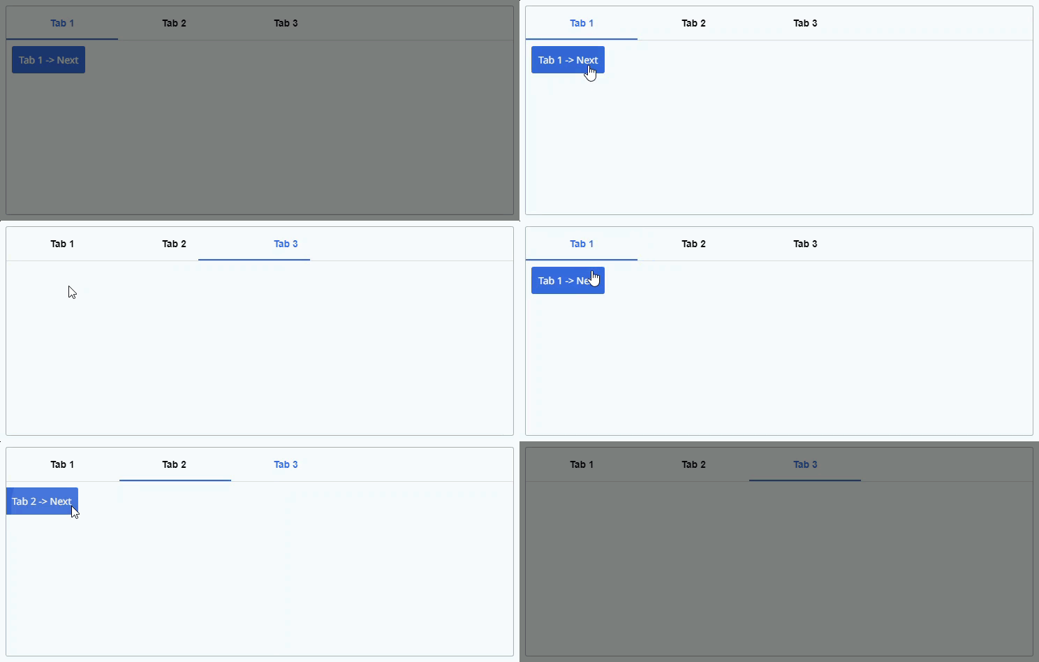
When you preview your app, clicking on the button in "Tab 1" navigates you to "Tab 2", and so on.

VB properties
| VB property | Data type | Description |
|---|---|---|
ActiveTabIndex | Integer | Index of the currently active tab. |
ActiveTabName | String | Name of the currently active tab. |
Hidden | Boolean | If true, hides the control at runtime. |
Disabled | Boolean | If true, disables the control at runtime. |