- Before you begin
- Getting started
- Integrations
- Working with process apps
- Working with dashboards and charts
- Working with process graphs
- Working with Discover process models and Import BPMN models
- Showing or hiding the menu
- Context information
- Export
- Filters
- Sending automation ideas to UiPath® Automation Hub
- Tags
- Due dates
- Compare
- Conformance checking
- Root cause analysis
- Simulating automation potential
- Triggering an automation from a process app
- Viewing Process data
- Creating apps
- Loading data
- Transforming data
- Customizing dashboards
- Publishing Dashboards
- App templates
- Notifications
- Additional resources
Process Mining user guide
Introduction
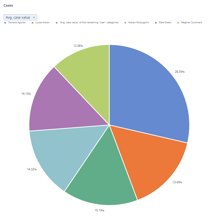
Pie charts can be used to compare the relative proportions of a certain metric within a category. The data in a pie chart is displayed in slices that form a circular graph. Each slice of the pie is relative to the size of the category used for the chart. The entire chart represents the total (number or 100%) of the category, while each slice represents a part of the total. The following illustration shows an example of a pie chart.

A legend is automatically generated for a pie chart.
Properties
You can edit the properties of a pie chart in the Edit pie chart panel.
The following table describes the properties of the Pie chart.
| Element | Description |
|---|---|
| Title | Text box that enables you to edit the title of the pie chart. |
| Tooltip | Text box that enables you add a text that will be displayed as tooltip when the user hovers the mouse over the chart title in the published process app. |
| Category | List box that enables you to select the category used for the slices on the pie chart. |
| Metrics | List of metrics that define the values displayed on the slices.
Note: You must at least select one metric. If you select multiple metrics, the first metric will be displayed by default. |
Maximum number of slices
A pie chart displays up to six slices. If the data consists of more than five slices for the selected category, a sixth slice is displayed representing the combined total of the remaining categories that are not displayed individually.
The purpose of the sixth slice is to provide a complete picture of the data distribution, when not all categories are displayed individually. It shows the proportion of the data that is not covered by the top 5 individual categories in comparison to the whole.