apps
2023.10
false
- Getting Started
- Before You Begin
- How To
- Notifications
- Using VB Expressions
- Designing your App
- Events and Rules
- Rule: If-Then-Else
- Rule: Open a Page
- Rule: Open URL
- Rule: Close Pop-Over/Bottom Sheet
- Rule: Show Message
- Rule: Show/Hide Spinner
- Rule: Set Value
- Rule: Start Process
- Rule: Reset Values
- Rule: Upload File to Storage Bucket
- Rule: Download File From Storage Bucket
- Rule: Create Entity Record
- Rule: Update Entity Record
- Rule: Delete Entity Record
- Rule: Add to Queue
- Rule: Trigger workflow
- Leveraging RPA in your App
- Leveraging Entities in Your App
- Leveraging Queues in Your App
- Application Lifecycle Management (ALM)
- Basic Troubleshooting Guide

Apps user guide
Last updated Mar 16, 2026
Date Picker
General
- Hint Text - Set the help text to be displayed at runtime.
- Default Date - Set a default date. If this property is bound to an app variable, changes to the default value will not propagate to the app variable.
- Tooltip - The text to be displayed when an app user hovers over the control. Use this to provide additional information on the control.
- Label - The display text of the control.
- Required - If true, app users must provide data in the control. To mark the control as mandatory at runtime, an asterisk
*is added after the label text. - Min date - Set the minimum date that app users can select at runtime.
- Max date - Set the maximum date that app users can select at runtime.
- Custom error message - The text to be displayed if the Required property is set to true and the control is left empty.
- Hidden- If true, hides the control at runtime.
- Disabled - If true, disables the control at runtime.
Note:
- Date Picker uses the
DateOnlytype. For example, you can set the Date Picker value tonew DateOnly(2023, 1, 25). - If you use
Date.Now()orDateTime.Now()in the Date Picker control, you must convert this type usingSystem.DateOnly.FromDateTime(Now). - Date Picker does not support displaying or working with time values.
- Date Picker uses the
Events
- Value changed - Configure what happens when the date is changed.
Style
- Control Alignment - By default, inherits the parent alignment. A different alignment other than the parent can be set. To default back to the parent alignment, deselect the overridden options.
Note:
The alignment is dependent on the layout selected for the parent (Vertical vs Horizontal).
- Label placement - By default, the label is set to be displayed on top of the control, at the left side. You can place it to the left of the control, on the same line. The Label Width property configures how wide the label should be, and the Space between property sets the distance between the label and the control.
- Background color - The background color of the control.
- Font - The font attributes for both the label and the input text, such as font family, size, color, or style (Bold, Italic and Underline). By default, the control inherits the font family of the immediate parent container which is indicated by the keyword "Inherited".
- Margin - The margin of the control. By default, a margin of 4px is set. Top/Bottom and Left/Right margin properties are combined. These properties can be detached using the Link button at the right side of the Margin section.
- Size - The width and height of the control. By default, the size is set to
auto. To set minimum or maximum values, click the three dot icon (...).
Location-specific Format
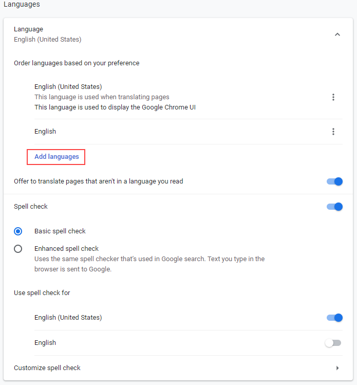
To view the date in the format specific to your locale in Google Chrome, follow the steps below:
-
Go to the following address in Google Chrome:
chrome://settings/languages. -
Add the missing language.

-
Move the language to the top of listed languages.
-
Restart Google Chrome.
-
Re-open your app and preview it.
-
Select the date in the Date Picker control. The date should now be displayed in the format specific to your locale.