- Getting Started
- Before You Begin
- How To
- Notifications
- Using VB Expressions
- Designing your App
- Events and Rules
- Rule: If-Then-Else
- Rule: Open a Page
- Rule: Open URL
- Rule: Close Pop-Over/Bottom Sheet
- Rule: Show Message
- Rule: Show/Hide Spinner
- Rule: Set Value
- Rule: Start Process
- Rule: Reset Values
- Rule: Upload File to Storage Bucket
- Rule: Download File From Storage Bucket
- Rule: Create Entity Record
- Rule: Update Entity Record
- Rule: Delete Entity Record
- Rule: Add to Queue
- Rule: Trigger workflow
- Leveraging RPA in your App
- Leveraging Entities in Your App
- Leveraging Queues in Your App
- Application Lifecycle Management (ALM)
- Basic Troubleshooting Guide
Apps user guide
A container holds controls and other containers within it and aligns them similarly.
General
- Tooltip - Tooltip to be displayed on the container. Use this to provide additional information on the control.
- Hidden- If true, hides the control at runtime.
- Disabled - If true, disables the control at runtime.
Events
- Clicked on - Configure what happens when the container is clicked.
Style
-
Control Alignment - By default, inherits the parent alignment. A different alignment other than the parent can be set. To default back to the parent alignment, deselect the overridden options.
Note:The alignment is dependent on the layout selected for the parent (Vertical vs Horizontal).
-
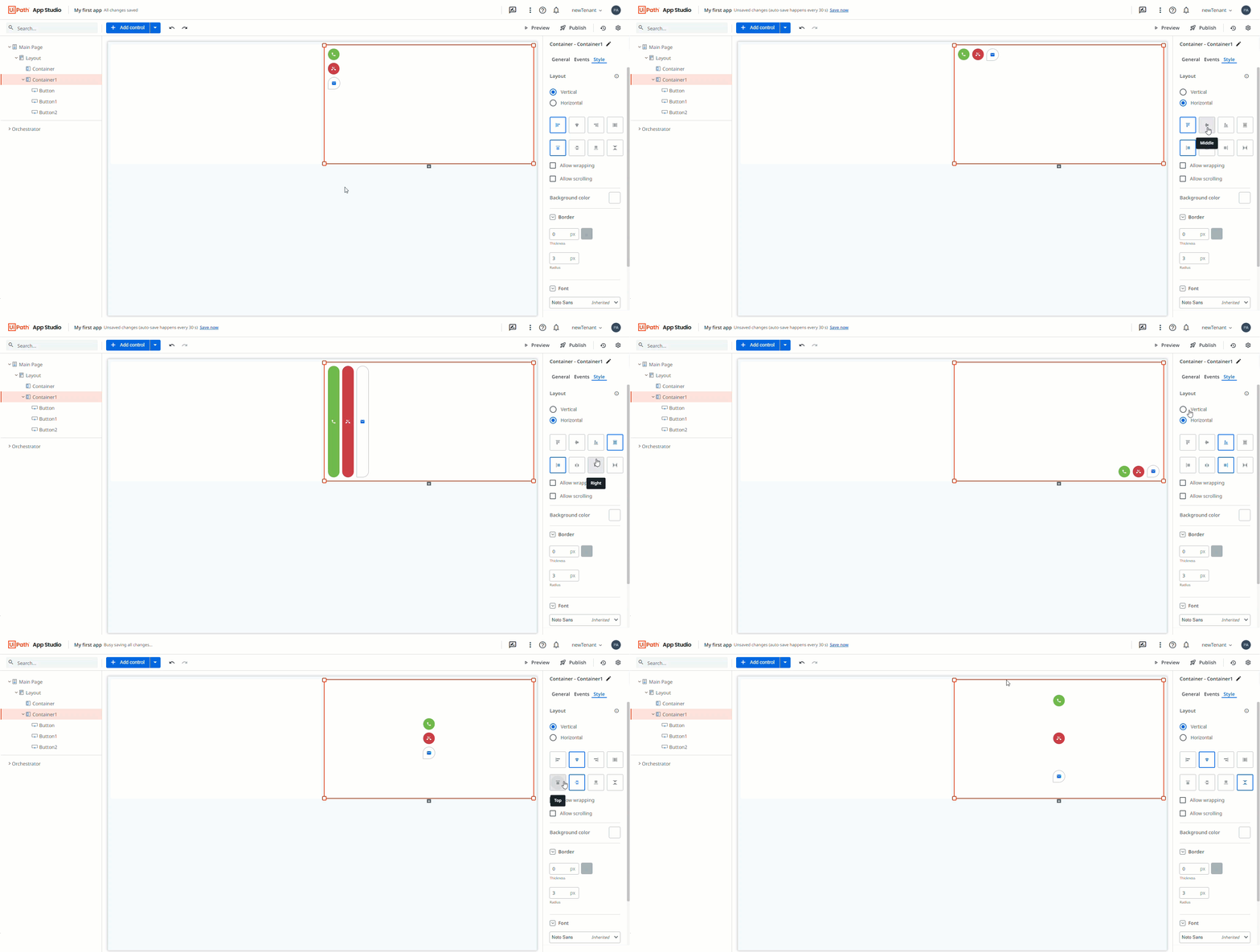
Layout - Determine how the controls within the container are positioned:
- Horizontal/Vertical - The orientation of controls.
- Alignment- The alignment of controls within the container.
- Allow wrapping - If selected, wraps the controls in the container.
- Allow scrolling - If selected, allows scrolling inside the container. To enable Allow Scrolling, the container must have a fixed height (vertical layout) or fixed width (horizontal layout).

-
Background Color - The background color of the container.
-
Border - The border for the control. Border Thickness, Color, and Radius can be configured.
-
Font - The font family for the container layout. All the controls within the container share the same font family. By default, the control inherits the font family of the immediate parent container which is indicated by the keyword "Inherited".
-
Margin- The margin of the layout. By default, a margin of 0px is set. Top/Bottom and Left/Right margin properties are combined. These properties can be detached using the Link button at the right side of the Margin section.
-
Padding - The padding of the layout. By default, a padding of 0px is set. Top/Bottom and Left/Right margin properties are combined. These properties can be detached using the Link button at the right side of the Padding section.
Important:If the container size has fixed values and if the controls within it occupy more space than the fixed value, then Justify - Middle, Justify - Bottom do not apply in a vertical orientation, and Justify - Center, Justify - Right do not apply in a horizontal orientation.