
- Primeros pasos
- Antes de empezar
- Tutorial
- Crea tu primera aplicación
- Incluir gráficos de Excel en Apps
- Crea una aplicación compatible con dispositivos móviles
- Incluir enlaces MailTo
- Incluir la clasificación por estrellas
- Utiliza Recuento con valores de conjunto de opciones
- Uso del visor de documentos
- Utilizar la vista maestra detallada
- Establecer contexto externo
- Directrices generales sobre la experiencia del usuario
- Uso de la actividad de envío de resultado provisional
- Diseñar tu aplicación
- Eventos y reglas
- Regla: Si-Entonces-Si no
- Regla: abrir una página
- Regla: Abrir URL
- Norma: cerrar ventana emergente/inferior
- Regla: mostrar mensaje
- Regla: mostrar/ocultar indicador giratorio
- Regla: establecer valores
- Regla: iniciar el proceso
- Regla: subir el archivo al depósito de almacenamiento
- Regla: obtener el archivo del depósito de almacenamiento
- Regla: restablece los valores
- Regla: crear/actualizar registro de entidad
- Norma: elimina el registro de entidad
- Regla: añadir a la cola
- Función: Y, O, No
- Función: Concat
- Función: Contiene
- Función: Recuento
- Función: TerminaEn
- Función: Si
- Función: EstáEnBlanco
- Función: Guid
- Función: Longitud
- Función: Lista
- Función: ComienzaPor
- Función: suma
- Función: ordenar
- Función: ahora
- Función: hoy
- Función: Tiempo
- Función: Año
- Función: Mes
- Función: Día
- Función: Hora
- Función: Minuto
- Función: nueva
- Función: buscar
- Función: filtro
- Aprovechamiento de RPA en tu App
- Aprovechamiento de las entidades en tu App
- Aprovechar las colas en tu aplicación
- Gestión del ciclo de vida de las aplicaciones (ALM)
- Guía básica de resolución de problemas
Crea una aplicación compatible con dispositivos móviles
Información general
You can use UiPath Apps to build mobile-friendly apps. The same app can be used on devices with different screen sizes, such as mobile phones, tablets, or computers, without any issues.
Para demostrarlo, sigue los pasos de la sección Tutorial .
También puedes encontrar un archivo de aplicación de muestra con más ejemplos al final de esta página.
Tutorial
Use este ejemplo para crear una aplicación que contenga tres campos y un botón de enviar. Esta aplicación se comporta de manera diferente según el tamaño de la pantalla.
-
Crea una nueva app.
-
Add a Container control to your app.
2.1 Set the Layout of the container to Horizontal.
2.2 Check the Allow wrapping property of the container.
2.3 Configure the Width size of the container as
100 %.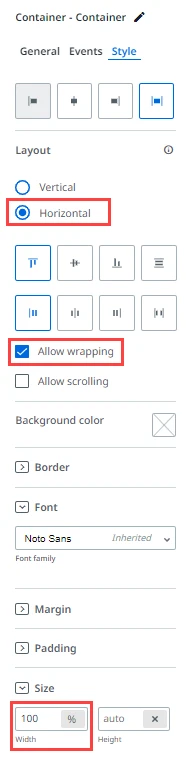
-
Add a Textbox control in the container.
3.1 Add
Namein the Label property.3.2 Change the Label Placement to Top from the Style tab.
-
Add a second Textbox control after the first one.
4.1 Add
Agein the Label property.4.2 Change the Label Placement to Top from the Style tab.
-
Add a third Textbox control after the second one.
4.1 Add
Addressin the Label property.4.2 Change the Label Placement to Top from the Style tab.
-
Add a second container below the first one with the same Style properties.
-
Add a Button control in the second container.
Resultado y pruebas
Ahora puede previsualizar y probar su aplicación.
To test your app using the Google Chrome browser, follow the steps below:
-
Haz clic derecho en cualquier lugar de la página.
-
Select Inspect from the menu.
-
From the menu on the right-hand side, click Toggle device toolbar.
-
Elija las dimensiones deseadas de la lista desplegable en la parte superior de la página para probar su aplicación.
Consejo:In the case of the Container layout control, the containers inside are automatically mobile-friendly. If the controls inside the containers need to be reactive as well, use the Allow wrapping property.
Para ver más ejemplos, puede descargar el siguiente archivo de aplicación de muestra.