Erfahren Sie mehr über die Automatisierung mit Agenten und Orchestrierung mit UiPath.
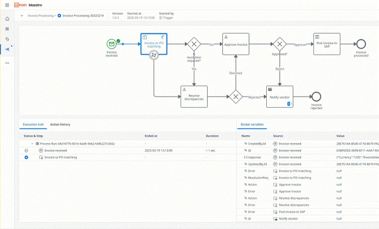
Maestro
Orchestrieren Sie Agents, Automatisierungen und Personen über End-to-End-Prozesse hinweg, um messbare Ergebnisse zu liefern.
Erste Schritte mit UiPath
Orchestrieren eines End-to-End-Geschäftsprozesses in einem einzigen Workflow
Erstellen Sie Ihr erstes Projekt in Studio.
Erstellen Sie Ihren ersten Agent in Studio Web.
Erstellen Sie conversational agents mit unserem Low-Code-Designer in Studio Web
Erfahren Sie, wie Connectors einen sicheren, standardisierten Zugriff auf externe Systeme bieten.
Beliebte Themen
Für Automation Cloud erforderlichen Netzwerkverkehr zulassen.
Studio auf Ihrer Maschine installieren
Erstellen Sie Schritt für Schritt Ihre ersten Automatisierungen.
Wählen Sie aus, wo Ihre Automation Cloud-Daten gespeichert werden.
Automatisierungen in einem Browser erstellen und ausführen
Neuigkeiten
Nutzen Sie agentisches Verhalten und kognitive Funktionen auf Ihrem Desktop.
Prompts in natürlicher Sprache in BPMN-Workflows umwandeln.
Entwerfen Sie Ihren Agent schneller und einfacher.
Entwerfen Sie Ihre automatisierten Tests sicher mit Ihrer eigenen Infrastruktur.
AI Trust Layer und Lösungen sind jetzt in Automation Suite verfügbar.
Erkunden Sie alle Produkte und Plattformen