En savoir plus sur l'automatisation agentique et l'orchestration avec UiPath
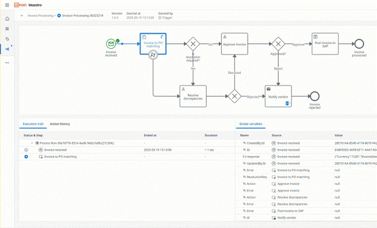
Maestro
Orchestrer les agents d’IA, les automatisations et les personnes à travers les Processes de bout en bout pour délivrer des résultats mesurables
Démarrer avec UiPath
Orchestrer un processus métier de bout en bout dans un seul workflow
Créer votre premier projet dans Studio
Générer votre premier agent dans Studio Web
Créer des agents conversationnels à l’aide de notre concepteur low-code dans Studio Web
Découvrir comment les connecteurs fournissent un accès sécurisé et normalisé aux systèmes externes
Sujets populaires
Autoriser le trafic réseau requis pour Automation Cloud
Installer Studio sur votre machine
Générer vos premières automatisations étape par étape
Choisir où vos données Automation Cloud sont stockées
Créer et exécuter des automatisations dans un navigateur
Nouveautés
Apporter le comportement agentique et les capacités cognitives à votre bureau
Transformer les invites en langage naturel en workflows BPMN
Concevoir votre agent plus rapidement et plus facilement
Concevoir vos tests automatisés en toute sécurité à l’aide de votre propre infrastructure
AI Trust Layer et Solutions désormais disponibles dans Automation Suite
Explorer tous les produits et plateformes