# Customizing column width in Edit Grids
> This tutorial shows how to modify the width of the last column in an **Edit Grid**.
This tutorial shows how to modify the width of the last column in an **Edit Grid**.
**Prerequisites**: To follow the steps in this tutorial, create a data table. Make sure that the last column of the table has content longer than, approximately, five to six words.
1. Add a **Build Data Table** activity in your workflow.
2. Open the **Build Data Table** wizard and add the desired columns for your table.
:::note
Make sure the columns have no spaces or special characters, because you will later use these names to link the columns in the form through **Property Names**.
:::
3. Save the data table to a variable. For this example, you can name it `dataTable`.

1. Add an **Edit Grid** into your form, and use the name of the data table variable (`dataTable`) as the **Property Name** of the component.
2. Add components into the **Edit Grid**, according to the columns and their values in the data table. The **Property Names** of these components are the exact names of the columns in the data table.
For this example, add three **Text Field** components. Use the following **Property Names** for the components: `column1`, `column2`, and `column3`.
3. Go to the **Edit Grid** component settings, in the **Templates** tab. You can choose to edit the column width using Bootstrap 3 or using the CSS `style` property.
* **Using Bootstrap 3**
1. In the **Header Template** section, change the default generated code with the following template:
```
{% util.eachComponent(components, function(component) { %}
{% if (displayValue(component)) { %}
{% if (component.key=== 'Column3') { %}
{% } %}
{% if (component.key !== 'Column3') { %}
{% } %}
{{ component.label }}
{% } %}
{% }) %}
```
2. In the **Row Template** section, change the default generated code with the following template:
```
{% util.eachComponent(components, function(component) { %}
{% if (!component.hasOwnProperty('tableView') || component.tableView) { %}
{% if (component.key=== 'Column3') { %}
{% } %}
{% if (component.key !== 'Column3') { %}
{% } %}
{{ getView(component, row[component.key]) }}
{% } %}
{% }) %}
{% if (!instance.options.readOnly && !instance.disabled) { %}
{% if (!instance.hasRemoveButtons || instance.hasRemoveButtons()) { %}
{% } %}
{% } %}
```
:::tip
* Notice that you compare the `component.key` value to the exact name of the column, which is the same one used as the **Property Name** of each text component.
* UiPath Forms are using the Bootstrap 3 framework. The total width of the table is divided into 12 sections. Therefore, make sure that any division you make, it adds up to 12. In this example, two columns with `col-sm-2` class take up 4 sections, leaving the remaining 8 for the third column (`col-sm-8`).
:::
* **Using the `style` property**:
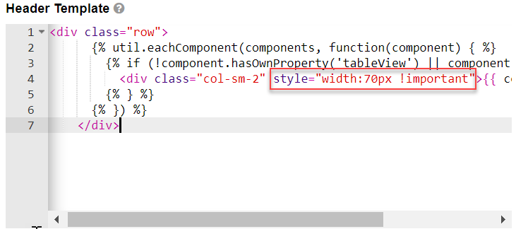
1. In the **Header Template** script, identify all `` tags and add your custom width as follows: `style="width:{your_custom_width}px !important"`. The width must be expressed in pixels.
2. In the **Row Template** script, identify all `` tags and add your custom width as follows: `style="width:{your_custom_width}px !important"`. The width must be expressed in pixels.
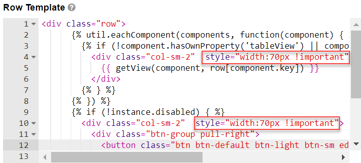
The `"col-sm-2"` element represents the default column width. You can modify the default column width by adding a customized style tag. For example `style="width:70px !important"` applies a width of 70 pixels to all **Edit Grid** columns.
4. Save the component and the form.