# UI Explorer
> **UI Explorer** is an advanced tool that enables you to create a custom selector for a specific UI element. It is available as a standalone tool you can download from the **Resource Center** in your Automation Cloud instance, or from Studio only if the `UiPath.UIAutomation.Activities` package is installed as a dependency to the project.
**UI Explorer** is an advanced tool that enables you to create a custom selector for a specific UI element. It is available as a standalone tool you can download from the **Resource Center** in your Automation Cloud instance, or from Studio only if the `UiPath.UIAutomation.Activities` package is installed as a dependency to the project.
Using UI Explorer as a standalone tool does not require you to install Studio. This comes in handy when you want to make sure that an application can be automated with selectors. It enables you to simply inspect elements without building a process. The standalone package also contains the [SetupExtensions](https://docs.uipath.com/studio/standalone/latest/user-guide/about-the-setupextensions-tool) utility, thus making it possible to install browser extensions and the JavaBridge to inspect elements across all your automation needs.
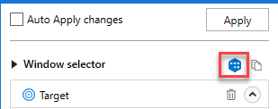
To open the **UI Explorer** window, click the button in the **Selectors** section, in the **Design** tab, or from the advanced editor in the selection screen of all the selectors of the **target** and **anchors** attributes, after indicating the target UI element.
:::note
If you do not have the `UiPath.UIAutomation.Activities` pack installed as a dependency for the current project, the **UI Explorer** button does not appear in the **Ribbon**.
:::
Alternatively, the **UI Explorer** can be launched from the **Tools** page in the Studio backstage view. UI Explorer from the context menu uses the UI automation libraries shipped with the current version of Studio.
:::note
The version of the UI Automation package that is currently used is displayed in the lower right corner in the **UI Explorer** you have opened. This version varies, as launching the **UI Explorer** from the **Tools** page uses the default **UI Automation** version shipped with the Studio version you are using, while opening **UI Explorer** from the **Ribbon** uses the version you have installed as a dependency for the current project.
:::

To be sure that you choose the best selector, remember to:
* Add or remove attributes
* Add parent or children tags
* Use wild cards to replace changing values
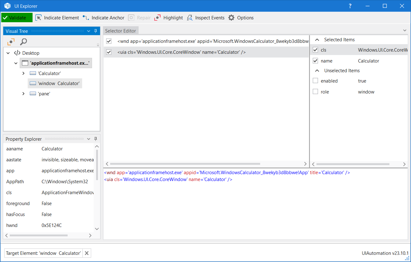
## Field Descriptions for the UI Explorer Window
Field
Description
Validate
Selector is being validated
Valid selector
Invalid selector
Modified selector, revalidate
Indicate Element
Indicates a new UI element to replace the previous one.
Indicate Anchor
Enables you to choose an anchor relative to the target UI element.
Repair
Enables you to re-indicate the same target UI element and repair the selector. This operation does not completely replace the previous selector. The button is available only when the selector is invalid.
Highlight
Brings the target element in the foreground. The highlight stays on until it's switched off. The button is enabled only if the selector is valid.
Inspect Events
Opens the Event Inspection Tool .
Options
Contains several options:
UI Frameworks - Changes the technology used to determine UI elements and their selectors. The following options are available:
Default – UiPath proprietary method. Usually works fine with all types of user interfaces. First try to generate a selector using the appropriate UiPath extensions or connectors (e.g. browser/remote/Java extension, SAP connector, etc.). If that is not possible, try to generate a selector using Active Accessibility (preferred for most desktop applications) or UI Automation (preferred for Office applications).
Active Accessibility - An earlier solution from Microsoft for making applications accessible. It is recommended that you use this option with legacy software, when the Default one does not work. Try to generate a selector using Active Accessibility, and skip UiPath extensions or connectors.To find out if a selector uses the Active Accessibility technology, you have to look for ctrl tags. Specifically, the sub-string <ctrl. In XAML, you might find that encoded as <ctrl.
UI Automation – The improved accessibility model from Microsoft. It is recommended that you use this option with newer applications, when the Default one does not work.Try to generate a selector using UI Automation, and skip UiPath extensions or connectors.
Note: Currently this framework does not support Chrome or Edge web pages and instead it generates wnd selectors, rather than falling back to the extension.
For more information, refer to Active Accessibility and UI Automation.
Delayed Restore - Delay restoring the UI Explorer window until after the selector data is loaded. Use this option when indicating UI elements that auto-close on focus lost, such as drop-downs or overlays.
Trigger Selector - Ensures the uniqueness of a UI element within its parent while increasing its monitoring accuracy. Use this option when generating selectors for trigger activities.
## The Visual Tree Panel
Displays a tree of the UI hierarchy and enables you to navigate through it, by clicking the arrows in front of each node.
By default, the first time when you open **UI Explorer**, this panel displays all opened applications, in alphabetical order.
Double-clicking a UI element (or right-clicking and selecting **Set as Target Element**) from the tree, populates the **Selector Editor**, **Selector Attributes** and **Property Explorer** panels.
Field
Description
Highlight
Highlights the selected element from the Visual Tree in real time. The highlight stays on until it's switched off.
Show Search Options
Displays the search box and search filter options.
Search Box
Enables you to look for a specific string. If an exact match is not found, nodes containing the nearest match are displayed. Wildcards are supported. Depending on the attribute selected from the Search by drop-down list, the search can be case sensitive. Note: The search only looks for matches in the tree structure under the selected UI object.
Search by
Filters your search to a selected attribute or a selector. The contents of this drop-down list change according to the selected UI element. Note: If Search by is set to Selector, you can only input one node in the <attribute name1='value1' ... /> format.
Children Only
Limit your search to the first level children of the selected node. By default, this check box is not selected.
## The Selector Editor Panel
Displays the selector for the specified UI object and enables you to customize it.
The bottom part of the panel displays the actual XML fragment that you have to use in a project. Once you find the selector you want, you can copy it from here and paste it in the **Properties** panel of an activity, in the **Selector** field.
The top part of this panel enables you to view all the nodes in a selector and eliminate the ones that are not necessary by clearing the check box in front of them. An element in the list of selector nodes becomes active when you enable or disable an attribute, or when editing a selector in the bottom panel. Only one node is active at a time.
Selecting a node here displays its attributes in the **Selector Attributes** and **Property Explorer** panels.
Selectors can also be edited with the aid of variables, either by using the `CTRL+K` hotkey to create a variable in the selector itself, or by specifying an already created variable with the `CTRL+Space` combination. Using the `CTRL+K` hotkey enables you to specify a value and a name for the variable. Please note that only `string` variables can be used.
## The Selector Attributes Panel
Displays all the available attributes of a selected node (from the **Selector Editor** panel).
You can add or eliminate some of the node attributes by selecting or clearing the check box in front of each attribute.
Additionally, you can change the value of each attribute yet this modification is retained only if the new selector points at the originally selected UI object.
## The Property Explorer Panel
Displays all the attributes that a specified UI object can have, including the ones that do not appear in the selector. They cannot be changed.
## Event Inspection Tool
In the context of trigger-based attended automation, the **Event Inspection Tool** can be used to identify the type of native events triggered when you interact with certain UI elements in an application, and then it can be used for configuring the **Application Event Trigger** activity. The tool captures and monitors all the selected event types, such as **Click**, **Key pressed**, **Focus gained**, **Focus lost**, and other relevant interactions, enabling you to analyze the actions performed and, if applicable, diagnose issues.
The **Event Inspection Tool** can be opened from the **UI Explorer**, once a valid UI element is selected, by clicking the **Inspect Events** toolbar button.
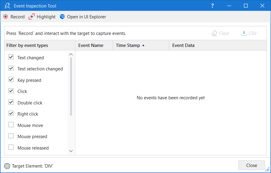
The toolbar consists of the following options:
* **Record** - The events generated by interacting with the UI element are recorded and added to the events list.
* **Pause** - The events generated by the UI element when you interact with it are no longer recorded.
* **Highlight** - Shows the contour of the target element and brings it to the foreground for a few seconds. The highlight stays on until it is disabled.
* **Open in UI Explorer** - The monitored element is opened in UI Explorer where you can observe the selector of that element.
Once you start event recording, two more options become available:
* **Clear** - Deletes all the recorded events.
* **CSV** - The captured events can be exported to a `.csv` file for further analysis.
The **Event Inspection Tool** window has two main sections:
* Event filter - Allows selecting the types of events you want to monitor for the target element.
* Event list - Displays information about captured events.
You can filter event types to be captured by enabling or disabling the checkboxes from the list of event types. The list may vary based on the selected element technology.
All mouse event types (**Mouse move**, **Mouse pressed**, **Mouse released**, **Mouse entered**, **Mouse exited**), specific for Web or Java UI elements, are disabled by default because the event list, in such cases, can become quite large. Our recommendation is to enable the mouse event types only if you have a specific need to monitor them.
It is worth also mentioning that event types can be enabled or disabled even after you started the event recording.
The event list has three columns:
* **Event Name** - The event type.
* **Time Stamp** - The date and hour when the event was performed.
* **Event Data** - The associated data and parameters for a certain event.
Each column can be sorted in ascending or descending order. The events are displayed by default in the order they were performed.

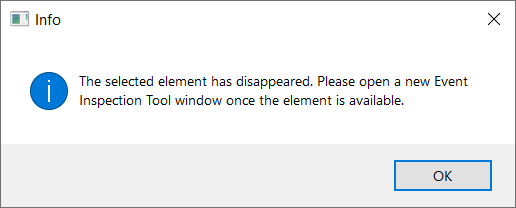
When the **Disappeared** event type is found, you can no longer continue monitoring and an error message is displayed on the screen. When clicking any option from the toolbar, the same error message is displayed on the screen. The only available options are to either clear the data or export it to a `.csv` file. To start monitoring again, close the window and open another instance of the **Event Inspection Tool**.