# Automation for React Native apps
> To build automations for Reach Native apps, you can use the React Native Demo App for iOS to
learn how to make specific components ready to automate.
To build automations for Reach Native apps, you can use the React Native Demo App for iOS to
learn how to make specific components ready to automate.
## Prerequisites
* **UiPath.MobileAutomation.Activities**Alternatively, you can use the
**Mobile Testing Project** default template, as this will install the
activity package for you.
* Device farm or Physical Mobile Device (see [Managing Devices](https://docs.uipath.com/activities/other/latest/ui-automation/device-configuration)).
* Appium endpoint.
## Prepare the environment
For this example, the TouchableOpacity component is being used to automate touch-based input. You can set other views as accessible
as the behavior will be similar with the TouchableOpacity component.
1. Download the [React Native Demo App for iOS](https://uipathtestappsto.blob.core.windows.net/testapps/ReactNativeDemoApp.ipa).
2. Configure an [iOS application](https://docs.uipath.com/activities/other/latest/ui-automation/application-configuration#managing-applications) in Mobile Device Manager using the React Native Demo App for iOS.
3. [Start the application in Mobile Device Manager](https://docs.uipath.com/activities/other/latest/ui-automation/mobile-device-automation-getting-started#getting-started).
4. Use the interaction bar right next to the device emulator to record the action so you can import them directly in Studio (see
[Import Recorded Actions](https://docs.uipath.com/activities/other/latest/ui-automation/mobile-device-automation-getting-started#getting-started)).
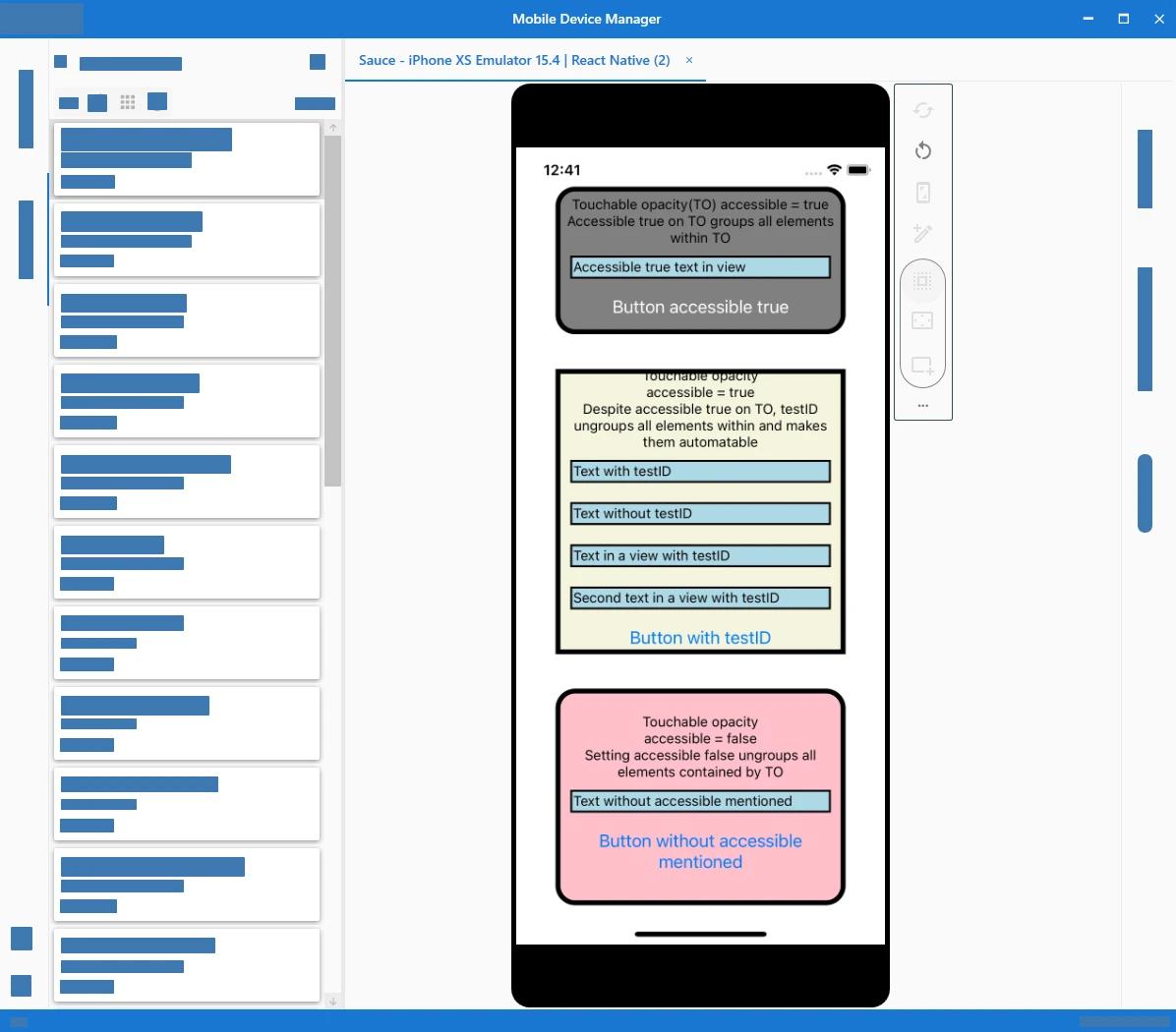
## Building automation for React Native apps
In this example, we use the React Native Demo App for iOS to configure specific properties to make components automatable.
### Accessibility properties
Setting this property to `true` indicates the view as an accessibility element. Accessibility set to true makes an element automatable. All touchable components
are accessible by default (see [React Native Accessibility](https://reactnative.dev/docs/accessibility)).
```
text onetext two
```
Property
Type
Description
accessible
bool
true
testID
string
'any text' Ungroups this component from its parent making it individually automatable. Makes the component automatable despite its parent accessibility status (true or false). not mentioned Component is treated accordingly to its parent accessibility status
### Mobile automation sample
Use the following [mobile automation sample](https://github.com/UiPath/mobile-automation-samples) as a starting point to building the automation according to your requirements. Alternatively, you can use Mobile Device Manager
to [record steps and then import them to Studio](https://docs.uipath.com/activities/other/latest/ui-automation/mobile-device-automation-getting-started#getting-started).
```
SafeAreaView,
ScrollView,
StatusBar,
StyleSheet,
Text,
Alert,
useColorScheme,
View,
TouchableOpacity,
Button
} from 'react-native';
Colors,
DebugInstructions,
Header,
LearnMoreLinks,
ReloadInstructions,
} from 'react-native/Libraries/NewAppScreen';
const App: () => Node = () => {
const isDarkMode = useColorScheme() === 'dark';
const backgroundStyle = {
backgroundColor: isDarkMode ? Colors.darker : Colors.lighter,
};
const click = () => {
Alert.alert("click!! ")
}
return (
Touchable opacity(TO) accessible = trueAccessible true on TO groups all elements within TOAccessible true text in viewTouchable opacity accessible = trueDespite accessible true on TO, testID ungroups all elements within and makes them automatableText with testIDText without testIDText in a view with testIDSecond text in a view with testIDTouchable opacity accessible = falseSetting accessible false ungroups all elements contained by TOText without accessible mentioned
);
};
const styles = StyleSheet.create({
container: {
flex: 1,
justifyContent: "space-between",
backgroundColor: "#fff",
padding: 20,
margin: 20,
},
top: {
flex: 0.2,
backgroundColor: "grey",
borderWidth: 5,
borderRadius: 20,
justifyContent: "center",
alignContent: "center"
},
middle: {
flex: 0.4,
backgroundColor: "beige",
borderWidth: 5,
justifyContent: "center",
alignContent: "center"
},
bottom: {
flex: 0.3,
backgroundColor: "pink",
borderWidth: 5,
borderRadius: 20,
justifyContent: "center",
alignContent: "center"
},
text1: {
alignContent: "center",
textAlign: "center"
},
text2: {
margin: 10,
backgroundColor: "lightblue",
padding: 1,
borderWidth: 2,
},
button: {
color: "white",
backgroundColor: "pink"
}
});
export default App;
```